
About
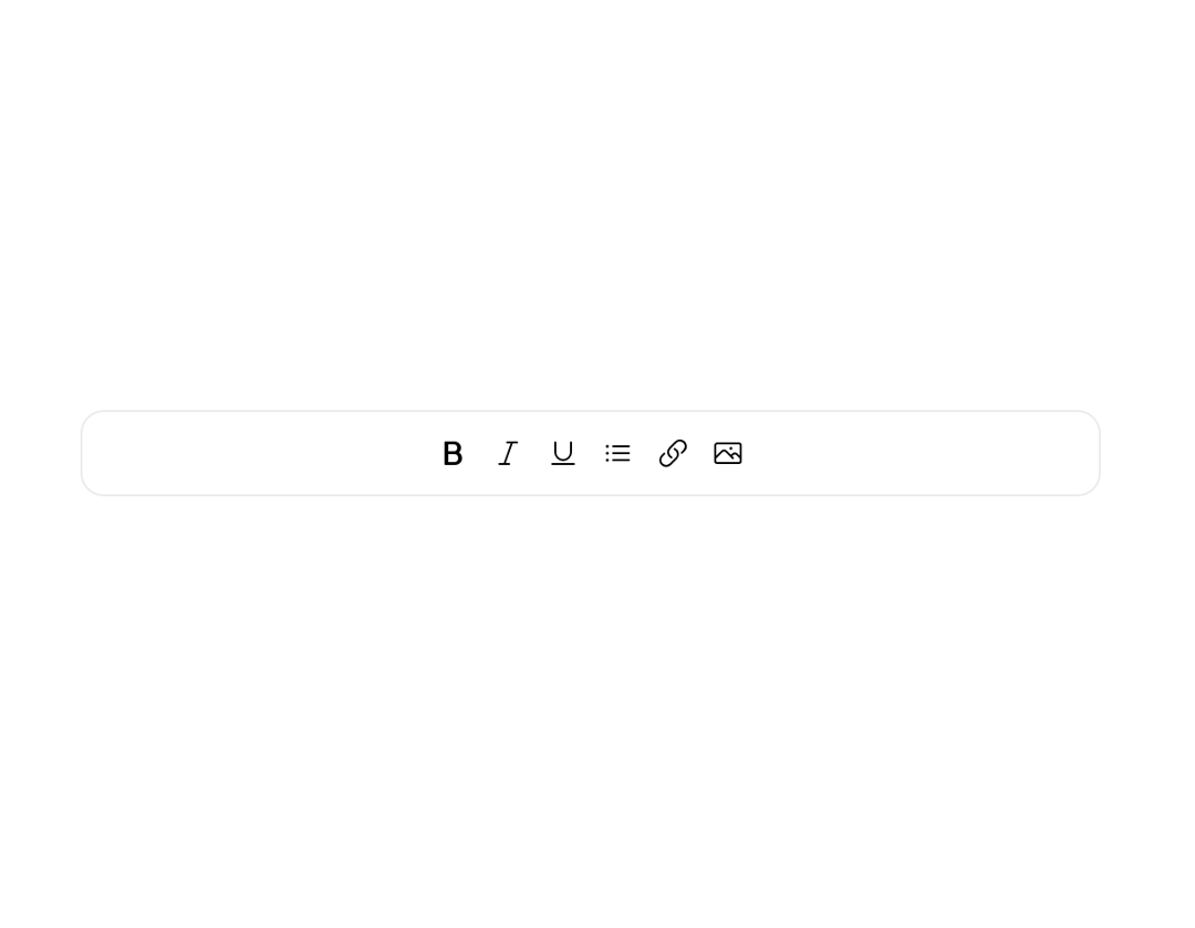
An Astryx layout primitive that centers content horizontally, vertically, or along both axes within its container.
Built with React and Tailwind. Copy the prompt and paste it into Claude Code, Cursor or Lovable: your agent adds Astryx Center to your project and fits it to your theme.
Code
How Astryx Center is used: the demo's code. The component's own source comes with a free account.
Usage.tsx
'use client';

import {Center} from '@/components/ui/astryx-center';
import {Card} from '@astryxdesign/core/Card';
import {Stack} from '@astryxdesign/core/Layout';
import {Icon} from '@astryxdesign/core/Icon';
import {IconButton} from '@astryxdesign/core/IconButton';
import {
  BoldIcon,
  ItalicIcon,
  UnderlineIcon,
  ListBulletIcon,
  LinkIcon,
  PhotoIcon,
} from '@heroicons/react/24/outline';

function CenterHorizontal() {
  return (
    <Card width={520} padding={2}>
      <Center axis="horizontal" width="100%">
        <Stack direction="horizontal" gap={0} vAlign="center">
          <IconButton
            label="Bold"
            icon={<Icon icon={BoldIcon} />}
            variant="ghost"
            size="sm"
          />
          <IconButton
            label="Italic"
            icon={<Icon icon={ItalicIcon} />}
            variant="ghost"
            size="sm"
          />
          <IconButton
            label="Underline"
            icon={<Icon icon={UnderlineIcon} />}
            variant="ghost"
            size="sm"
          />
          <IconButton
            label="List"
            icon={<Icon icon={ListBulletIcon} />}
            variant="ghost"
            size="sm"
          />
          <IconButton
            label="Link"
            icon={<Icon icon={LinkIcon} />}
            variant="ghost"
            size="sm"
          />
          <IconButton
            label="Image"
            icon={<Icon icon={PhotoIcon} />}
            variant="ghost"
            size="sm"
          />
        </Stack>
      </Center>
    </Card>
  );
}

export default function CenterHorizontalDemo() {
  return (
    <div
      data-astryx-theme="neutral"
      data-theme="light"
      style={{colorScheme: 'light', display: 'contents'}}>
      <CenterHorizontal />
    </div>
  );
}
Dependencies
More by Astryx
View all

Astryx Banner
56
Astryx Avatar
28
Astryx Aspect Ratio
28
Astryx Badge
25
Astryx Button Group
23
Astryx Toggle Button
16
Astryx Avatar Group
8
Astryx Chat Composer Drawer
6