
About
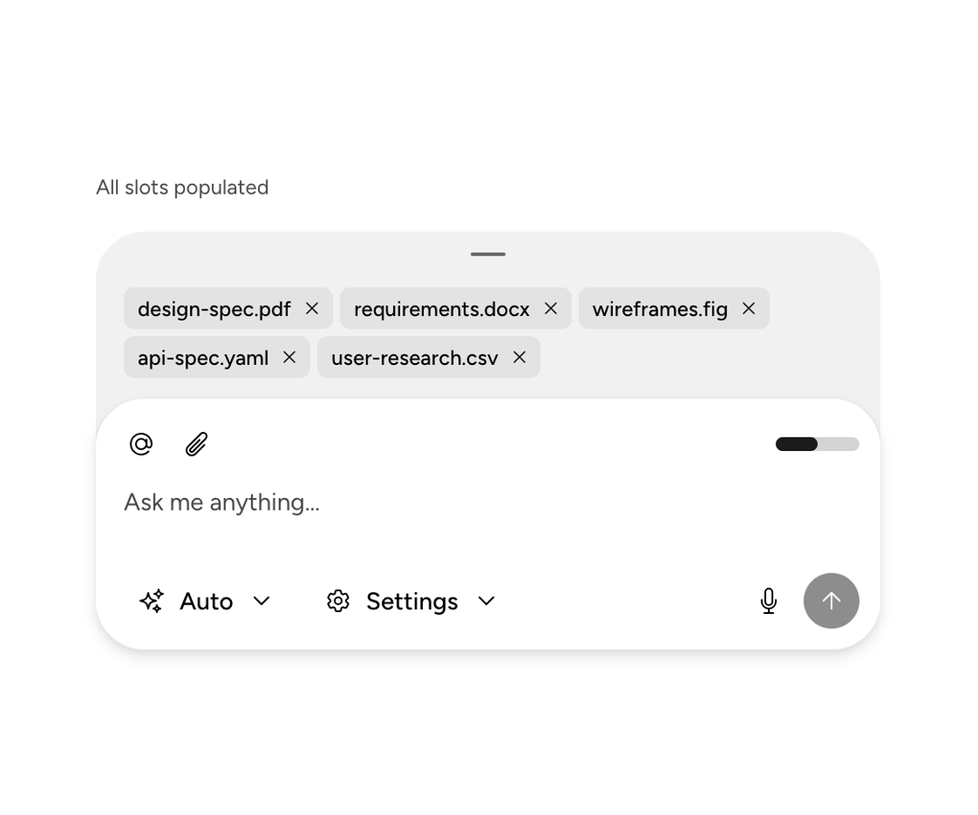
An Astryx chat-composer shell arranging input, drawer, header, footer, send actions, status, and keyboard focus behavior.
Built with React and Tailwind. Copy the prompt and paste it into Claude Code, Cursor or Lovable: your agent adds Astryx Chat Composer to your project and fits it to your theme.
Code
How Astryx Chat Composer is used: the demo's code. The component's own source comes with a free account.
Usage.tsx
'use client';

import {useState} from 'react';
import {
  ChatComposer,
  ChatComposerDrawer,
  ChatComposerInput,
} from '@/components/ui/astryx-chat-composer';
import {Token} from '@astryxdesign/core/Token';
import {Button} from '@astryxdesign/core/Button';
import {DropdownMenu} from '@astryxdesign/core/DropdownMenu';
import {Icon} from '@astryxdesign/core/Icon';
import {ProgressBar} from '@astryxdesign/core/ProgressBar';
import {Stack} from '@astryxdesign/core/Layout';
import {Text} from '@astryxdesign/core/Text';
import {
  AtSymbolIcon,
  Cog6ToothIcon,
  MicrophoneIcon,
  PaperClipIcon,
  SparklesIcon,
} from '@heroicons/react/24/outline';

function ChatComposerFullFeatured() {
  const [isStreaming, setIsStreaming] = useState(false);

  return (
    <Stack direction="vertical" gap={4} width={450} maxWidth="100%">
      <Text type="supporting" color="secondary">
        All slots populated
      </Text>
      <ChatComposer
        onSubmit={value => {
          console.log('Sent:', value);
          setIsStreaming(true);
          setTimeout(() => setIsStreaming(false), 3000);
        }}
        isStopShown={isStreaming}
        onStop={() => setIsStreaming(false)}
        placeholder="Ask me anything..."
        input={<ChatComposerInput style={{minHeight: 44}} />}
        drawer={
          <ChatComposerDrawer count={5}>
            <Token label="design-spec.pdf" onRemove={() => {}} />
            <Token label="requirements.docx" onRemove={() => {}} />
            <Token label="wireframes.fig" onRemove={() => {}} />
            <Token label="api-spec.yaml" onRemove={() => {}} />
            <Token label="user-research.csv" onRemove={() => {}} />
          </ChatComposerDrawer>
        }
        headerActions={
          <>
            <Button
              label="Mention"
              variant="ghost"
              size="sm"
              icon={<Icon icon={AtSymbolIcon} />}
              isIconOnly
            />
            <Button
              label="Attach file"
              variant="ghost"
              size="sm"
              icon={<Icon icon={PaperClipIcon} />}
              isIconOnly
            />
          </>
        }
        headerContext={
          <ProgressBar label="Context window" value={50} isLabelHidden />
        }
        footerActions={
          <>
            <DropdownMenu
              button={{
                label: 'Auto',
                variant: 'ghost',
                size: 'md',
                icon: <Icon icon={SparklesIcon} size="sm" />,
                children: 'Auto',
              }}
              menuWidth={200}
              items={[
                {label: 'Auto', onClick: () => {}},
                {label: 'Model A', onClick: () => {}},
                {label: 'Model B', onClick: () => {}},
                {label: 'Model C', onClick: () => {}},
              ]}
            />
            <DropdownMenu
              button={{
                label: 'Settings',
                variant: 'ghost',
                size: 'md',
                icon: <Icon icon={Cog6ToothIcon} size="sm" />,
                children: 'Settings',
              }}
              menuWidth={200}
              items={[
                {label: 'Preferences', onClick: () => {}},
                {label: 'Keyboard shortcuts', onClick: () => {}},
                {label: 'About', onClick: () => {}},
              ]}
            />
          </>
        }
        sendActions={
          <Button
            label="Microphone"
            variant="ghost"
            size="md"
            icon={<Icon icon={MicrophoneIcon} />}
            isIconOnly
          />
        }
      />
    </Stack>
  );
}

export default function ChatComposerFullFeaturedDemo() {
  return (
    <div
      data-astryx-theme="neutral"
      data-theme="light"
      style={{colorScheme: 'light', display: 'contents'}}>
      <ChatComposerFullFeatured />
    </div>
  );
}
Dependencies
More by Astryx
View all

Astryx Banner
56
Astryx Avatar
28
Astryx Aspect Ratio
28
Astryx Badge
25
Astryx Button Group
23
Astryx Toggle Button
16
Astryx Avatar Group
8
Astryx Chat Composer Drawer
6