
About
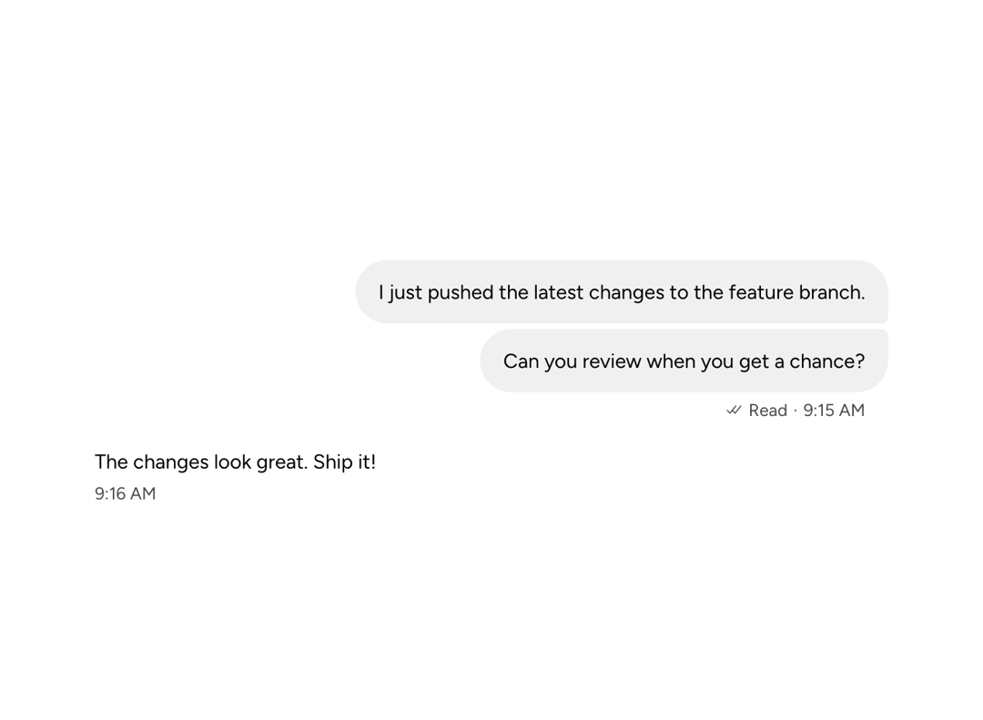
Styled content container for the chat "bubble." Reads sender from parent ChatMessage context to auto-style the background. Use filled for standard messages and ghost when content needs alignment without a visible boundary. Supports name/metadata slots aligned with bubble padding, and multi-bubble grouping via the group prop for consecutive messages from the same sender.
Built with React and Tailwind. Copy the prompt and paste it into Claude Code, Cursor or Lovable: your agent adds Astryx Chat Message Bubble to your project and fits it to your theme.
Code
How Astryx Chat Message Bubble is used: the demo's code. The component's own source comes with a free account.
Usage.tsx
// Copyright (c) Meta Platforms, Inc. and affiliates.

'use client';

import {
  ChatMessageList,
  ChatMessage,
  ChatMessageBubble,
  ChatMessageMetadata,
} from '@/components/ui/astryx-chat-message-bubble';
import {Timestamp} from '@astryxdesign/core/Timestamp';

function ChatMessageBubbleShowcase() {
  return (
    <ChatMessageList style={{maxWidth: 600}}>
      <ChatMessage sender="user">
        <ChatMessageBubble group="first">
          I just pushed the latest changes to the feature branch.
        </ChatMessageBubble>
        <ChatMessageBubble
          group="last"
          metadata={
            <ChatMessageMetadata
              timestamp={
                <Timestamp value="2026-04-10T09:15:00" format="time" />
              }
              status="read"
            />
          }>
          Can you review when you get a chance?
        </ChatMessageBubble>
      </ChatMessage>
      <ChatMessage sender="assistant">
        <ChatMessageBubble
          variant="ghost"
          metadata={
            <ChatMessageMetadata
              timestamp={
                <Timestamp value="2026-04-10T09:16:00" format="time" />
              }
            />
          }>
          The changes look great. Ship it!
        </ChatMessageBubble>
      </ChatMessage>
    </ChatMessageList>
  );
}

export default function ChatMessageBubbleShowcaseDemo() {
  return (
    <div
      data-astryx-theme="neutral"
      data-theme="light"
      style={{colorScheme: 'light', display: 'contents'}}>
      <ChatMessageBubbleShowcase />
    </div>
  );
}
Dependencies
More by Astryx
View all

Astryx Banner
56
Astryx Avatar
28
Astryx Aspect Ratio
27
Astryx Badge
25
Astryx Button Group
23
Astryx Toggle Button
16
Astryx Avatar Group
8
Astryx Button
4