

The mark on a chosen option: a checkmark by default, and nothing at all when unchosen, so a listbox shows no empty box beside every row. This is the indicator to replace to change what "chosen" looks like: mapping it to RadioIndicator gives every single-selection mark radio visuals, including an empty circle on unchosen rows. Unlike the checkbox and radio visuals it renders no chrome of its own (it IS the glyph), so a host's theme target lands on the same element as astryx-icon.
Built with React and Tailwind. Copy the prompt and paste it into Claude Code, Cursor or Lovable: your agent adds Astryx Check Indicator to your project and fits it to your theme.
Code
How Astryx Check Indicator is used: the demo's code. The component's own source comes with a free account.
Usage.tsx
'use client';

import {CheckIndicator} from '@/components/ui/astryx-check-indicator';

function CheckIndicatorExample() {
  return <CheckIndicator state="checked" size="sm" />;
}

export default function CheckIndicatorExampleDemo() {
  return (
    <div
      data-astryx-theme="neutral"
      data-theme="light"
      style={{colorScheme: 'light', display: 'contents'}}>
      <CheckIndicatorExample />
    </div>
  );
}
Dependencies
More by Astryx
View all

Astryx Banner
59
Astryx Aspect Ratio
31
Astryx Avatar
30
Astryx Badge
29
Astryx Button Group
27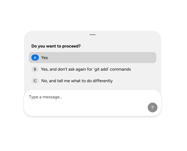
Astryx Chat Composer Drawer
19
Astryx Toggle Button
17
Astryx Avatar Group
9