
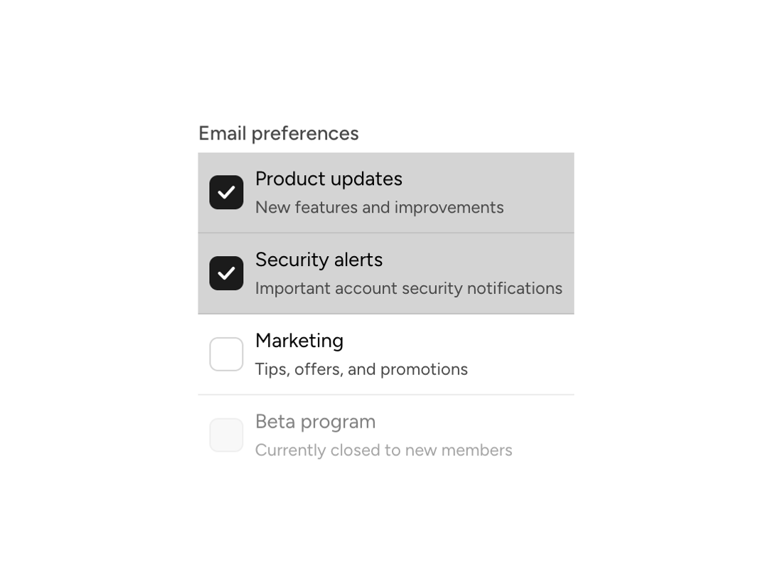
Individual checkbox item with label, description, and end content slot. Works in collection mode (inside a CheckboxList with a value array) or standalone mode (inside List, or inside a CheckboxList without value, such as a select-all item). On a touch screen (a coarse primary pointer), a toggleable row is one press target: a touch on the label, the description or the box itself shows the pressed state on the row and its checkbox together. Where the primary pointer is fine, the box keeps its own press.
Built with React and Tailwind. Copy the prompt and paste it into Claude Code, Cursor or Lovable: your agent adds Astryx Checkbox List Item to your project and fits it to your theme.
Code
How Astryx Checkbox List Item is used: the demo's code. The component's own source comes with a free account.
Usage.tsx
// Copyright (c) Meta Platforms, Inc. and affiliates.

'use client';

import {useState} from 'react';
import {CheckboxList, CheckboxListItem} from '@/components/ui/astryx-checkbox-list-item';

function CheckboxListItemShowcase() {
  const [value, setValue] = useState<string[]>(['updates', 'security']);

  return (
    <CheckboxList
      label="Email preferences"
      value={value}
      onChange={setValue}
      hasDividers>
      <CheckboxListItem
        label="Product updates"
        value="updates"
        description="New features and improvements"
      />
      <CheckboxListItem
        label="Security alerts"
        value="security"
        description="Important account security notifications"
      />
      <CheckboxListItem
        label="Marketing"
        value="marketing"
        description="Tips, offers, and promotions"
      />
      <CheckboxListItem
        label="Beta program"
        value="beta"
        description="Currently closed to new members"
        isDisabled
      />
    </CheckboxList>
  );
}

export default function CheckboxListItemShowcaseDemo() {
  return (
    <div
      data-astryx-theme="neutral"
      data-theme="light"
      style={{colorScheme: 'light', display: 'contents'}}>
      <CheckboxListItemShowcase />
    </div>
  );
}
Dependencies
More by Astryx
View all

Astryx Banner
56
Astryx Avatar
28
Astryx Aspect Ratio
27
Astryx Badge
25
Astryx Button Group
23
Astryx Toggle Button
16
Astryx Avatar Group
8
Astryx Button
4