
About
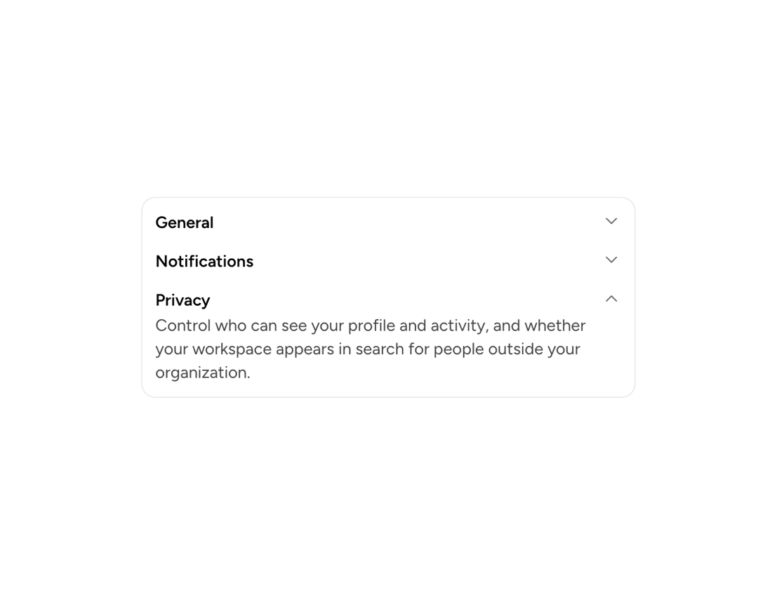
A primitive that makes any content collapsible: a trigger button toggles visibility of the content area, managing its own state or deferring to a parent CollapsibleGroup.
Built with React and Tailwind. Copy the prompt and paste it into Claude Code, Cursor or Lovable: your agent adds Astryx Collapsible to your project and fits it to your theme.
Code
How Astryx Collapsible is used: the demo's code. The component's own source comes with a free account.
Usage.tsx
'use client';

import {Collapsible, CollapsibleGroup} from '@/components/ui/astryx-collapsible';
import {Text} from '@astryxdesign/core/Text';
import {Card} from '@astryxdesign/core/Card';
import {Stack} from '@astryxdesign/core/Stack';

/**
 * Rows inside one card, coordinated so only one is open at a time.
 *
 * Triggers take body-semibold rather than the trigger's default `large`: three
 * rows sharing a single surface are peers, and at 17px semibold each would
 * read as its own section heading. Keep `large` for the case it is for — one
 * Collapsible per card or per Section, where the trigger really is the
 * heading of that surface (see the Multiple Mode and Controlled examples).
 */
function CollapsibleShowcase() {
  return (
    <Card width={420}>
      <CollapsibleGroup type="single" defaultValue="notifications">
        <Stack gap={4}>
          <Collapsible
            trigger={
              <Text type="body" weight="semibold">
                General
              </Text>
            }
            value="general">
            <Text type="body" color="secondary">
              Display name, language, and time zone. Time zone drives every date
              shown in the product, including scheduled reports.
            </Text>
          </Collapsible>

          <Collapsible
            trigger={
              <Text type="body" weight="semibold">
                Notifications
              </Text>
            }
            value="notifications">
            <Stack gap={2}>
              <Text type="body" color="secondary">
                Choose which email and push notifications you receive. Mentions
                and direct messages are always delivered — everything else can
                be turned off or batched into a daily digest.
              </Text>
              <Text type="body" color="secondary">
                Quiet hours pause push notifications overnight in your local
                time zone without affecting email.
              </Text>
            </Stack>
          </Collapsible>

          <Collapsible
            trigger={
              <Text type="body" weight="semibold">
                Privacy
              </Text>
            }
            value="privacy">
            <Text type="body" color="secondary">
              Control who can see your profile and activity, and whether your
              workspace appears in search for people outside your organization.
            </Text>
          </Collapsible>
        </Stack>
      </CollapsibleGroup>
    </Card>
  );
}

export default function CollapsibleShowcaseDemo() {
  return (
    <div
      data-astryx-theme="neutral"
      data-theme="light"
      style={{colorScheme: 'light', display: 'contents'}}>
      <CollapsibleShowcase />
    </div>
  );
}
Dependencies
More by Astryx
View all

Astryx Banner
56
Astryx Avatar
28
Astryx Aspect Ratio
27
Astryx Badge
25
Astryx Button Group
23
Astryx Toggle Button
16
Astryx Avatar Group
8
Astryx Button
4