
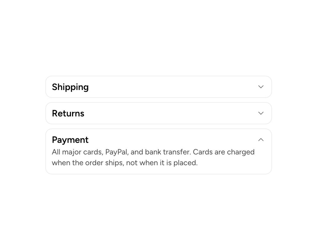
About
Coordinates multiple Collapsible instances so only one (single mode) or any number (multiple mode) can be open at a time. Renders no wrapper DOM element unless dividers are enabled.
Built with React and Tailwind. Copy the prompt and paste it into Claude Code, Cursor or Lovable: your agent adds Astryx Collapsible Group to your project and fits it to your theme.
Code
How Astryx Collapsible Group is used: the demo's code. The component's own source comes with a free account.
Usage.tsx
'use client';

import {Collapsible, CollapsibleGroup} from '@/components/ui/astryx-collapsible-group';
import {Card} from '@astryxdesign/core/Card';
import {Text} from '@astryxdesign/core/Text';
import {Stack} from '@astryxdesign/core/Stack';

/**
 * The whole point of the group: open one section and the others close
 * themselves. Nothing here tracks that — no state, no handlers — the group
 * owns which `value` is open and the children only declare their own.
 *
 * One Collapsible per Card, so each trigger keeps its own `large` type: it is
 * the heading of its surface, not a row in a list. Compare the FAQ block,
 * where the questions share a surface and step down to body-semibold.
 */
function CollapsibleGroupShowcase() {
  return (
    <CollapsibleGroup type="single" defaultValue="shipping">
      <Stack gap={2} width="100%" maxWidth={420}>
        <Card>
          <Collapsible trigger="Shipping" value="shipping">
            <Text type="body" color="secondary">
              Standard delivery takes 3–5 business days and is free over $50.
              Express is next business day if you order before 2pm.
            </Text>
          </Collapsible>
        </Card>

        <Card>
          <Collapsible trigger="Returns" value="returns">
            <Text type="body" color="secondary">
              30 days from delivery, unused and in the original packaging.
              Return shipping is on us for anything that arrived damaged or was
              not what you ordered.
            </Text>
          </Collapsible>
        </Card>

        <Card>
          <Collapsible trigger="Payment" value="payment">
            <Text type="body" color="secondary">
              All major cards, PayPal, and bank transfer. Cards are charged when
              the order ships, not when it is placed.
            </Text>
          </Collapsible>
        </Card>
      </Stack>
    </CollapsibleGroup>
  );
}

export default function CollapsibleGroupShowcaseDemo() {
  return (
    <div
      data-astryx-theme="neutral"
      data-theme="light"
      style={{colorScheme: 'light', display: 'contents'}}>
      <CollapsibleGroupShowcase />
    </div>
  );
}
Dependencies
More by Astryx
View all

Astryx Banner
56
Astryx Avatar
28
Astryx Aspect Ratio
27
Astryx Badge
25
Astryx Button Group
23
Astryx Toggle Button
16
Astryx Avatar Group
8
Astryx Button
4