
About
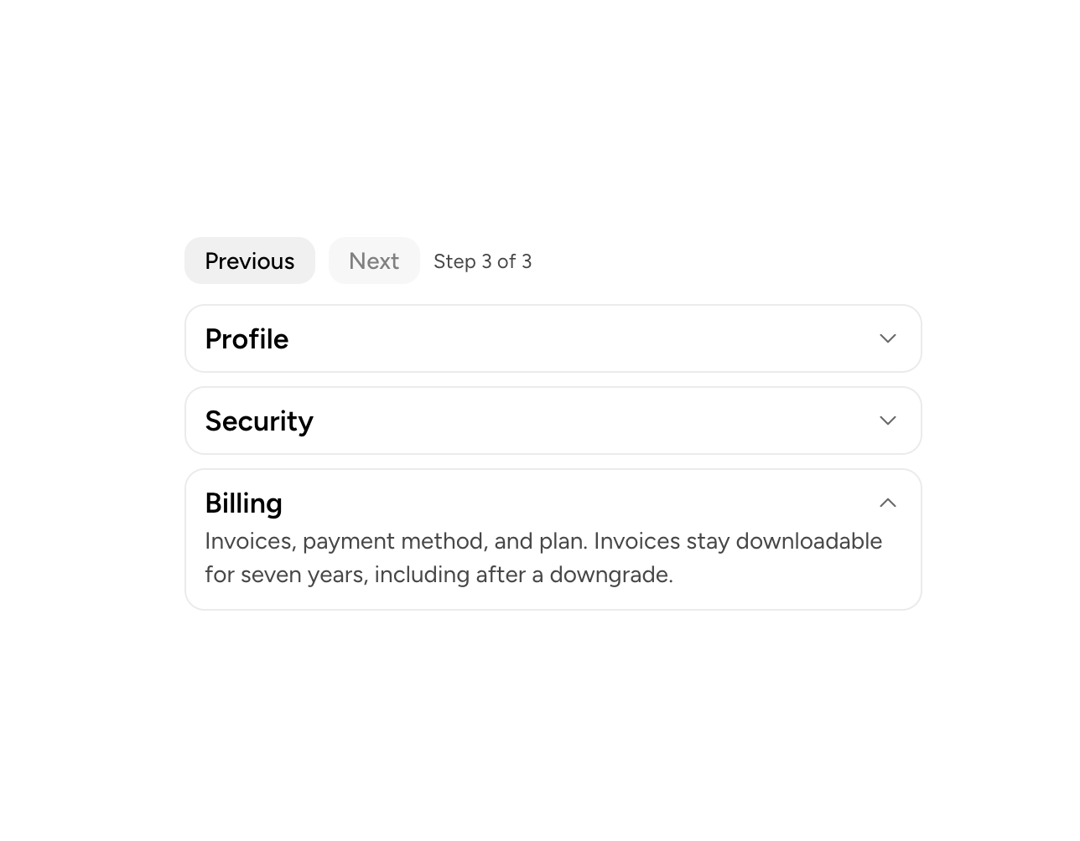
A primitive that makes any content collapsible: a trigger button toggles visibility of the content area, managing its own state or deferring to a parent CollapsibleGroup.
Built with React and Tailwind. Copy the prompt and paste it into Claude Code, Cursor or Lovable: your agent adds Astryx Collapsible to your project and fits it to your theme.
Code
How Astryx Collapsible is used: the demo's code. The component's own source comes with a free account.
Usage.tsx
'use client';

import {useState} from 'react';
import {Collapsible, CollapsibleGroup} from '@/components/ui/astryx-collapsible';
import {Card} from '@astryxdesign/core/Card';
import {Text} from '@astryxdesign/core/Text';
import {Button} from '@astryxdesign/core/Button';
import {Stack} from '@astryxdesign/core/Stack';

/**
 * Controlled: the parent owns which section is open, so something other than
 * a click can move it — a URL parameter, a validation failure jumping to the
 * offending step, or the buttons here.
 *
 * `onChange` gives back the whole open value, `string` for type="single" and
 * `string[]` for type="multiple".
 */
const STEPS = ['profile', 'security', 'billing'] as const;
type Step = (typeof STEPS)[number];

function CollapsibleControlledAccordion() {
  const [open, setOpen] = useState<Step>('profile');
  const index = STEPS.indexOf(open);
  const handleOpenChange = (value: string | string[]) => {
    if (typeof value === 'string' && STEPS.includes(value as Step)) {
      setOpen(value as Step);
    }
  };

  return (
    <Stack gap={3} maxWidth={440}>
      <Stack direction="horizontal" gap={2} vAlign="center">
        <Button
          label="Previous"
          variant="secondary"
          size="sm"
          isDisabled={index <= 0}
          onClick={() => setOpen(STEPS[Math.max(0, index - 1)])}
        />
        <Button
          label="Next"
          variant="secondary"
          size="sm"
          isDisabled={index >= STEPS.length - 1}
          onClick={() => setOpen(STEPS[Math.min(STEPS.length - 1, index + 1)])}
        />
        <Text type="supporting">
          Step {index + 1} of {STEPS.length}
        </Text>
      </Stack>

      <CollapsibleGroup type="single" value={open} onChange={handleOpenChange}>
        <Stack gap={2}>
          <Card>
            <Collapsible trigger="Profile" value="profile">
              <Text type="body" color="secondary">
                Name, email, and photo. Changes save as you type; the email
                address needs confirmation from the new inbox before it takes
                effect.
              </Text>
            </Collapsible>
          </Card>

          <Card>
            <Collapsible trigger="Security" value="security">
              <Text type="body" color="secondary">
                Two-factor authentication, active sessions, and recent login
                history. Signing out of a session revokes its token immediately.
              </Text>
            </Collapsible>
          </Card>

          <Card>
            <Collapsible trigger="Billing" value="billing">
              <Text type="body" color="secondary">
                Invoices, payment method, and plan. Invoices stay downloadable
                for seven years, including after a downgrade.
              </Text>
            </Collapsible>
          </Card>
        </Stack>
      </CollapsibleGroup>
    </Stack>
  );
}

export default function CollapsibleControlledAccordionDemo() {
  return (
    <div
      data-astryx-theme="neutral"
      data-theme="light"
      style={{colorScheme: 'light', display: 'contents'}}>
      <CollapsibleControlledAccordion />
    </div>
  );
}
Dependencies
More by Astryx
View all

Astryx Banner
56
Astryx Avatar
28
Astryx Aspect Ratio
28
Astryx Badge
25
Astryx Button Group
23
Astryx Toggle Button
16
Astryx Avatar Group
8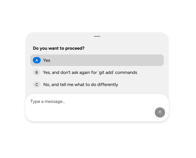
Astryx Chat Composer Drawer
6