
About
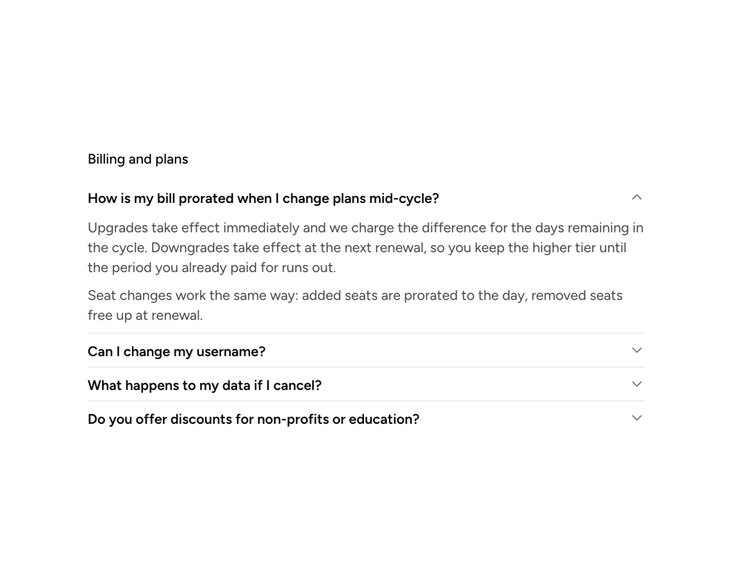
A primitive that makes any content collapsible: a trigger button toggles visibility of the content area, managing its own state or deferring to a parent CollapsibleGroup.
Built with React and Tailwind. Copy the prompt and paste it into Claude Code, Cursor or Lovable: your agent adds Astryx Collapsible to your project and fits it to your theme.
Code
How Astryx Collapsible is used: the demo's code. The component's own source comes with a free account.
Usage.tsx
'use client';

import {Collapsible, CollapsibleGroup} from '@/components/ui/astryx-collapsible';
import {Text} from '@astryxdesign/core/Text';
import {Link} from '@astryxdesign/core/Link';
import {Stack} from '@astryxdesign/core/Stack';

/**
 * Type sizing, because an FAQ is the case that gets it wrong most often.
 *
 * The trigger's own type is `large` (17px semibold) — right for a settings
 * page where each Collapsible is a section heading, too heavy for a list of
 * ten questions, where every row would read as a heading and none would read
 * as more important than the next.
 *
 * The trigger takes a ReactNode, so a question sets its own type: body at
 * semibold. Question and answer then share one size and separate on weight
 * and color instead — the hierarchy an FAQ actually wants. Answers are
 * `secondary`, which keeps the scannable column of questions primary.
 */
function CollapsibleDividedAccordion() {
  return (
    <Stack gap={3} maxWidth={560}>
      <Text type="label">Billing and plans</Text>

      <CollapsibleGroup type="single" hasDividers defaultValue="proration">
        <Collapsible
          trigger={
            <Text type="body" weight="semibold">
              How is my bill prorated when I change plans mid-cycle?
            </Text>
          }
          value="proration">
          <Stack gap={2}>
            <Text type="body" color="secondary">
              Upgrades take effect immediately and we charge the difference for
              the days remaining in the cycle. Downgrades take effect at the
              next renewal, so you keep the higher tier until the period you
              already paid for runs out.
            </Text>
            <Text type="body" color="secondary">
              Seat changes work the same way: added seats are prorated to the
              day, removed seats free up at renewal.
            </Text>
          </Stack>
        </Collapsible>

        <Collapsible
          trigger={
            <Text type="body" weight="semibold">
              Can I change my username?
            </Text>
          }
          value="username">
          <Text type="body" color="secondary">
            Once every 30 days, from your profile settings. Old links keep
            working — we redirect them for a year.
          </Text>
        </Collapsible>

        <Collapsible
          trigger={
            <Text type="body" weight="semibold">
              What happens to my data if I cancel?
            </Text>
          }
          value="cancel">
          <Stack gap={2}>
            <Text type="body" color="secondary">
              Your workspace goes read-only at the end of the billing period.
              Nothing is deleted for 30 days, so reactivating inside that window
              restores everything exactly as it was.
            </Text>
            <Text type="body" color="secondary">
              After 30 days the workspace and its backups are permanently
              removed. Export first if you want a copy — an export covers
              documents, comments, and version history.
            </Text>
            <Link href="#export" isStandalone hasUnderline>
              How to export your workspace
            </Link>
          </Stack>
        </Collapsible>

        <Collapsible
          trigger={
            <Text type="body" weight="semibold">
              Do you offer discounts for non-profits or education?
            </Text>
          }
          value="discounts">
          <Text type="body" color="secondary">
            Yes — 50% off any paid plan for registered non-profits and
            accredited schools. Email your documentation and we usually apply it
            within two business days.
          </Text>
        </Collapsible>
      </CollapsibleGroup>
    </Stack>
  );
}

export default function CollapsibleDividedAccordionDemo() {
  return (
    <div
      data-astryx-theme="neutral"
      data-theme="light"
      style={{colorScheme: 'light', display: 'contents'}}>
      <CollapsibleDividedAccordion />
    </div>
  );
}
Dependencies
More by Astryx
View all

Astryx Banner
56
Astryx Avatar
28
Astryx Aspect Ratio
28
Astryx Badge
25
Astryx Button Group
23
Astryx Toggle Button
16
Astryx Avatar Group
8
Astryx Chat Composer Drawer
6