
About
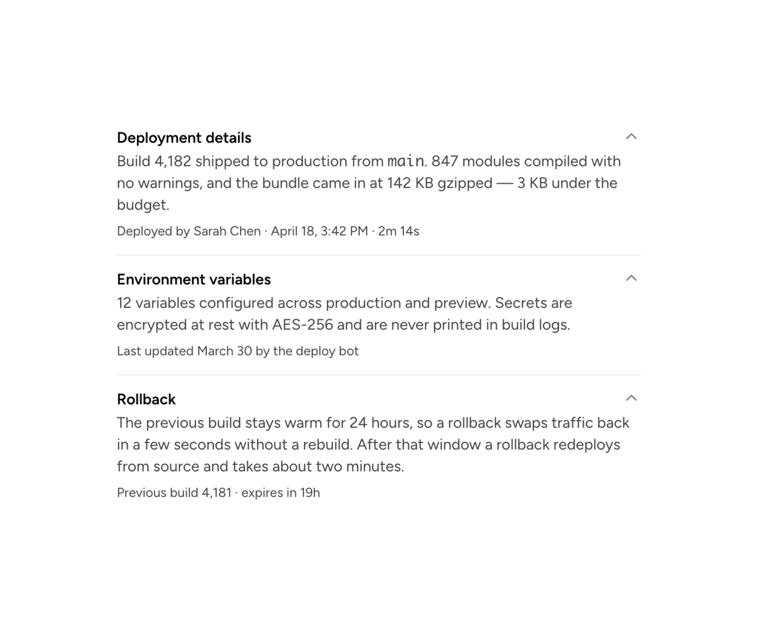
A primitive that makes any content collapsible: a trigger button toggles visibility of the content area, managing its own state or deferring to a parent CollapsibleGroup.
Built with React and Tailwind. Copy the prompt and paste it into Claude Code, Cursor or Lovable: your agent adds Astryx Collapsible to your project and fits it to your theme.
Code
How Astryx Collapsible is used: the demo's code. The component's own source comes with a free account.
Usage.tsx
'use client';

import {Collapsible} from '@/components/ui/astryx-collapsible';
import {Text} from '@astryxdesign/core/Text';
import {Divider} from '@astryxdesign/core/Divider';
import {Stack} from '@astryxdesign/core/Stack';

/**
 * A flat list on the page background, no card and no group dividers — the
 * Dividers are placed by hand so the rows can carry different spacing than
 * `hasDividers` gives them.
 *
 * Rows, so the triggers take body-semibold rather than the default `large`:
 * these are peers in a list, not section headings. The metadata line under
 * each answer is `supporting`, the one place a third size earns its place.
 */
function CollapsibleWithoutCard() {
  return (
    <Stack gap={3} maxWidth={480}>
      <Collapsible
        trigger={
          <Text type="body" weight="semibold">
            Deployment details
          </Text>
        }
        value="deployment">
        <Stack gap={1}>
          <Text type="body" color="secondary">
            Build 4,182 shipped to production from <code>main</code>. 847
            modules compiled with no warnings, and the bundle came in at 142 KB
            gzipped — 3 KB under the budget.
          </Text>
          <Text type="supporting">
            Deployed by Sarah Chen · April 18, 3:42 PM · 2m 14s
          </Text>
        </Stack>
      </Collapsible>

      <Divider />

      <Collapsible
        trigger={
          <Text type="body" weight="semibold">
            Environment variables
          </Text>
        }
        value="environment">
        <Stack gap={1}>
          <Text type="body" color="secondary">
            12 variables configured across production and preview. Secrets are
            encrypted at rest with AES-256 and are never printed in build logs.
          </Text>
          <Text type="supporting">Last updated March 30 by the deploy bot</Text>
        </Stack>
      </Collapsible>

      <Divider />

      <Collapsible
        trigger={
          <Text type="body" weight="semibold">
            Rollback
          </Text>
        }
        value="rollback">
        <Stack gap={1}>
          <Text type="body" color="secondary">
            The previous build stays warm for 24 hours, so a rollback swaps
            traffic back in a few seconds without a rebuild. After that window a
            rollback redeploys from source and takes about two minutes.
          </Text>
          <Text type="supporting">Previous build 4,181 · expires in 19h</Text>
        </Stack>
      </Collapsible>
    </Stack>
  );
}

export default function CollapsibleWithoutCardDemo() {
  return (
    <div
      data-astryx-theme="neutral"
      data-theme="light"
      style={{colorScheme: 'light', display: 'contents'}}>
      <CollapsibleWithoutCard />
    </div>
  );
}
Dependencies
More by Astryx
View all

Astryx Banner
56
Astryx Avatar
28
Astryx Aspect Ratio
28
Astryx Badge
25
Astryx Button Group
23
Astryx Toggle Button
16
Astryx Avatar Group
8
Astryx Chat Composer Drawer
6