
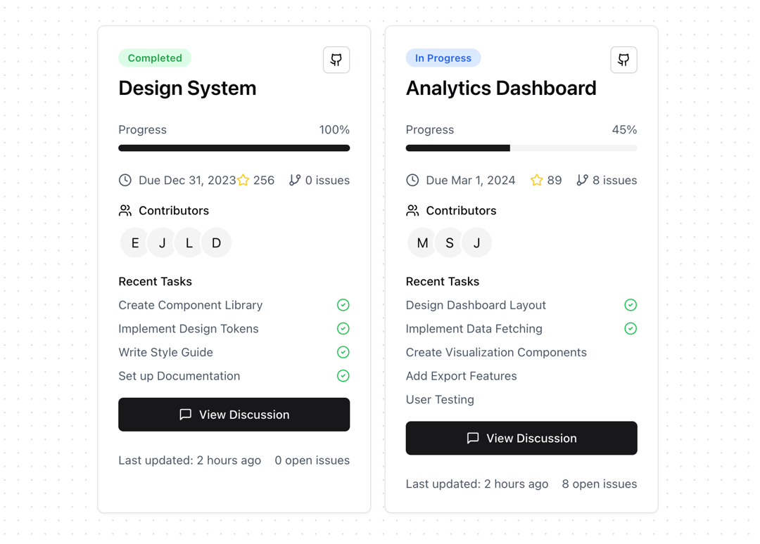
An interactive, expandable card component for displaying project status and details with smooth animations. Notes: • Built with Framer Motion for smooth animations • Uses Lucide React for consistent iconography • Responsive design with a mobile-first approach • Interactive expand/collapse functionality • TypeScript support with proper types • Integrates with Shadcn UI components • Supports custom styling and theming • Optimised performance with proper hooks usage Features: • Smooth expand/collapse animations • Progress tracking • Contributor avatars with tooltips • Task completion status • GitHub integration display • Interactive buttons and badges • Responsive layout • Accessibility features
Built with React and Tailwind. Copy the prompt and paste it into Claude Code, Cursor or Lovable: your agent adds Expandable Card to your project and fits it to your theme.
Code
How Expandable Card is used: the demo's code. The component's own source comes with a free account.
Usage.tsx
import { ProjectStatusCard } from "@/components/ui/expandable-card"

function ExpandableCardDemo() {
  return (
    <div className="grid gap-4 md:grid-cols-2">
      <ProjectStatusCard
        title="Design System"
        progress={100}
        dueDate="Dec 31, 2023"
        contributors={[
          { name: "Emma" },
          { name: "John" },
          { name: "Lisa" },
          { name: "David" }
        ]}
        tasks={[
          { title: "Create Component Library", completed: true },
          { title: "Implement Design Tokens", completed: true },
          { title: "Write Style Guide", completed: true },
          { title: "Set up Documentation", completed: true }
        ]}
        githubStars={256}
        openIssues={0}
      />

      <ProjectStatusCard
        title="Analytics Dashboard"
        progress={45}
        dueDate="Mar 1, 2024"
        contributors={[
          { name: "Michael" },
          { name: "Sophie" },
          { name: "James" }
        ]}
        tasks={[
          { title: "Design Dashboard Layout", completed: true },
          { title: "Implement Data Fetching", completed: true },
          { title: "Create Visualization Components", completed: false },
          { title: "Add Export Features", completed: false },
          { title: "User Testing", completed: false }
        ]}
        githubStars={89}
        openIssues={8}
      />
    </div>
  )
}

export { ExpandableCardDemo };
Dependencies
More by Prism UI
View all
Display Cards
5.4K
Pricing
3.8K
Floating Action Panel
198
Hero Badge
158
useExpandable
135
Logo Carousel
132
Icons
128
Popover
104
More in Cards
View all

Statistics Card 2
263
Stats cards with links
39
Card
70

Course Design Cards
1.1K
The Item one
3

Card Studio
7
Statistics Card 7
292

Item
10
