
About
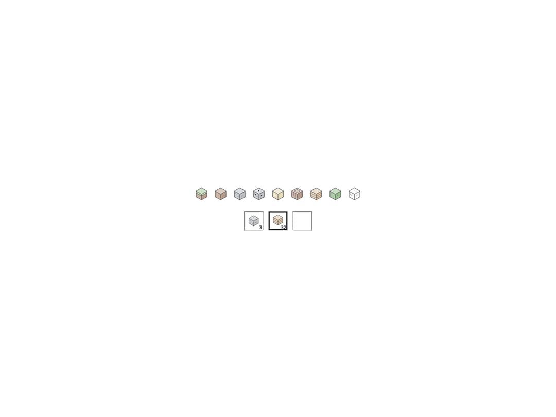
A small static SVG icon of a Minecraft-style block drawn in its material's tint, plus a recessed inventory slot that holds one with an item count, used for hotbars and inventories.
Built with React and Tailwind. Copy the prompt and paste it into Claude Code, Cursor or Lovable: your agent adds Block Icon to your project and fits it to your theme.
Code
How Block Icon is used: the demo's code. The component's own source comes with a free account.
Usage.tsx
import { BlockIcon, BlockSlot } from "@/components/ui/block-icon";

const TYPES = [
  "grass",
  "dirt",
  "stone",
  "ore",
  "sand",
  "log",
  "planks",
  "leaves",
  "glass",
] as const;

export default function BlockIconDemo() {
  return (
    <div className="flex min-h-[220px] w-full flex-col items-center justify-center gap-6 bg-background p-8 text-foreground">
      <div className="flex flex-wrap items-center justify-center gap-3">
        {TYPES.map((type) => (
          <BlockIcon key={type} type={type} />
        ))}
      </div>
      <div className="flex items-center gap-3">
        <BlockSlot item={{ type: "stone", count: 3 }} />
        <BlockSlot item={{ type: "planks", count: 32 }} selected />
        <BlockSlot item={null} />
      </div>
    </div>
  );
}
More by abhishek-mallick
View all
Isometric Bars Chart
22
Chest
13
Rack
13
Skyline
11
Isometric Laptop
10
Stack
10
Keys
10
Isometric Cube
10