
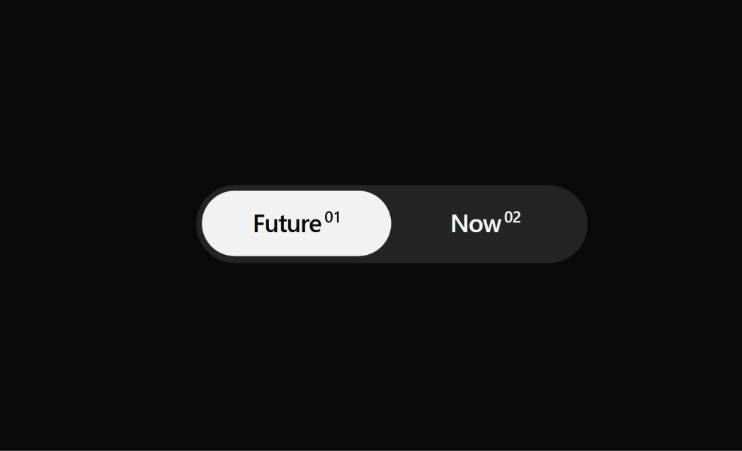
About
An accessible, pill-shaped segmented control and mode toggle with optional superscript indices, keyboard navigation, and smooth active pill transitions. Ideal for switching between views, timelines, or filter states.
Built with React and Tailwind. Copy the prompt and paste it into Claude Code, Cursor or Lovable: your agent adds Segmented Mode Toggle to your project and fits it to your theme.
Code
How Segmented Mode Toggle is used: the demo's code. The component's own source comes with a free account.
Usage.tsx
// This is a file with a demo for your component
// That's what users will see in the preview
// Create new files in this directory to add more demos

import { Component } from "@/components/ui/segmented-mode-toggle";

// ONLY DEFAULT EXPORT WILL BE TREATED AS A DEMO
export default function DemoOne() {
  return <Component />;
}
More by Syed
View all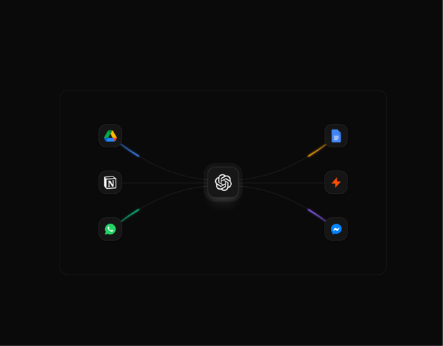

Animated Beam Integration
135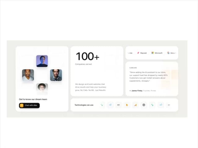
Agency Bento Grid
87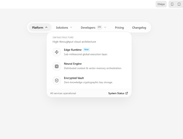
Morphing Island Navbar
75
Animated Tree View
58
Interactive Eye Tracker
56
Rolling Counter
55
Grid Testimonials Marquee
42
Tier Badge
41