
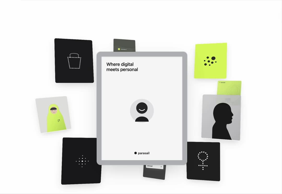
About
A pure 3D orbital card showcase with automatic 21st.dev light/dark theme sync, click-to-focus depth swoops, mouse wheel scrubbing, drag gestures, and smooth autoplay.
Built with React and Tailwind. Copy the prompt and paste it into Claude Code, Cursor or Lovable: your agent adds SpatialCardCarousel to your project and fits it to your theme.
Code
How SpatialCardCarousel is used: the demo's code. The component's own source comes with a free account.
Usage.tsx
"use client";

import React from "react";
import {
  SpatialCardCarousel,
  type SpatialCarouselTheme,
} from "@/components/ui/spatial-card-carousel";

const settings = {
  theme: "auto",
  autoPlay: true,
  interval: 2400,
  pauseOnHover: true,
};

const VALID_THEMES: SpatialCarouselTheme[] = ["auto", "light", "dark"];

export default function SpatialCardCarouselDemo(
  props: Partial<typeof settings>
) {
  const config = { ...settings, ...props };

  const theme: SpatialCarouselTheme = VALID_THEMES.includes(
    config.theme as SpatialCarouselTheme
  )
    ? (config.theme as SpatialCarouselTheme)
    : "auto";

  const interval =
    typeof config.interval === "number" &&
    Number.isFinite(config.interval) &&
    config.interval >= 900
      ? Math.min(config.interval, 10000)
      : 2400;

  const wrapperThemeClass =
    theme === "dark"
      ? "bg-[#0B0B0C]"
      : theme === "light"
        ? "bg-[#FFFFFF]"
        : "bg-[#FFFFFF] dark:bg-[#0B0B0C]";

  return (
    <div
      className={`flex min-h-[600px] w-full items-center justify-center p-4 sm:p-8 transition-colors duration-500 ${wrapperThemeClass}`}
    >
      <div className="w-full max-w-5xl">
        <SpatialCardCarousel
          theme={theme}
          autoPlay={Boolean(config.autoPlay)}
          interval={interval}
          pauseOnHover={Boolean(config.pauseOnHover)}
        />
      </div>
    </div>
  );
}
Dependencies
More by Syed
View all

Animated Beam Integration
135
Agency Bento Grid
87
Morphing Island Navbar
75
Animated Tree View
58
Interactive Eye Tracker
56
Rolling Counter
55
Grid Testimonials Marquee
42
Tier Badge
41