
About
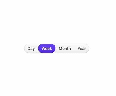
A pill-shaped, animated group of mutually-exclusive toggle buttons used for switching between views, such as day/week/month/year ranges.
Built with React and Tailwind. Copy the prompt and paste it into Claude Code, Cursor or Lovable: your agent adds Segmented Control to your project and fits it to your theme.
Code
How Segmented Control is used: the demo's code. The component's own source comes with a free account.
Usage.tsx
import {
  SegmentedControl,
  SegmentedControlItem,
} from "@/components/ui/css-segmentedcontrol";

export default function SegmentedControlDemo() {
  return (
    <div className="flex items-center justify-center w-full h-screen">
      <SegmentedControl
        aria-label="Time period"
        defaultSelectedKeys={["day"]}
        disallowEmptySelection
      >
        <SegmentedControlItem id="day">Day</SegmentedControlItem>
        <SegmentedControlItem id="week">Week</SegmentedControlItem>
        <SegmentedControlItem id="month">Month</SegmentedControlItem>
        <SegmentedControlItem id="year">Year</SegmentedControlItem>
      </SegmentedControl>
    </div>
  );
}
Dependencies
More by py_ets
View all
Alert Dialog
10
React Aria CheckboxGroup
9
Command Palette
7
React Aria DatePicker
5
Progress Bar
5
React Aria Tree
4
React Aria Switch
4
React Aria ColorArea
4