About
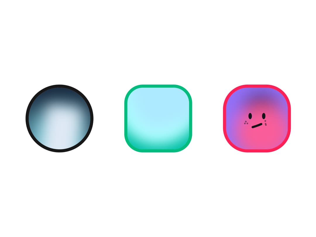
A set of avatar overlay pieces (status ring, online indicator, notification badge, corner icon, and a procedurally-generated fallback image) for decorating a user avatar with presence, verification, or unread-count states.
Built with React and Tailwind. Copy the prompt and paste it into Claude Code, Cursor or Lovable: your agent adds Avatar Extended to your project and fits it to your theme.
Code
How Avatar Extended is used: the demo's code. The component's own source comes with a free account.
Usage.tsx
import { Avatar, AvatarFallback, AvatarImage } from "@/components/ui/avatar";
import { AvatarExtended, AvatarRing } from "@/components/ui/avatar-extended";

export default function Demo() {
  return (
    <div className="flex flex-wrap items-center gap-6">
      <AvatarExtended>
        <Avatar>
          <AvatarImage
            alt="Elon Musk"
            src="https://avatars.spaceui.one/v1?name=orion&variant=titan"
          />
          <AvatarFallback>EM</AvatarFallback>
        </Avatar>
        <AvatarRing />
      </AvatarExtended>

      <AvatarExtended>
        <Avatar className="rounded-lg">
          <AvatarImage
            alt="Nova"
            src="https://avatars.spaceui.one/v1?name=lyra&variant=glass"
          />
          <AvatarFallback>NV</AvatarFallback>
        </Avatar>
        <AvatarRing className="rounded-lg ring-emerald-500" />
      </AvatarExtended>

      <AvatarExtended>
        <Avatar className="rounded-xl">
          <AvatarImage
            alt="Evil Rabbit"
            src="https://avatars.spaceui.one/v1?name=vega&variant=pebble"
          />
          <AvatarFallback>ER</AvatarFallback>
        </Avatar>
        <AvatarRing className=" rounded-xl ring-rose-500" />
      </AvatarExtended>
    </div>
  );
}
Dependencies
More by adrielzimbril
View all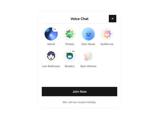

Voice Chat Widget
129
Bloop Orb
107
Generating Orb
100
Mesh Gradient
83
Handle Reel
82
Gradient File Upload
73
Thinking Orb
72
Doodle Callout
47