
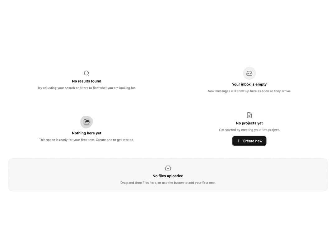
About
A set of decorative empty-state placeholders (simple, icon badge, illustration, action button, and dashed card variants) for showing "no results" or "no data yet" messages in lists, inboxes, and dashboards.
Built with React and Tailwind. Copy the prompt and paste it into Claude Code, Cursor or Lovable: your agent adds Empty Styled to your project and fits it to your theme.
Code
How Empty Styled is used: the demo's code. The component's own source comes with a free account.
Usage.tsx
import EmptyStyled, {
  IconEmpty,
  IllustrationEmpty,
  ActionEmpty,
  CardEmpty,
} from "@/components/ui/empty-styled";

export default function EmptyStyledDemo() {
  return (
    <div className="grid w-full grid-cols-1 gap-6 p-8 sm:grid-cols-2">
      <EmptyStyled size="sm" />
      <IconEmpty size="sm" />
      <IllustrationEmpty size="sm" />
      <ActionEmpty size="sm" />
      <CardEmpty size="sm" className="sm:col-span-2" />
    </div>
  );
}
Dependencies
More by ai 2
View all
Ripple Buttons
31
Styled Toggle Switches
19
Styled Progress Bars
16
Styled Badges
13
OTP Pin Input
10
Particle Toggles
9
File Input
8
Minimal Slider
7
More in Dashboards
View all
Dashboard with Collapsible Sidebar
2.5K

Sidebar
332

SaaS Template
2.6K

Card
229
Stats Bento
1.2K

Course Design Cards
1.2K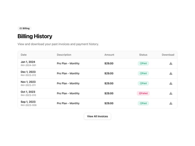

Invoice History Table
82

Data Grid Table
15

