
About
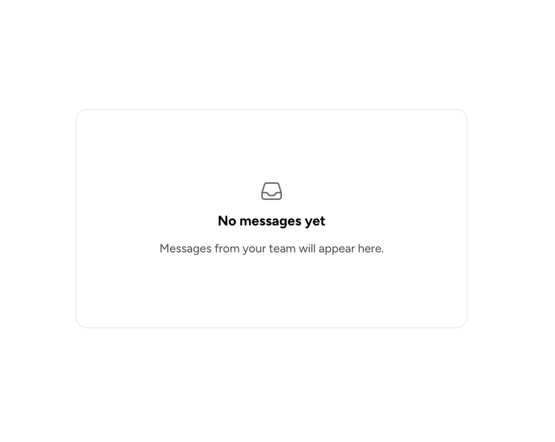
An Astryx layout primitive that centers content horizontally, vertically, or along both axes within its container.
Built with React and Tailwind. Copy the prompt and paste it into Claude Code, Cursor or Lovable: your agent adds Astryx Center to your project and fits it to your theme.
Code
How Astryx Center is used: the demo's code. The component's own source comes with a free account.
Usage.tsx
'use client';

import {Center} from '@/components/ui/astryx-center';
import {Card} from '@astryxdesign/core/Card';
import {Stack} from '@astryxdesign/core/Layout';
import {Icon} from '@astryxdesign/core/Icon';
import {Text} from '@astryxdesign/core/Text';
import {InboxIcon} from '@heroicons/react/24/outline';

function CenterInsideACard() {
  return (
    <Card width={400}>
      <Center height={200}>
        <Stack direction="vertical" gap={2} hAlign="center">
          <Icon icon={InboxIcon} size="lg" color="secondary" />
          <Text type="body" weight="bold">
            No messages yet
          </Text>
          <Text type="supporting" color="secondary">
            Messages from your team will appear here.
          </Text>
        </Stack>
      </Center>
    </Card>
  );
}

export default function CenterInsideACardDemo() {
  return (
    <div
      data-astryx-theme="neutral"
      data-theme="light"
      style={{colorScheme: 'light', display: 'contents'}}>
      <CenterInsideACard />
    </div>
  );
}
Dependencies
More by Alok Srivastava
View all
Glossy Slider Call Button
21
Dot Graph Card
20
Profile Menu Expander
2
Astryx Base Typeahead
1
Pixel Perfect Command Palette
1
Astryx Alert Dialog
Expandable Book Search Palette