
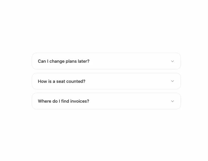
About
A card-styled FAQ accordion where each collapsible item sits in its own bordered rounded panel, used for pricing/FAQ sections.
Built with React and Tailwind. Copy the prompt and paste it into Claude Code, Cursor or Lovable: your agent adds Accordion Card to your project and fits it to your theme.
Code
How Accordion Card is used: the demo's code. The component's own source comes with a free account.
Usage.tsx
import AccordionCard from "@/components/ui/accordion-card";

export default function AccordionCardDemo() {
  return (
    <div className="flex w-full items-center justify-center p-10">
      <AccordionCard />
    </div>
  );
}
More by Arihant jain
View all
Footer section
1.9K
Multistep Form
720
Animated Drawer
696
Status Badge
525
Stacked Circular Footer
434
Input Modal
339
Large Name Footer
201
Profile Dropdown
199
More in Cards
View all

Course Design Cards
1.1K

Card Studio
14

Interactive Tech Stack Bento Grid with Hover Effects
286

Statistics Card 2
281
Stats cards with links
125
Statistics Card 10
273

Weather Card
60
Streak Badge
302

