
About
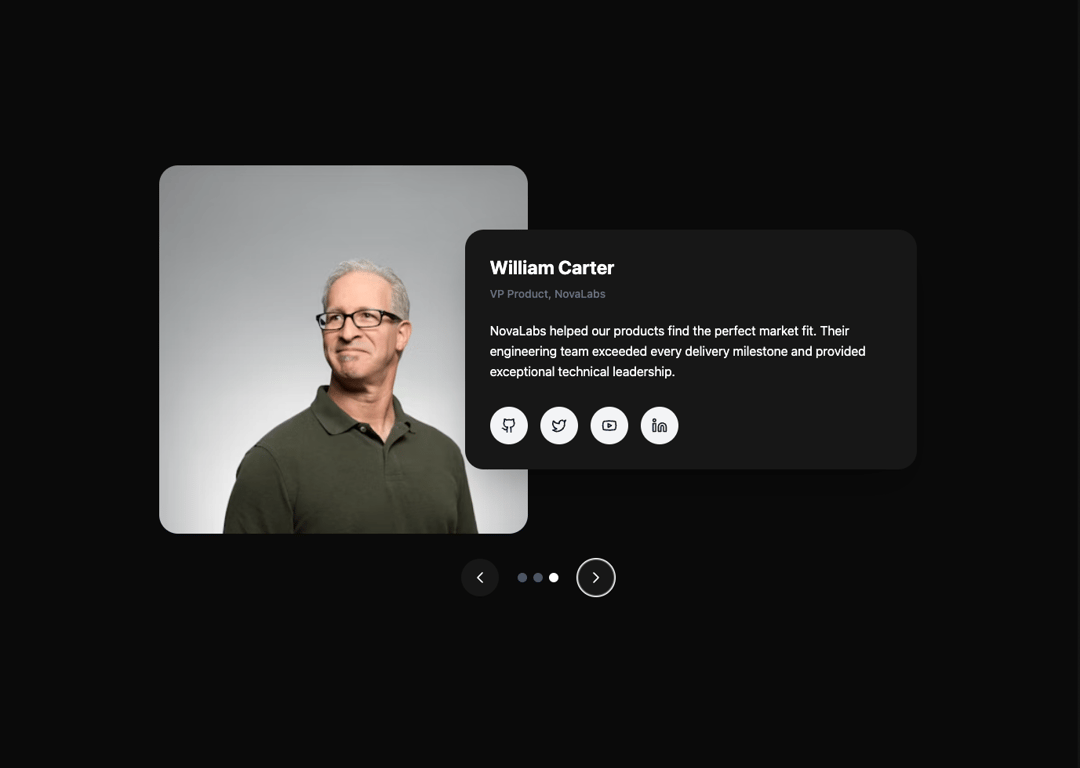
A responsive testimonial carousel component featuring profile cards with avatars, descriptions, and social links. Built with smooth fade animations, bottom navigation controls, and supports both light and dark themes for seamless integration.
Built with React and Tailwind. Copy the prompt and paste it into Claude Code, Cursor or Lovable: your agent adds Profile Card Testimonial Carousel to your project and fits it to your theme.
Code
How Profile Card Testimonial Carousel is used: the demo's code. The component's own source comes with a free account.
Usage.tsx
import { TestimonialCarousel } from "@/components/ui/profile-card-testimonial-carousel";

export default function TestimonialCarouselDemo() {
  return (
    <div className="min-h-screen flex items-center justify-center">
      <TestimonialCarousel />
    </div>
  );
}
Dependencies
More by Arunachalam
View all
Scroll media expansion hero
11.1K
Modern Animated Sign In
1.2K
Bottom Nav Bar
917
Adaptive Notch Navigation Bar
754
Toast
673
Connected Carousel
506
Animated File Tree
352
Inverted Cursor
308
More in Testimonials
View all

Testimonial
130
testimonial
883

Centered Testimonial
30
Testimonials Section
173
Testimonial 2
36
Staggered Testimonials Grid
159

Voice Testimonial
135

Card Studio
15

