
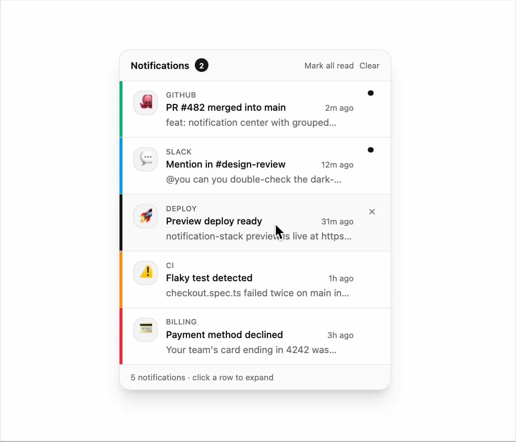
About
notification center
Built with React and Tailwind. Copy the prompt and paste it into Claude Code, Cursor or Lovable: your agent adds Notification Center to your project and fits it to your theme.
Code
How Notification Center is used: the demo's code. The component's own source comes with a free account.
Usage.tsx
import { NotificationCenter } from "@/components/ui/notification-center";
import type { NotificationItem } from "@/components/ui/notification-center";

const settings = {
  showFooter: true,
  defaultExpanded: true,
  staggerMs: 60,
};

const seed: NotificationItem[] = [
  {
    id: "n1",
    source: "GitHub",
    emoji: "🐙",
    title: "PR #482 merged into main",
    body: "feat: notification center with grouped rows, tone accents and unread indicators was merged by baileyrosen3 after 2 approvals.",
    time: "2m ago",
    unread: true,
    tone: "success",
  },
  {
    id: "n2",
    source: "Slack",
    emoji: "💬",
    title: "Mention in #design-review",
    body: "@you can you double-check the dark-mode contrast on the unread dot before we ship?",
    time: "12m ago",
    unread: true,
    tone: "info",
  },
  {
    id: "n3",
    source: "Deploy",
    emoji: "🚀",
    title: "Preview deploy ready",
    body: "notification-stack preview is live at https://preview.example.com/builds/4821. Smoke test passed in 42s.",
    time: "31m ago",
    unread: false,
    tone: "default",
  },
  {
    id: "n4",
    source: "CI",
    emoji: "⚠️",
    title: "Flaky test detected",
    body: "checkout.spec.ts failed twice on main in the last hour. Quarantine suggested until flake is triaged.",
    time: "1h ago",
    unread: false,
    tone: "warning",
  },
  {
    id: "n5",
    source: "Billing",
    emoji: "💳",
    title: "Payment method declined",
    body: "Your team's card ending in 4242 was declined for this month's invoice. Update billing to avoid service interruption.",
    time: "3h ago",
    unread: false,
    tone: "danger",
  },
];

export default function Demo(props: Partial<typeof settings>) {
  const s = { ...settings, ...props };
  return (
    <div className="flex min-h-72 items-start justify-center bg-background p-6">
      <NotificationCenter
        items={seed}
        title="Notifications"
        showFooter={s.showFooter}
        defaultExpanded={s.defaultExpanded}
        staggerMs={s.staggerMs}
      />
    </div>
  );
}
More by Bailey Rosen
View all
Gem Smoke
19