
About
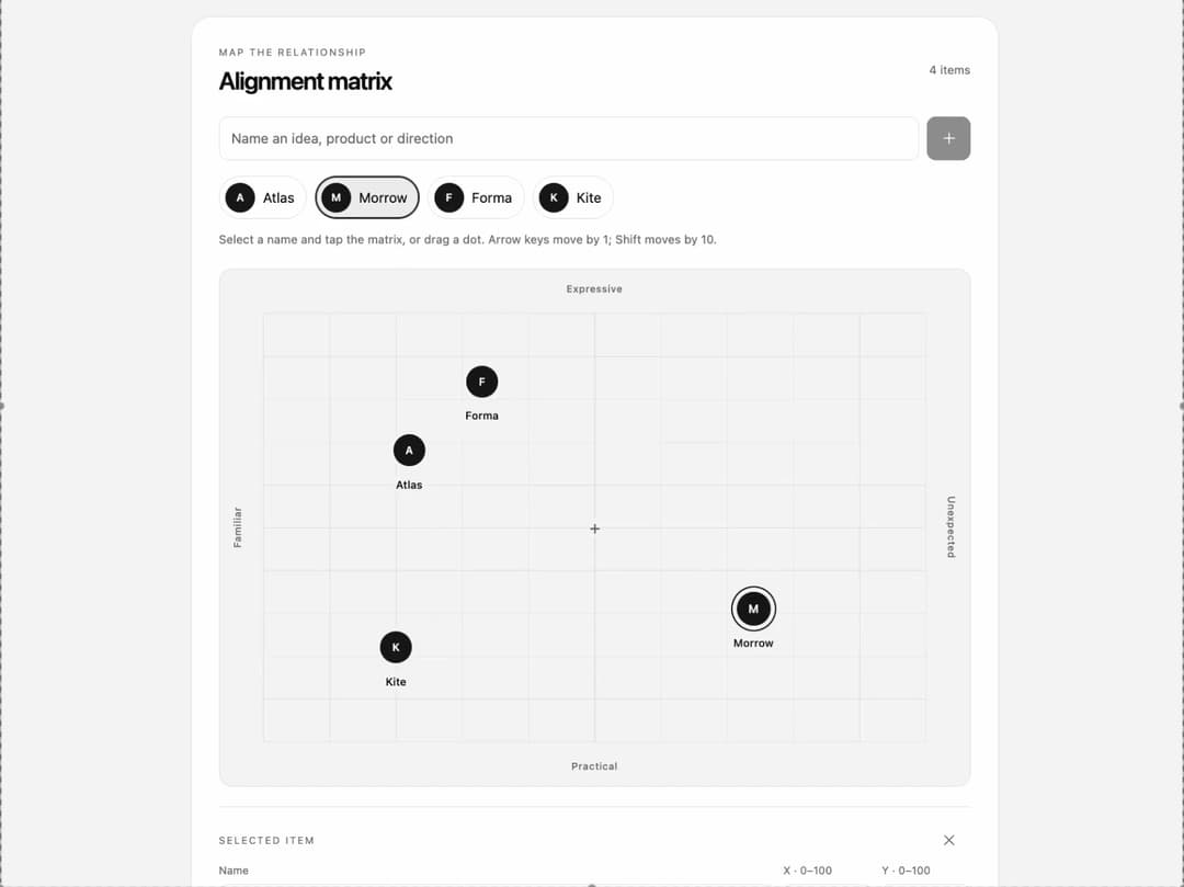
A compact, interactive React matrix for comparing ideas, products, or directions across two editable axes. Add names, place and drag points, adjust positions with a keyboard, and optionally use local images. Includes a responsive demo with light and dark themes.
Built with React and Tailwind. Copy the prompt and paste it into Claude Code, Cursor or Lovable: your agent adds Alignment Matrix to your project and fits it to your theme.
Code
How Alignment Matrix is used: the demo's code. The component's own source comes with a free account.
Usage.tsx
"use client";

/**
 * SPDX-License-Identifier: MIT
 * MIT License
 *
 * Copyright (c) 2026 Black Bambu Inc.
 *
 * Permission is hereby granted, free of charge, to any person obtaining a copy
 * of this software and associated documentation files (the "Software"), to deal
 * in the Software without restriction, including without limitation the rights
 * to use, copy, modify, merge, publish, distribute, sublicense, and/or sell
 * copies of the Software, and to permit persons to whom the Software is
 * furnished to do so, subject to the following conditions:
 *
 * The above copyright notice and this permission notice shall be included in all
 * copies or substantial portions of the Software.
 *
 * THE SOFTWARE IS PROVIDED "AS IS", WITHOUT WARRANTY OF ANY KIND, EXPRESS OR
 * IMPLIED, INCLUDING BUT NOT LIMITED TO THE WARRANTIES OF MERCHANTABILITY,
 * FITNESS FOR A PARTICULAR PURPOSE AND NONINFRINGEMENT. IN NO EVENT SHALL THE
 * AUTHORS OR COPYRIGHT HOLDERS BE LIABLE FOR ANY CLAIM, DAMAGES OR OTHER
 * LIABILITY, WHETHER IN AN ACTION OF CONTRACT, TORT OR OTHERWISE, ARISING FROM,
 * OUT OF OR IN CONNECTION WITH THE SOFTWARE OR THE USE OR OTHER DEALINGS IN THE
 * SOFTWARE.
 */

import { useEffect, useState } from "react";
import { AlignmentMatrix, type AlignmentItem } from "@/components/ui/alignment-matrix";

const settings = {
  title: "Alignment matrix",
  leftLabel: "Familiar",
  rightLabel: "Unexpected",
  topLabel: "Expressive",
  bottomLabel: "Practical",
  allowImages: true,
  showGrid: true,
  readOnly: false,
};
const initialItems: AlignmentItem[] = [
  { id: "atlas", name: "Atlas", position: { x: 22, y: 68 } },
  { id: "morrow", name: "Morrow", position: { x: 73, y: 78 } },
  { id: "forma", name: "Forma", position: { x: 62, y: 25 } },
  { id: "kite", name: "Kite", position: { x: 20, y: 22 } },
];

export default function Demo(props: Partial<typeof settings>) {
  const [previewControls, setPreviewControls] = useState<{
    values: Partial<typeof settings>;
    remountToken: number;
  }>({ values: {}, remountToken: 0 });

  // Compatibility for 21st previews whose infrastructure does not forward controls.
  // Ordinary React hosts can still configure this demo directly through props.
  useEffect(() => {
    if (window.parent === window) return;
    const handleMessage = (event: MessageEvent) => {
      if (event.source !== window.parent) return;
      const data = event.data;
      if (!data || data.type !== "21st-controls:set") return;
      if (!data.values || typeof data.values !== "object" || Array.isArray(data.values)) return;
      const keys = Object.keys(settings) as (keyof typeof settings)[];
      const values = Object.fromEntries(keys
        .filter(key => Object.prototype.hasOwnProperty.call(data.values, key)
          && typeof data.values[key] === typeof settings[key])
        .map(key => [key, data.values[key]])) as Partial<typeof settings>;
      setPreviewControls({
        values,
        remountToken: Number.isSafeInteger(data.remountToken) && data.remountToken >= 0
          ? data.remountToken : 0,
      });
    };
    window.addEventListener("message", handleMessage);
    window.parent.postMessage({ type: "21st-controls:ready" }, "*");
    return () => window.removeEventListener("message", handleMessage);
  }, []);

  return <DemoContent {...props} {...previewControls.values} key={previewControls.remountToken} />;
}

function DemoContent(props: Partial<typeof settings>) {
  const s = { ...settings, ...props };
  const [items, setItems] = useState<AlignmentItem[]>(initialItems);
  return <main className="am-demo">
    {/* The host owns theme state and semantic tokens, including iframe previews. */}
    <style>{`
      .am-demo{box-sizing:border-box;width:100%;min-width:0;min-height:100vh;padding:36px 20px;background:var(--color-muted,#f3f5f8);color:var(--color-foreground,#18202c);font-family:ui-sans-serif,system-ui,-apple-system,sans-serif}
      .am-demo-wrap{max-width:820px;margin:auto}.am-demo-nav{display:flex;align-items:center;justify-content:space-between;gap:16px;margin-bottom:22px}.am-demo-kicker{font-size:11px;letter-spacing:.13em;text-transform:uppercase;font-weight:600}.am-demo-actions{display:flex;gap:6px}.am-demo-actions button{font:inherit;font-size:12px;background:transparent;color:inherit;border:1px solid var(--color-border);border-radius:100px;min-height:44px;padding:8px 13px;cursor:pointer}.am-demo-actions button:focus-visible{outline:2px solid var(--color-primary);outline-offset:4px}.am-demo-footer{font-size:11px;color:var(--color-muted-foreground);line-height:1.65;display:flex;justify-content:space-between;gap:20px;margin:20px 4px 0}
      @media(max-width:600px){.am-demo{padding:20px 12px}.am-demo-nav{align-items:flex-start}.am-demo-kicker{max-width:100px;line-height:1.5}.am-demo-footer{flex-direction:column;gap:4px}}
    `}</style>
    <div className="am-demo-wrap">
      <header className="am-demo-nav"><span className="am-demo-kicker">Interactive alignment</span><div className="am-demo-actions"><button type="button" onClick={() => setItems(initialItems)}>Reset demo</button></div></header>
      <AlignmentMatrix {...s} items={items} onItemsChange={setItems} />
      <footer className="am-demo-footer"><span>Four fictional ideas. One shared frame of reference.</span><span>Changes reset on reload</span></footer>
    </div>
  </main>;
}
More by Shawn Nicholson · Black Bambu
View all

Material Moodboard Slider
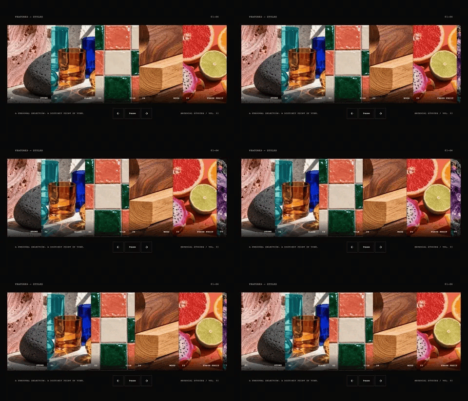
Featured Styles Strip
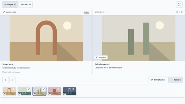
Open Space Gallery