
About
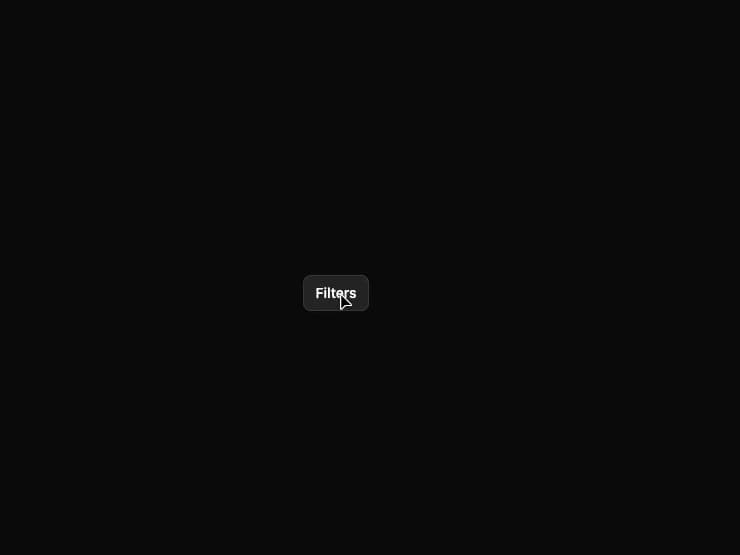
A non-blocking popup panel anchored to a trigger element, used for filters, quick pickers, or contextual details, with automatic flip/collision positioning, focus trapping, escape-to-close and outside-click dismissal.
Built with React and Tailwind. Copy the prompt and paste it into Claude Code, Cursor or Lovable: your agent adds Popover to your project and fits it to your theme.
Code
How Popover is used: the demo's code. The component's own source comes with a free account.
Usage.tsx
"use client";

import Popover from "@/components/ui/popover";

export default function PopoverDemo() {
  return (
    <div className="flex min-h-[380px] w-full items-center justify-center bg-neutral-950 p-10">
      <Popover
        label="Filter options"
        trigger={
          <button className="inline-flex h-9 items-center gap-2 rounded-md border border-white/10 bg-white/5 px-3 text-sm font-medium text-white hover:bg-white/10">
            Filters
          </button>
        }
      >
        {({ close }) => (
          <div className="w-64 p-3 text-sm">
            <div className="mb-2 text-xs font-semibold uppercase tracking-wide text-white/50">
              Status
            </div>
            <div className="flex flex-col gap-1">
              {["Open", "In progress", "Closed"].map((label) => (
                <label
                  key={label}
                  className="flex items-center gap-2 rounded px-2 py-1.5 hover:bg-white/5"
                >
                  <input type="checkbox" className="accent-indigo-500" />
                  {label}
                </label>
              ))}
            </div>
            <div className="mt-3 flex justify-end">
              <button
                onClick={close}
                className="rounded-md bg-indigo-500 px-3 py-1.5 text-xs font-medium text-white hover:bg-indigo-400"
              >
                Apply
              </button>
            </div>
          </div>
        )}
      </Popover>
    </div>
  );
}
More by bypaws
View all
Chip