
About
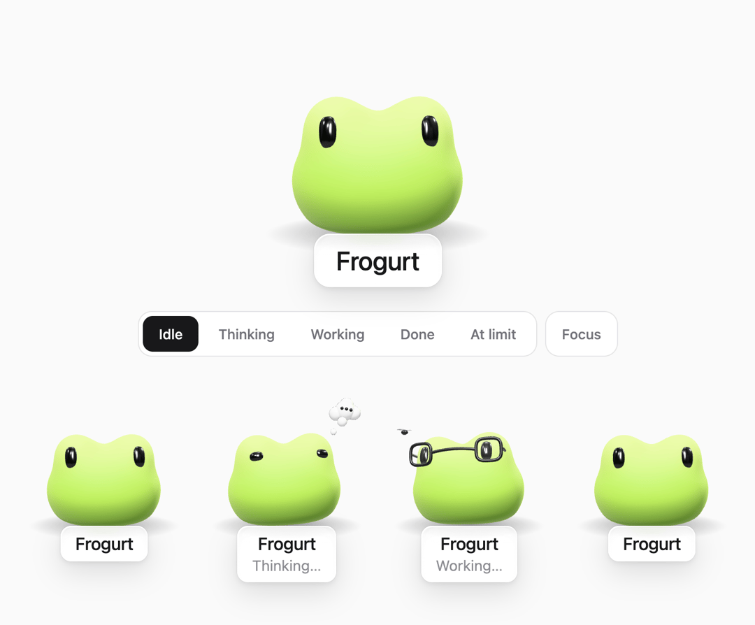
Animated 3D AI agent mascot for React and Three.js, inspired by Dots and Muse. A matte frog with idle, thinking, working, done and at-limit states, plus a liquid-glass status badge for chat UIs.
Built with React and Tailwind. Copy the prompt and paste it into Claude Code, Cursor or Lovable: your agent adds AI Agent Mascot States to your project and fits it to your theme.
Code
How AI Agent Mascot States is used: the demo's code. The component's own source comes with a free account.
Usage.tsx
"use client";

import { useEffect, useState } from "react";
import { FrogMascot, FROG_MASCOT_STATES, type FrogMascotState } from "@/components/ui/ai-agent-mascot";

export default function FrogMascotDemo() {
  const [state, setState] = useState<FrogMascotState>("idle");
  const [focus, setFocus] = useState(false);

  // Esc leaves the focus view.
  useEffect(() => {
    if (!focus) return;
    const onKey = (event: KeyboardEvent) => {
      if (event.key === "Escape") setFocus(false);
    };
    window.addEventListener("keydown", onKey);
    return () => window.removeEventListener("keydown", onKey);
  }, [focus]);

  if (focus) {
    // Just him, centred, and a way back: the button, or Esc.
    return (
      <div className="fixed inset-0 z-50 flex flex-col items-center justify-center gap-6 bg-zinc-50 dark:bg-zinc-950">
        <FrogMascot state={state} size={300} followPointer />
        {/* Where Focus was: under him. */}
        <button
          type="button"
          onClick={() => setFocus(false)}
          className="flex items-center gap-2 rounded-xl border border-zinc-200 bg-white px-4 py-3 text-sm font-medium text-zinc-500 transition-colors hover:text-zinc-900 dark:border-white/10 dark:bg-white/[0.03] dark:text-zinc-400 dark:hover:text-white"
        >
          Leave focus
          <kbd className="rounded-md border border-zinc-200 px-1.5 text-[11px] font-medium dark:border-white/15">Esc</kbd>
        </button>
      </div>
    );
  }

  return (
    <div className="flex min-h-[600px] w-full flex-col items-center justify-center gap-6 bg-zinc-50 px-6 py-10 text-zinc-900 dark:bg-zinc-950 dark:text-zinc-100">
      <FrogMascot state={state} size={240} followPointer />

      <div className="flex flex-wrap items-center justify-center gap-2">
        <div
          role="radiogroup"
          aria-label="What the frog is doing"
          className="flex flex-wrap justify-center gap-1 rounded-xl border border-zinc-200 bg-white p-1 dark:border-white/10 dark:bg-white/[0.03]"
        >
          {FROG_MASCOT_STATES.map((option) => (
            <button
              key={option.id}
              type="button"
              role="radio"
              aria-checked={state === option.id}
              onClick={() => setState(option.id)}
              className={`rounded-lg px-4 py-2 text-sm font-medium transition-colors ${
                state === option.id
                  ? "bg-zinc-900 text-white dark:bg-white dark:text-black"
                  : "text-zinc-500 hover:text-zinc-900 dark:text-zinc-400 dark:hover:text-white"
              }`}
            >
              {option.label}
            </button>
          ))}
        </div>
        <button
          type="button"
          onClick={() => setFocus(true)}
          className="rounded-xl border border-zinc-200 bg-white px-4 py-3 text-sm font-medium text-zinc-500 transition-colors hover:text-zinc-900 dark:border-white/10 dark:bg-white/[0.03] dark:text-zinc-400 dark:hover:text-white"
        >
          Focus
        </button>
      </div>

      {/* Every state at once. */}
      <div className="mt-2 flex w-full flex-wrap items-start justify-center gap-4">
        {FROG_MASCOT_STATES.map((option) => (
          <button
            key={option.id}
            type="button"
            onClick={() => setState(option.id)}
            aria-label={`Show ${option.label}`}
            className="rounded-2xl p-1 transition-colors hover:bg-zinc-100 dark:hover:bg-white/[0.04]"
          >
            <FrogMascot state={option.id} size={160} />
          </button>
        ))}
      </div>
    </div>
  );
}
Dependencies
More by carolina
View all

Draggable Widget Grid
2.5K
Grid Pulse
450
Techstack
213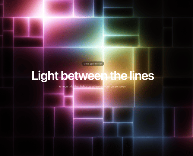
Reactive Glow Grid
49
More in AI chats
View all

AI Actions
339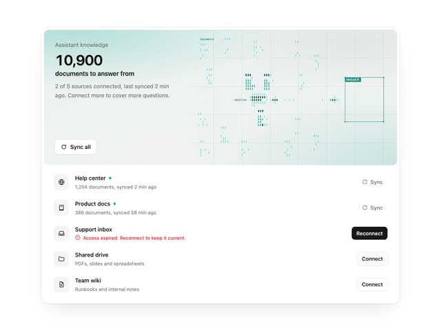

Illos Knowledge Sources
41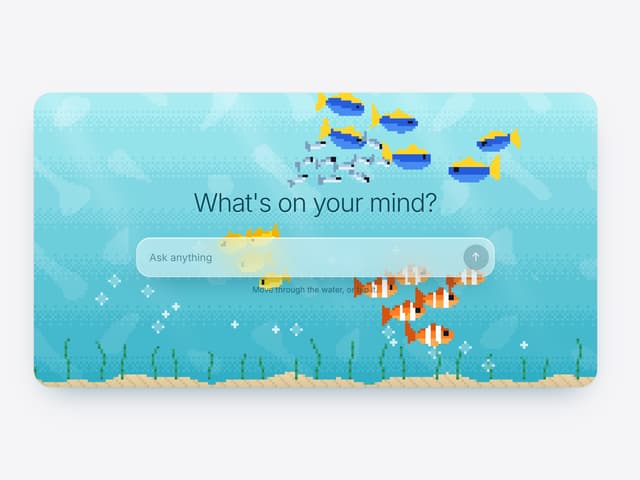

Aquarium Prompt
56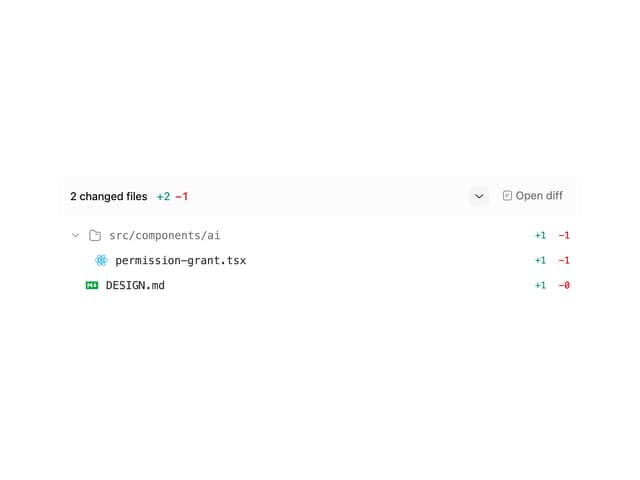
Commit
33
Attachments
39
Color Picker
171
Chat Bubble
199

AI Suggestions
20

