
About
Here is Avatar component
Built with React and Tailwind. Copy the prompt and paste it into Claude Code, Cursor or Lovable: your agent adds Basic Avatar to your project and fits it to your theme.
Code
How Basic Avatar is used: the demo's code. The component's own source comes with a free account.
Usage.tsx
import { Avatar, AvatarFallback, AvatarImage } from '@/components/ui/avatar'

const AvatarRingDemo = () => {
  return (
    <Avatar className='ring-ring ring-2'>
      <AvatarImage src='https://cdn.21st.dev/assets/mirror/ec/ec81be4cc810190ce4d240fcc57295965c5cebaa8751558595ade91eb62c09a4.png' alt='Hallie Richards' />
      <AvatarFallback className='text-xs'>HR</AvatarFallback>
    </Avatar>
  )
}

export default AvatarRingDemo
More by Clevision
View all

Calendar
110
Card Studio
106
Collapsible
43
Button Group
40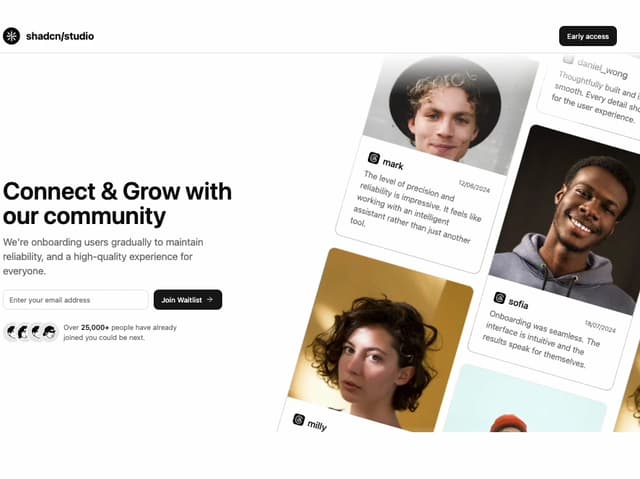
Waitlist 01
36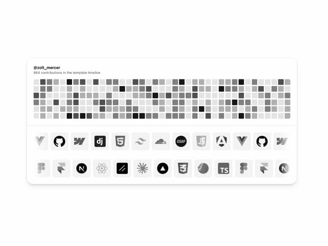
Logo Cloud
35
Buttons
34
Hero Section 01
33