
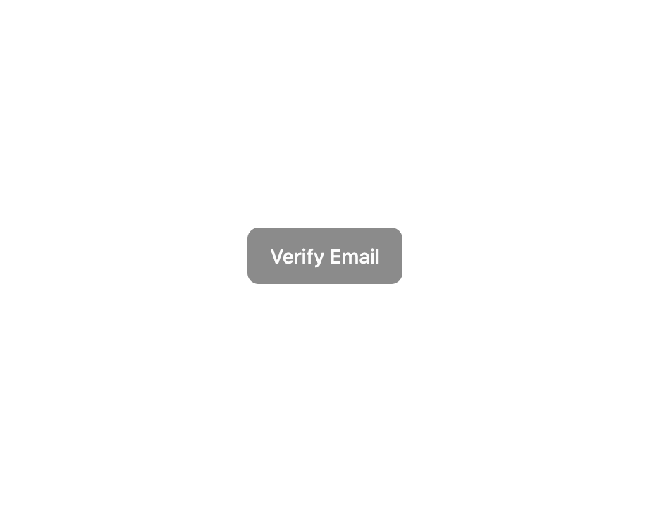
About
Here is Buttons Components
Built with React and Tailwind. Copy the prompt and paste it into Claude Code, Cursor or Lovable: your agent adds Buttons to your project and fits it to your theme.
Code
How Buttons is used: the demo's code. The component's own source comes with a free account.
Usage.tsx
import { Button } from '@/components/ui/button'

const ButtonDisabledDemo = () => {
  return <Button disabled>Verify Email</Button>
}

export default ButtonDisabledDemo
More by Clevision
View all

Calendar
110
Card Studio
106
Collapsible
43
Button Group
38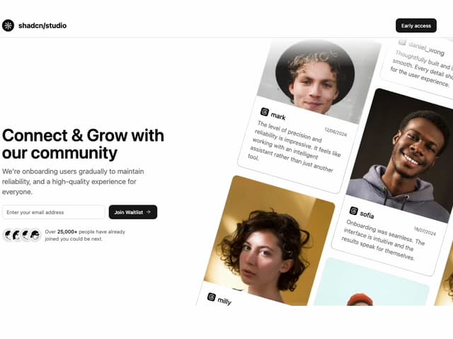
Waitlist 01
32
Combobox
32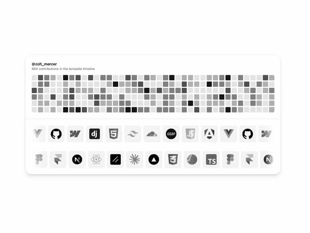
Logo Cloud
31
Radio Group 1
30
More in Buttons
View all

Button
4
Texture Button
102
Native Button
12
Button
10
Button
75
Split Button
36

HeroUI Button Group
11

Eclipse Button
42


