
About
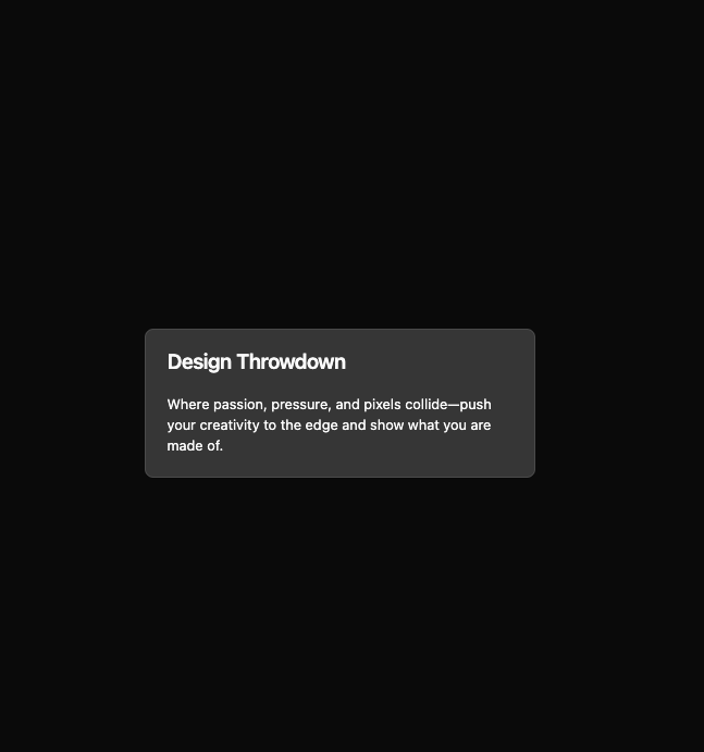
Here is Card component
Built with React and Tailwind. Copy the prompt and paste it into Claude Code, Cursor or Lovable: your agent adds Card Studio to your project and fits it to your theme.
Code
How Card Studio is used: the demo's code. The component's own source comes with a free account.
Usage.tsx
import { Card, CardContent, CardHeader, CardTitle } from '@/components/ui/card'

const CardSoftDemo = () => {
  return (
    <Card className='bg-primary/20 max-w-md gap-0'>
      <CardHeader>
        <CardTitle>Design Throwdown</CardTitle>
      </CardHeader>
      <CardContent>
        Where passion, pressure, and pixels collide—push your creativity to the edge and show what you are made of.
      </CardContent>
    </Card>
  )
}

export default CardSoftDemo
More by Clevision
View all

Calendar
110
Collapsible
43
Button Group
39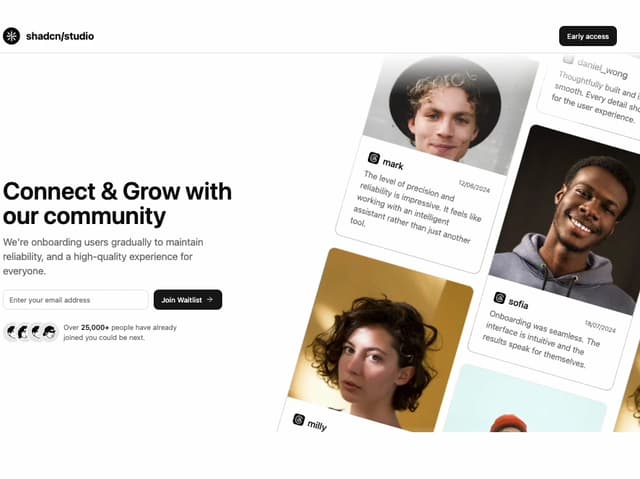
Waitlist 01
34
Buttons
34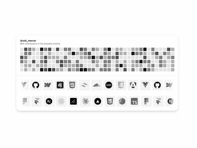
Logo Cloud
32
Combobox
32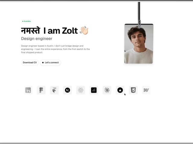
Hero Section 44
31
More in Cards
View all
Stats cards with links
94

Card
72
Statistics Card 7
319

Course Design Cards
1.2K
Statistics Card 2
298

Interactive Tech Stack Bento Grid with Hover Effects
520

Testimonial
131

Card
18
