
About
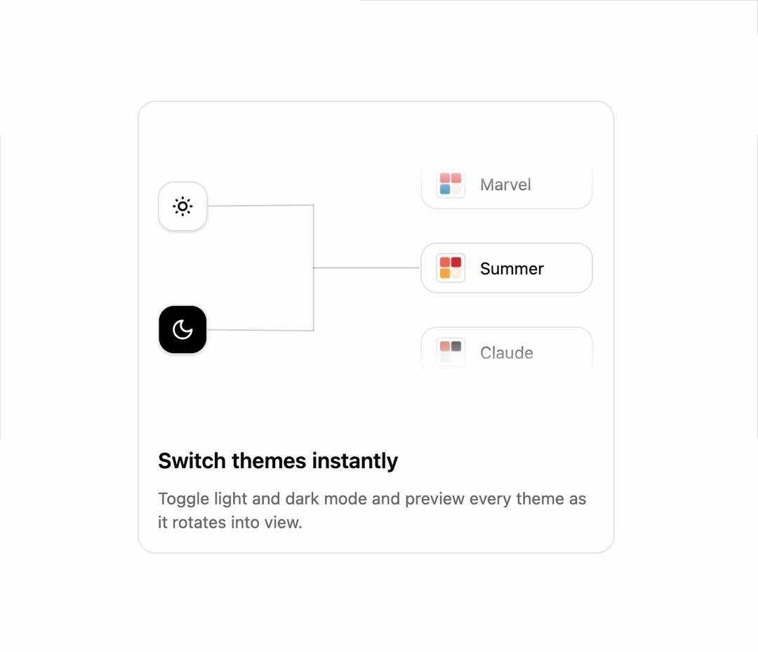
Bento card with animated beam connection and auto-rotating theme carousel by Shadcn Studio.
Built with React and Tailwind. Copy the prompt and paste it into Claude Code, Cursor or Lovable: your agent adds Bento Cards to your project and fits it to your theme.
Code
How Bento Cards is used: the demo's code. The component's own source comes with a free account.
Usage.tsx
import BentoCard from '@/components/ui/shadcn-studio-bento-cards-10'

const BentoCardsPreview = () => {
  return (
    <div className='mx-auto max-w-md px-4 py-8 sm:px-6 sm:py-16 lg:px-8'>
      <div className='h-95'>
        <BentoCard
          title='Switch themes instantly'
          description='Toggle light and dark mode and preview every theme as it rotates into view.'
        />
      </div>
    </div>
  )
}

export default BentoCardsPreview
Dependencies
More by Clevision
View all

Syntra Hero
153
Calendar
111
Card Studio
108
Hero Section 41
56
Agency Hero
49
Hero Section
43
Collapsible
43
Logo Cloud
42
More in Cards
View all

Course Design Cards
1.3K

Statistics Card 2
305

Interactive Tech Stack Bento Grid with Hover Effects
620

Card
19
Statistics Card 7
327
Card
61
The Item one
4
Stats cards with links
96
