
About
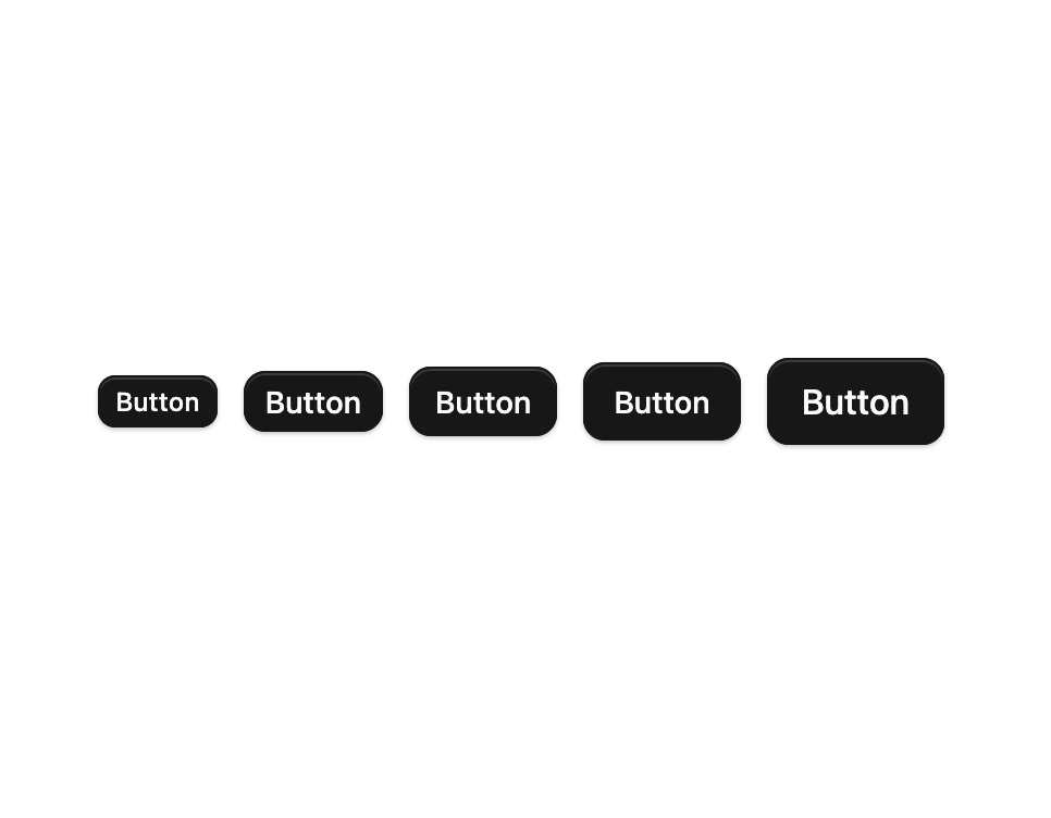
A polymorphic button built on Base UI's useRender. Ships 8 visual variants (default, secondary, outline, ghost, link, destructive, destructive-outline) and a full set of sizes including icon sizes (xs–xl). Has a built-in loading state that overlays an inline spinner and hides the label, a render prop for rendering as any element or as a child, and focus-visible / pressed styling out of the box.
Built with React and Tailwind. Copy the prompt and paste it into Claude Code, Cursor or Lovable: your agent adds Button to your project and fits it to your theme.
Code
How Button is used: the demo's code. The component's own source comes with a free account.
Usage.tsx
import { Button } from "@/components/ui/cnippet-button";

export default function ButtonSizes() {
  return (
    <div className="flex flex-wrap items-center justify-center gap-3">
      <Button size="xs">Button</Button>
      <Button size="sm">Button</Button>
      <Button size="default">Button</Button>
      <Button size="lg">Button</Button>
      <Button size="xl">Button</Button>
    </div>
  );
}
Dependencies
More by Cnippet
View all

Team
1.3K
Davincho Hero-1
699
Aero Hero-3
608
Random Letter Swap Navigation
538
Features
526
Services with Animated Hover Modal
479
Blogs
402
Aero Hero-1
373