
About
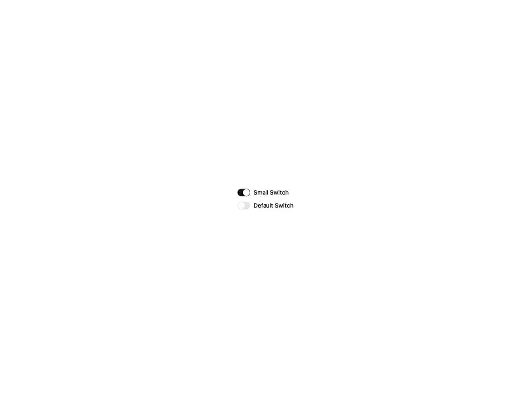
An accessible toggle switch built on Base UI's Switch primitive. Animated thumb with a springy press/scale interaction, two sizes (default and sm), controlled or uncontrolled usage via checked / defaultChecked, disabled state, and easy accent recoloring through the data-checked:* utilities. Re-exports SwitchPrimitive for advanced composition.
Built with React and Tailwind. Copy the prompt and paste it into Claude Code, Cursor or Lovable: your agent adds Switch to your project and fits it to your theme.
Code
How Switch is used: the demo's code. The component's own source comes with a free account.
Usage.tsx
import { Switch } from "@/components/ui/cnippet-switch";

export default function SwitchSizes() {
  return (
    <div className="flex flex-col items-start justify-start gap-3">
      <div className="flex items-center gap-2">
        <Switch id="switch-sm" size="sm" />
        <label className="font-medium text-sm" htmlFor="switch-sm">
          Small Switch
        </label>
      </div>
      <div className="flex items-center gap-2">
        <Switch id="switch-default" size="default" />
        <label className="font-medium text-sm" htmlFor="switch-default">
          Default Switch
        </label>
      </div>
    </div>
  );
}