
About
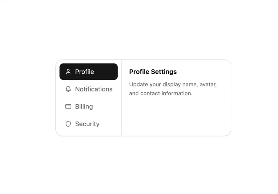
A settings card with a vertical sidebar of icon-labeled sections that swap the panel content when selected.
Built with React and Tailwind. Copy the prompt and paste it into Claude Code, Cursor or Lovable: your agent adds Settings Card with Sidebar to your project and fits it to your theme.
Code
How Settings Card with Sidebar is used: the demo's code. The component's own source comes with a free account.
Usage.tsx
import { Pattern } from "@/components/ui/v-card-17";

export default function Default() {
  return (
    <div className="flex min-h-svh w-full items-center justify-center p-10">
      <Pattern />
    </div>
  );
}
Dependencies
More by Cnippet
View all

Team
1.3K
Davincho Hero-1
692
Aero Hero-3
590
Features
519
Random Letter Swap Navigation
513
Services with Animated Hover Modal
472
Blogs
398
Aero Hero-1
366
More in Cards
View all

Course Design Cards
1.2K

Card Studio
11

Interactive Tech Stack Bento Grid with Hover Effects
329

Card
70
Statistics Card 2
283
Stats cards with links
87
The Item one
3
Statistics Card 10
277
