About
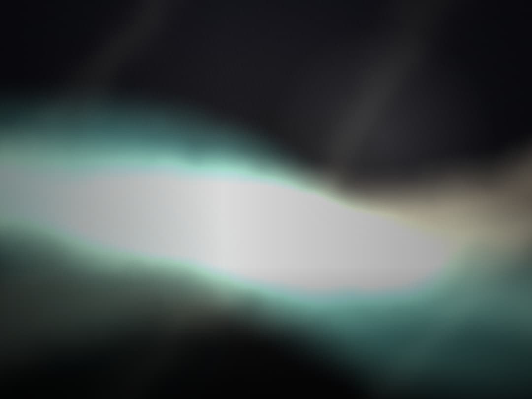
An animated full-screen WebGL hero background with satin-dark aurora ribbons, pearlescent sheen, film grain, and cursor-driven depth, with slots for title, subtitle, and description.
Built with React and Tailwind. Copy the prompt and paste it into Claude Code, Cursor or Lovable: your agent adds Silk Aurora to your project and fits it to your theme.
Code
How Silk Aurora is used: the demo's code. The component's own source comes with a free account.
Usage.tsx
import { SilkAurora } from "@/components/ui/silk-aurora";

const settings = {
  speed: 1,
  intensity: 1,
  grain: 0.85,
  mouseInfluence: 1,
  vignette: 1,
};

export default function Demo(props: Partial<typeof settings>) {
  const s = { ...settings, ...props };
  return (
    <div className="h-screen w-screen">
      <SilkAurora
        className="h-full min-h-0"
        speed={s.speed}
        intensity={s.intensity}
        grain={s.grain}
        mouseInfluence={s.mouseInfluence}
        vignette={s.vignette}
      />
    </div>
  );
}
More by componentry
View all
Scroll Choreography
1K
Collection Surfer
794
Liquid Glass Carousel
404
Animated Gradient
371
Wheel Carousel
362
Circuit Board
154
Infinite Image Field
107
Magnetic Dock
99
More in Heroes
View all

SaaS Template
2.4K

Hero
1.2K

Responsive Hero Banner
2K
Centered Hero with Image Fan
920

HeroSectionWithGradient
334

Hero 03
314
Editorial Collage Hero
425
Glass Fold
196
