"use client";
import type { ReactNode } from "react";
import { AiBlobWarpAvatar } from "@/components/ui/ai-blob-warp";
function SampleCard({
label,
description,
children,
}: {
label: string;
description: string;
children: ReactNode;
}) {
return (
<div className="flex flex-col items-center gap-3 rounded-xl border border-border/60 bg-card/40 p-4 text-center shadow-sm">
{children}
<div className="space-y-1">
<p className="font-medium text-foreground text-sm">{label}</p>
<p className="max-w-56 text-balance text-muted-foreground text-xs leading-relaxed">
{description}
</p>
</div>
</div>
);
}
export default function AiBlobWarpDemo() {
return (
<div className="mx-auto max-w-lg space-y-8 px-4 py-10 sm:py-14">
<div className="text-center">
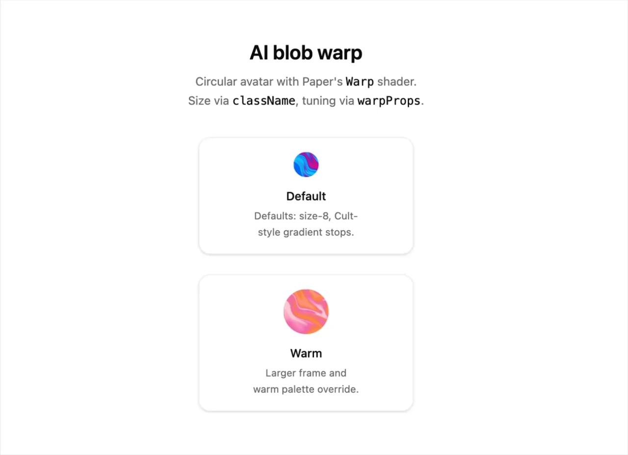
<h1 className="mb-2 font-semibold text-2xl text-foreground">
AI blob warp
</h1>
<p className="text-balance text-muted-foreground text-sm leading-relaxed">
Circular avatar with Paper's{" "}
<code className="text-foreground">Warp</code> shader. Size via{" "}
<code className="text-foreground">className</code>, tuning via{" "}
<code className="text-foreground">warpProps</code>.
</p>
</div>
<div className="flex flex-wrap justify-center gap-6">
<SampleCard
description="Defaults: size-8, Cult-style gradient stops."
label="Default"
>
<AiBlobWarpAvatar aria-label="Default warp avatar" />
</SampleCard>
<SampleCard
description="Larger frame and warm palette override."
label="Warm"
>
<AiBlobWarpAvatar
aria-label="Warm warp avatar"
className="size-14"
warpProps={{
colors: ["#fda4af", "#fb923c", "#f472b6", "#fecdd3"],
}}
/>
</SampleCard>
</div>
</div>
);
}