
About
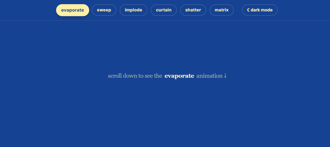
Scroll-triggered kinetic text disintegration effects with GSAP, SplitText, and responsive multi-style particle dissolution.
Built with React and Tailwind. Copy the prompt and paste it into Claude Code, Cursor or Lovable: your agent adds Kinetic Text Disintegration to your project and fits it to your theme.
Code
How Kinetic Text Disintegration is used: the demo's code. The component's own source comes with a free account.
Usage.tsx
"use client";

import { useEffect, useState } from "react";
import {
  AnimatedEvaporate,
  AnimatedSweep,
  AnimatedImplode,
  AnimatedCurtain,
  AnimatedShatter,
  AnimatedMatrixDrop
} from "@/components/ui/kinetic-text-disintegration";

type AnimationType = "evaporate" | "sweep" | "implode" | "curtain" | "shatter" | "matrix";

export default function DemoOne() {
  const [dark, setDark] = useState(false);
  const [ready, setReady] = useState(false);
  const [activeAnim, setActiveAnim] = useState<AnimationType>("evaporate");

  useEffect(() => {
    setReady(true);
    // Optional: Check system preference on load
    if (window.matchMedia && window.matchMedia('(prefers-color-scheme: dark)').matches) {
      setDark(true);
    }
  }, []);

  if (!ready) return null;

  const renderActiveComponent = () => {
    // Dynamic particle colors based on light/dark state
    const particleColor = dark ? "#60a5fa" : "#fdf0a6"; // Light blue for dark mode, pale yellow for light mode
    const subParticleColor = dark ? "#3b82f6" : "#eab308"; // Deeper blue for dark mode, gold for light mode

    const props = { color: particleColor, className: "max-w-xs sm:max-w-2xl md:max-w-5xl" };

    const text = (
      <h1 className="text-5xl sm:text-6xl md:text-8xl font-serif font-black lowercase tracking-tighter text-[#fdf0a6] dark:text-slate-100 antialiased drop-shadow-md pb-2 leading-none transition-colors duration-300">
        hardware &<br />animated
      </h1>
    );

    const subProps = { color: subParticleColor, delay: 0.2 };

    const subText = (
      <p className="text-base sm:text-lg md:text-2xl text-[#fdf0a6]/80 dark:text-slate-400 mt-4 sm:mt-6 max-w-sm sm:max-w-xl mx-auto font-medium leading-relaxed tracking-tight antialiased lowercase transition-colors duration-300 px-4">
        scroll up and down to see the selected interaction trigger repeatedly.
      </p>
    );

    switch (activeAnim) {
      case "sweep":
        return <><AnimatedSweep {...props}>{text}</AnimatedSweep><AnimatedSweep {...subProps}>{subText}</AnimatedSweep></>;
      case "implode":
        return <><AnimatedImplode {...props}>{text}</AnimatedImplode><AnimatedImplode {...subProps}>{subText}</AnimatedImplode></>;
      case "curtain":
        return <><AnimatedCurtain {...props}>{text}</AnimatedCurtain><AnimatedCurtain {...subProps}>{subText}</AnimatedCurtain></>;
      case "shatter":
        return <><AnimatedShatter {...props}>{text}</AnimatedShatter><AnimatedShatter {...subProps}>{subText}</AnimatedShatter></>;
      case "matrix":
        return <><AnimatedMatrixDrop {...props}>{text}</AnimatedMatrixDrop><AnimatedMatrixDrop {...subProps}>{subText}</AnimatedMatrixDrop></>;
      case "evaporate":
      default:
        return <><AnimatedEvaporate {...props}>{text}</AnimatedEvaporate><AnimatedEvaporate {...subProps}>{subText}</AnimatedEvaporate></>;
    }
  };

  return (
    <div className={dark ? "dark" : ""} data-theme={dark ? "dark" : "light"}>

      {/* Sticky Navigation */}
      <nav className="fixed top-0 left-0 w-full z-50 bg-[#164294]/90 dark:bg-slate-950/90 backdrop-blur-md border-b border-[#fdf0a6]/20 dark:border-slate-800 p-3 sm:p-4 flex flex-wrap justify-center gap-2 sm:gap-3 transition-colors duration-300">
        {["evaporate", "sweep", "implode", "curtain", "shatter", "matrix"].map((anim) => (
          <button
            key={anim}
            onClick={() => setActiveAnim(anim as AnimationType)}
            className={`px-3 py-1.5 sm:px-4 sm:py-2 rounded-full text-xs sm:text-sm font-bold transition-all lowercase tracking-wide
              ${activeAnim === anim
                ? "bg-[#fdf0a6] text-[#164294] dark:bg-blue-500 dark:text-white shadow-lg scale-105"
                : "bg-transparent text-[#fdf0a6] dark:text-slate-300 border border-[#fdf0a6]/40 dark:border-slate-700 hover:bg-[#fdf0a6]/10 dark:hover:bg-slate-800"
              }`}
          >
            {anim}
          </button>
        ))}

        {/* Dark/Light Mode Toggle */}
        <button
          onClick={() => setDark(!dark)}
          className="ml-0 sm:ml-4 px-3 py-1.5 sm:px-4 sm:py-2 rounded-full border border-[#fdf0a6]/40 dark:border-slate-700 text-[#fdf0a6] dark:text-slate-300 text-xs sm:text-sm font-bold lowercase hover:bg-[#fdf0a6]/10 dark:hover:bg-slate-800 transition-colors"
        >
          {dark ? "☀ light mode" : "☾ dark mode"}
        </button>
      </nav>

      {/* Main Background: Classic Blue in Light Mode, Deep Slate in Dark Mode */}
      <main className="hw-stage relative min-h-screen w-full flex flex-col items-center bg-[#164294] dark:bg-slate-950 transition-colors duration-300 overflow-hidden">

        {/* Spacer to force scrolling */}
        <div className="h-[80vh] flex items-center justify-center text-[#fdf0a6]/60 dark:text-slate-500 text-base sm:text-xl tracking-tight lowercase font-serif px-4 text-center">
          scroll down to see the <span className="font-black mx-1 sm:mx-2 text-[#fdf0a6] dark:text-blue-400">{activeAnim}</span> animation ↓
        </div>

        {/* Dynamic Canvas Container */}
        <div className="w-full max-w-7xl mx-auto px-4 py-20 sm:py-32 flex items-center justify-center min-h-[40vh]">
          <section className="flex flex-col items-center justify-center w-full gap-6 sm:gap-8 text-center" key={activeAnim}>
            {renderActiveComponent()}
          </section>
        </div>

        {/* Bottom spacer to scroll past the animation so it can reset */}
        <div className="h-[80vh] flex items-center justify-center text-[#fdf0a6]/60 dark:text-slate-500 text-base sm:text-xl tracking-tight lowercase font-serif">
          ↑ scroll back up to replay
        </div>

      </main>
    </div>
  );
}
Dependencies
More by Daiwiik Harihar
View all

Spatial Product Showcase
2.3K
Perspective Tunnel Hero
1.8K
Constellation Grid
1.2K
Focus Rail
1.1K
Elastic Gallery
1K
Rolling List
942
Hero Shutter Text
926
Text Block Animation
890
More in Text
View all

Vertical Cut Reveal Characters
124
Motion Blur Text
41
Text Reveal
33

Rainbow Text Effect
52

Shine Border
983

NeonRGBTextEffect
152
Apple Hello Effect
641
Toolbar
49
