
About
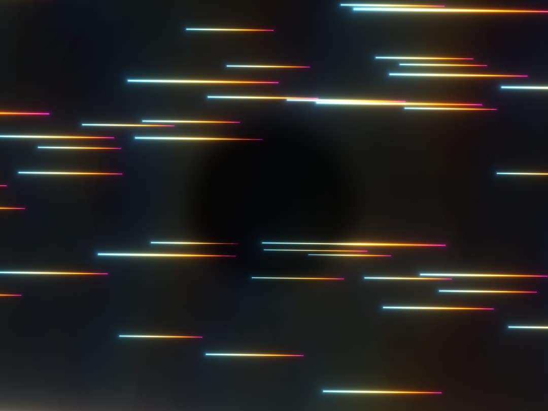
A full-screen animated background component created with React and Three.js. It renders a dynamic, colorful line light up pattern using a custom GLSL shader. The component is interactive, allowing its appearance to be controlled via props (or UI buttons in the demo) to change colors based on different states, such as "active" or "upcoming" reminders. It also includes an optional center-dimming effect.
Built with React and Tailwind. Copy the prompt and paste it into Claude Code, Cursor or Lovable: your agent adds Light Up shader to your project and fits it to your theme.
Code
How Light Up shader is used: the demo's code. The component's own source comes with a free account.
Usage.tsx
import InteractiveStarfieldShader from "@/components/ui/light-up-shader";

const settings = {
  hasActiveReminders: false,
  hasUpcomingReminders: false,
  disableCenterDimming: false,
};

export default function Demo(props: Partial<typeof settings>) {
  const s = { ...settings, ...props };
  return (
    <div className="h-screen w-screen">
      <InteractiveStarfieldShader {...s} />
    </div>
  );
}
Dependencies
More by Dhileep Kumar GM
View all

Aether Flow Hero
1.9K
Woven Light Hero
1.5K
AnomalousMatterHero
1.5K
PulseFit hero
917
Mountain Scene
858
HolographicCard
818
3D Animation
756
Cybernetic Bento Grid
556
More in Shaders
View all
Glass Fold
189

Neural Noise
711

Line Shader Homlu UI
48
animated pattern cloud
615
Black Hole
21
Oceanic
160

Raidal 2
156
Voice Orb
6


