
About
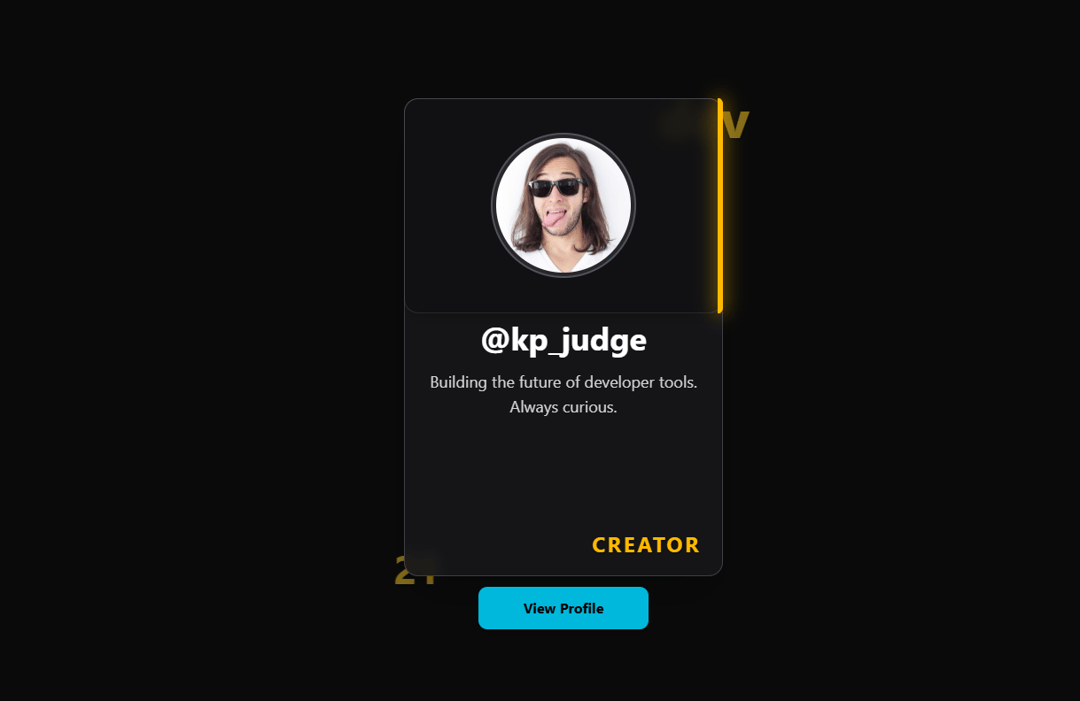
An interactive, 3D-tilt profile card component featuring an animated status cycle, tier-based glow effects, a sliding glass panel, and a customizable action button.
Built with React and Tailwind. Copy the prompt and paste it into Claude Code, Cursor or Lovable: your agent adds ProfileCard to your project and fits it to your theme.
Code
How ProfileCard is used: the demo's code. The component's own source comes with a free account.
Usage.tsx
import React from 'react'
import ProfileCard from '@/components/ui/profile-card'


const PROFILE_DATA = {
  username: "@kp_judge",
  bio: "Building the future of developer tools. Always curious.",
  status: ["JUDGE", "CREATOR", "DEVELOPER", "INNOVATOR"],
  tier: 3,
  imageUrl: "https://cdn.21st.dev/assets/mirror/43/43e61218d8f1e83c81bc0d4aaf0be9f51ad1a9e54d2cf9491a21ab85a445f9b3.jpg",
}

function App() {
  return (
    <main
      className="
        w-full
        min-h-screen
        flex
        items-center
        justify-center
        font-sans
        p-4
        bg-[hsl(var(--background))]
      "
      style={{ perspective: '1000px' }}
    >
      <ProfileCard data={PROFILE_DATA} />
    </main>
  )
}

export default App;
More by Dhileep Kumar GM
View all

Aether Flow Hero
1.9K
Woven Light Hero
1.5K
AnomalousMatterHero
1.5K
PulseFit hero
919
Mountain Scene
858
HolographicCard
818
3D Animation
758
Cybernetic Bento Grid
556
More in Cards
View all
Stats cards with links
120

Course Design Cards
1.1K

Statistics Card 2
258
Card
55

Card Studio
9
Statistics Card 7
288
The Item one
3

Weather Card
52
