
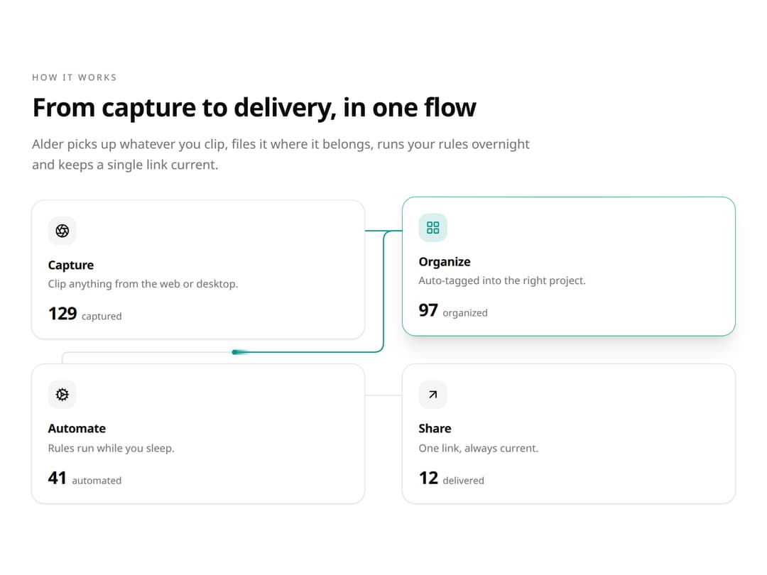
Feature Flow Section for React and Tailwind CSS (shadcn/ui): feature cards joined by connectors, where a light particle flows from card to card and lights each one with a lifted ring and a metric that rolls up by one. It is built to show how a product's steps connect instead of listing them. Cards reflow from a row to a 2x2 grid to a column with connectors that follow them. Controlled or uncontrolled activeIndex, onActiveChange and onSelect, hover jumps, arrow keys, aria-current, reduced motion, light and dark. Use it for "How it works" and Features sections on landing pages. The included demo loops a four-step workflow and makes no requests. Requires React only, with no animation library.
Built with React and Tailwind. Copy the prompt and paste it into Claude Code, Cursor or Lovable: your agent adds Feature Flow Section – Connected Feature Cards with Animated Data Flow to your project and fits it to your theme.
Code
How Feature Flow Section – Connected Feature Cards with Animated Data Flow is used: the demo's code. The component's own source comes with a free account.
Usage.tsx
"use client";

import * as React from "react";
import { Aperture, ArrowUpRight, Cog, LayoutGrid } from "lucide-react";
import { FeatureFlowSection } from "@/components/ui/feature-flow-section";
import type { FeatureFlowDirection, FeatureFlowItem, FeatureFlowTone } from "@/components/ui/feature-flow-section";

const FEATURES: FeatureFlowItem[] = [
  { id: "capture", icon: <Aperture aria-hidden="true" />, title: "Capture", description: "Clip anything from the web or desktop.", metric: { value: 128, label: "captured" }, iconMotion: "pulse" },
  { id: "organize", icon: <LayoutGrid aria-hidden="true" />, title: "Organize", description: "Auto-tagged into the right project.", metric: { value: 96, label: "organized" }, iconMotion: "shift" },
  { id: "automate", icon: <Cog aria-hidden="true" />, title: "Automate", description: "Rules run while you sleep.", metric: { value: 41, label: "automated" }, iconMotion: "spin" },
  { id: "share", icon: <ArrowUpRight aria-hidden="true" />, title: "Share", description: "One link, always current.", metric: { value: 12, label: "delivered" }, iconMotion: "nudge" },
];

const DIRECTIONS: FeatureFlowDirection[] = ["auto", "row", "column"];
const TONES: FeatureFlowTone[] = ["chart-1", "chart-2", "chart-3", "chart-4", "chart-5"];

export default function Demo({ autoplay = true }: { autoplay?: boolean }) {
  const params = React.useMemo(() => new URLSearchParams(typeof location === "undefined" ? "" : location.search), []);
  const controlled = params.get("controlled") === "1";
  const lock = params.has("lock") ? Number(params.get("lock")) : null;
  const direction = DIRECTIONS.find((value) => value === params.get("direction")) ?? "auto";
  const tone = TONES.find((value) => value === params.get("tone")) ?? "chart-2";
  const [active, setActive] = React.useState(0);
  const [requested, setRequested] = React.useState(-1);
  const [selected, setSelected] = React.useState("");

  return (
    <main
      data-demo-root
      data-requested={requested}
      data-selected={selected}
      className="flex min-h-[min(100svh,760px)] w-full items-center justify-center bg-background px-6 py-8 text-foreground sm:px-10"
    >
      <FeatureFlowSection
        className="max-w-[1120px]"
        features={FEATURES}
        eyebrow="How it works"
        heading="From capture to delivery, in one flow"
        lead="Alder picks up whatever you clip, files it where it belongs, runs your rules overnight and keeps a single link current."
        direction={direction}
        tone={tone}
        {...(autoplay ? { autoplay: true, loop: true } : {})}
        {...(controlled
          ? { activeIndex: lock ?? active, onActiveChange: (index: number) => { setRequested(index); setActive(index); } }
          : { onActiveChange: setRequested })}
        onSelect={(_, feature) => setSelected(feature.id)}
      />
    </main>
  );
}
Dependencies
More by DHxWhy
View all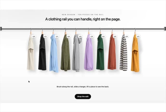

Product Rail Gallery – Fashion Store Hero Section
2.7K
Sushi Conveyor Belt Menu – Restaurant Hero Section
1.2K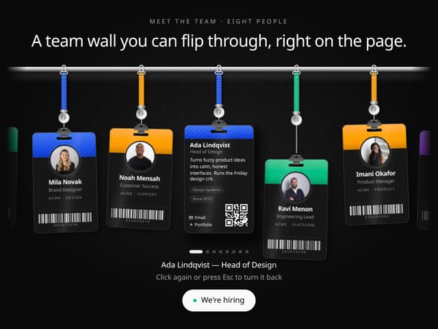
Team Lanyard Rail – Meet the Team Section with Flip Badges
1.2K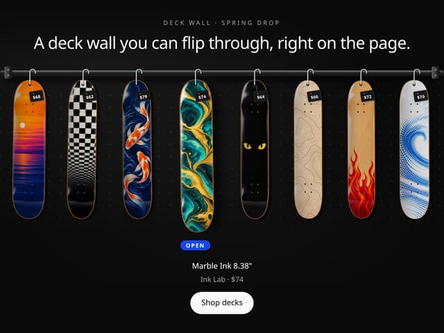
Skateboard Deck Rail Gallery – Skate Shop Hero Section
605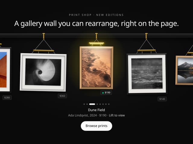
Picture Rail Image Gallery – Art Print Shop Hero Section
421
Sun Moon Dark Mode Theme Toggle
382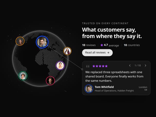
World Testimonials Globe – Social Proof Hero Section
326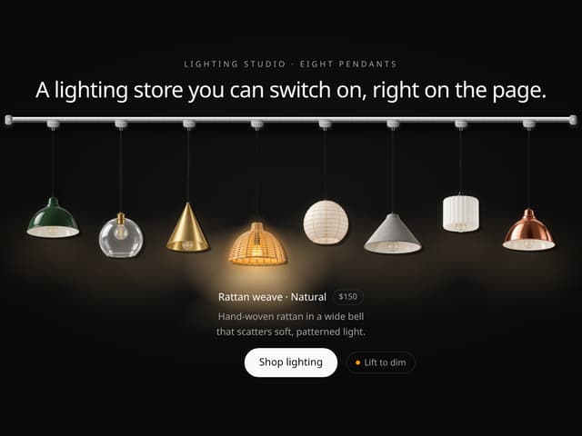
Pendant Lamp Rail Gallery – Lighting Store Hero Section
323
More in Features
View all

Features 8
3.2K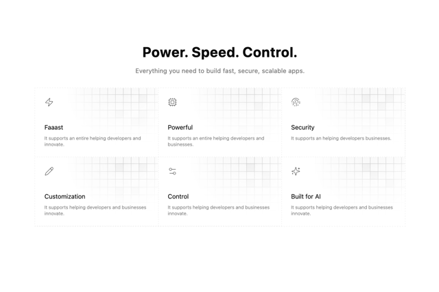

Grid Feature Cards
1.9K

Feature 72
135

Feature Sections
194
Feature with advantages
293
Features 4
393
Features Card
258
Feature Section with card gradient
173


