
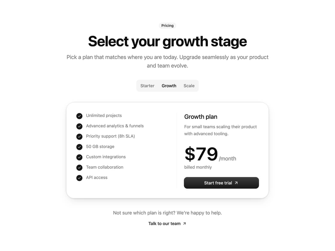
About
An animated pricing section where visitors switch between plan tiers with a segmented toggle and watch the plan card's price, description, and feature list transition smoothly.
Built with React and Tailwind. Copy the prompt and paste it into Claude Code, Cursor or Lovable: your agent adds Toggle Pricing Cards to your project and fits it to your theme.
Code
How Toggle Pricing Cards is used: the demo's code. The component's own source comes with a free account.
Usage.tsx
import Pricing from "@/components/ui/pricing-7";

export default function PricingDemo() {
  return <Pricing />;
}
Dependencies
More by Diar Muradi
View all

Toggleable Add-on Pricing
195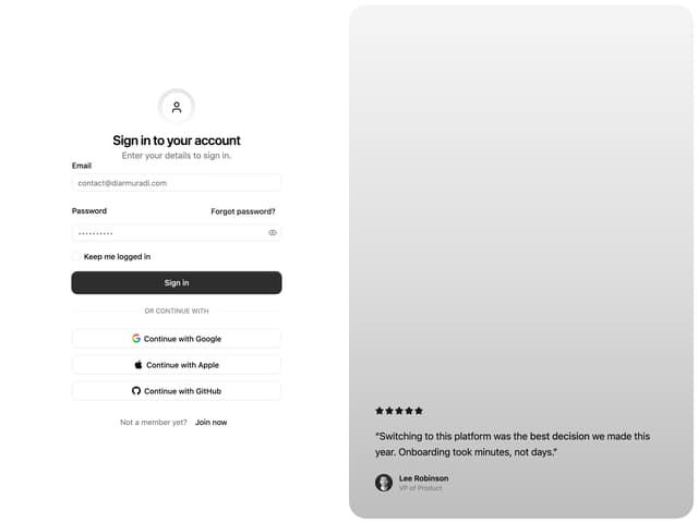
Split Sign In Form
114
ROI Pricing Calculator
61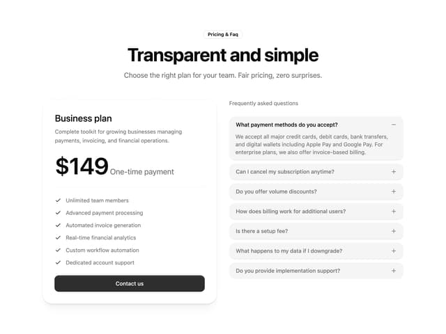
Pricing With FAQ
54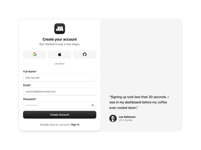
Sign Up Split Panel
51
Logo Orbit
48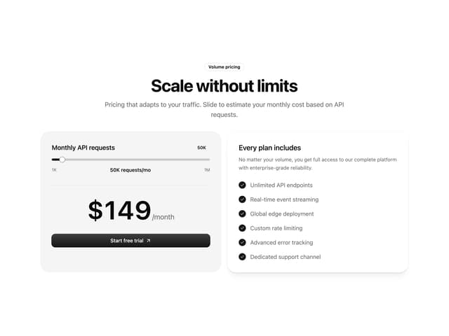
Volume Pricing Card
36
FAQ Snapshot Grid
27
More in Pricing
View all
Pricing Section
676

Pricing Card
389

Pricing Section
195
Bento Pricing Component
14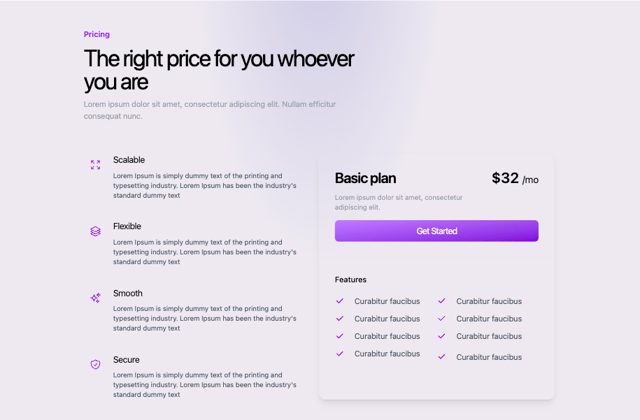
Colorful-Pricing
89

Pricing Cards
23

RuixenPricing05
114
pricing section
171


