About
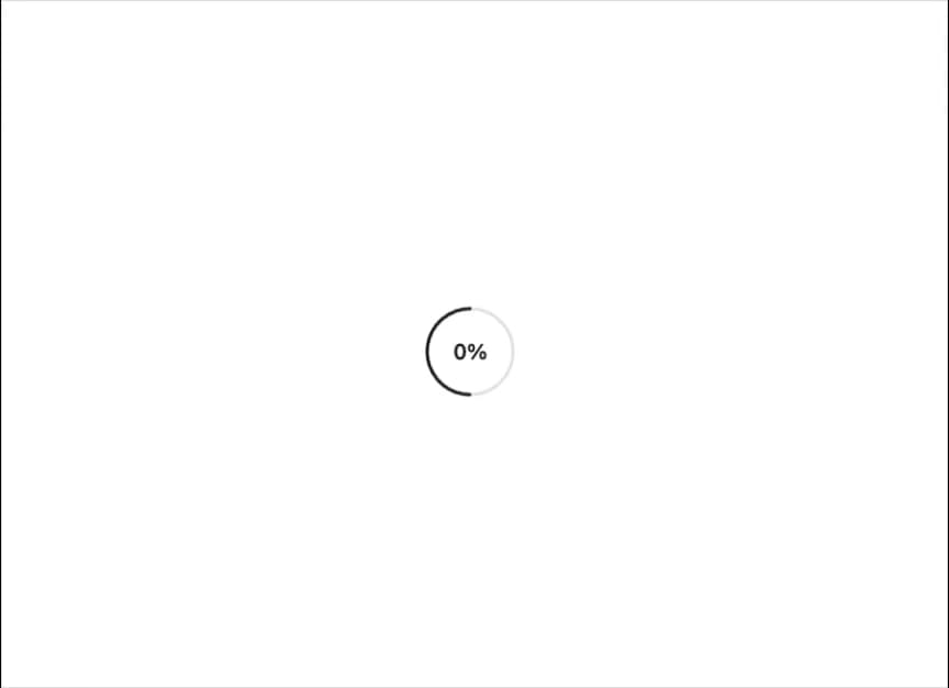
A composable circular progress indicator with track, range, and value text parts, supporting determinate and indeterminate states.
Built with React and Tailwind. Copy the prompt and paste it into Claude Code, Cursor or Lovable: your agent adds Circular Progress to your project and fits it to your theme.
Code
How Circular Progress is used: the demo's code. The component's own source comes with a free account.
Usage.tsx
"use client";

import * as React from "react";
import {
  CircularProgress,
  CircularProgressIndicator,
  CircularProgressRange,
  CircularProgressTrack,
  CircularProgressValueText,
} from "@/components/ui/circular-progress";

export default function CircularProgressDemo() {
  const [value, setValue] = React.useState(0);

  React.useEffect(() => {
    const interval = setInterval(() => {
      setValue((prev) => {
        if (prev >= 100) {
          clearInterval(interval);
          return 100;
        }
        return prev + 2;
      });
    }, 150);
    return () => clearInterval(interval);
  }, []);

  return (
    <CircularProgress value={value} size={60}>
      <CircularProgressIndicator>
        <CircularProgressTrack />
        <CircularProgressRange />
      </CircularProgressIndicator>
      <CircularProgressValueText />
    </CircularProgress>
  );
}
Dependencies
More by Dice UI
View all

Compare Slider
80
Sortable
52
Status
32
Pending
29
Banner
19
Kanban Board
9
Stack
8
Marquee
6