
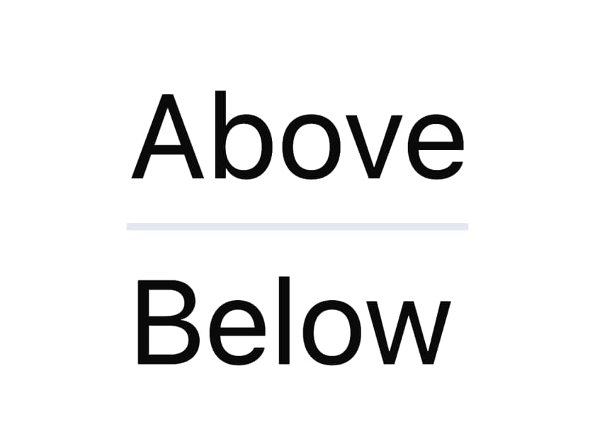
About
A thin horizontal or vertical separator line for splitting content sections, with an optional centered text label like "or continue with".
Built with React and Tailwind. Copy the prompt and paste it into Claude Code, Cursor or Lovable: your agent adds Divider to your project and fits it to your theme.
Code
How Divider is used: the demo's code. The component's own source comes with a free account.
Usage.tsx
import Divider from "@/components/ui/divider";

export default function DividerDemo() {
  return (
    <div style={{ maxWidth: 320 }}>
      <p>Above</p>
      <Divider />
      <p>Below</p>
    </div>
  );
}
More by dixant
View all
Tooltip
1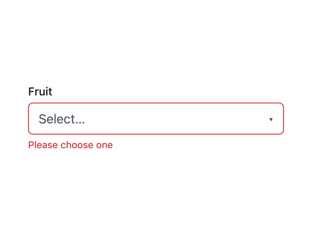
Select
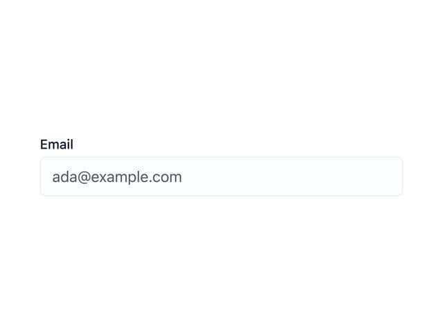
Tatva Input
Typography
Avatar
Stack

Alert
Accordion