
About
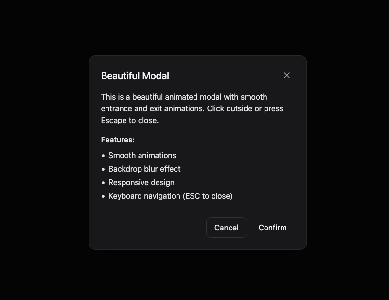
Here is Basic Modal component
Built with React and Tailwind. Copy the prompt and paste it into Claude Code, Cursor or Lovable: your agent adds Basic Modal to your project and fits it to your theme.
Code
How Basic Modal is used: the demo's code. The component's own source comes with a free account.
Usage.tsx
"use client"

import React, { useState } from "react"

import BasicModal from "@/components/ui/basic-modal"

const ModalDemo = () => {
  const [isOpen, setIsOpen] = useState(false)

  return (
    <div className="flex flex-col gap-4 p-8">
      <button
        onClick={() => setIsOpen(true)}
        className="bg-background cursor-pointer rounded-md border p-3 shadow-xs"
      >
        Open Modal
      </button>

      <BasicModal
        isOpen={isOpen}
        onClose={() => setIsOpen(false)}
        title="Beautiful Modal"
        size="md"
      >
        <div className="flex flex-col gap-4">
          <p>
            This is a beautiful animated modal with smooth entrance and exit
            animations. Click outside or press Escape to close.
          </p>
          <div className="flex flex-col gap-2">
            <h4 className="font-medium">Features:</h4>
            <ul className="list-inside list-disc space-y-1">
              <li>Smooth animations</li>
              <li>Backdrop blur effect</li>
              <li>Responsive design</li>
              <li>Keyboard navigation (ESC to close)</li>
            </ul>
          </div>
          <div className="mt-4 flex justify-end gap-2">
            <button
              onClick={() => setIsOpen(false)}
              className="hover:bg-secondary rounded-lg border px-4 py-2 transition-colors"
            >
              Cancel
            </button>
            <button
              onClick={() => setIsOpen(false)}
              className="bg-brand hover:bg-brand-secondary rounded-lg px-4 py-2 text-white transition-colors"
            >
              Confirm
            </button>
          </div>
        </div>
      </BasicModal>
    </div>
  )
}

export default ModalDemo
Dependencies
More by Edu Calvo
View all

Scrollable Card Stack
233
Siri Orb
160
AI Task List
158
Cursor Follow
153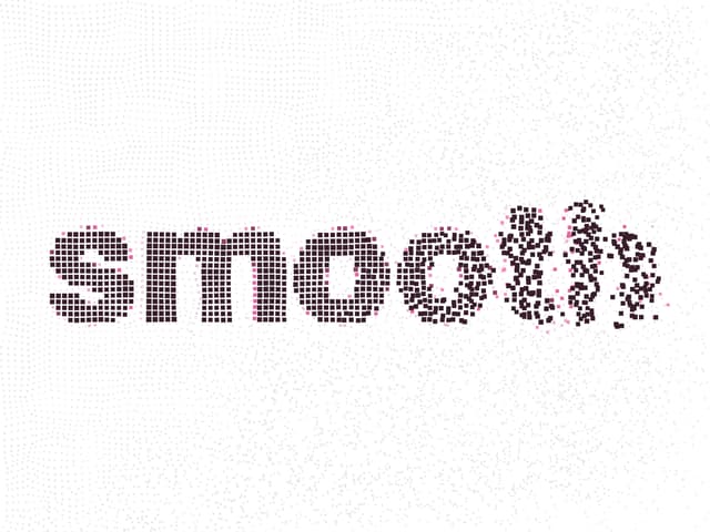
Pixel Flow Field
137
Agent Avatar
126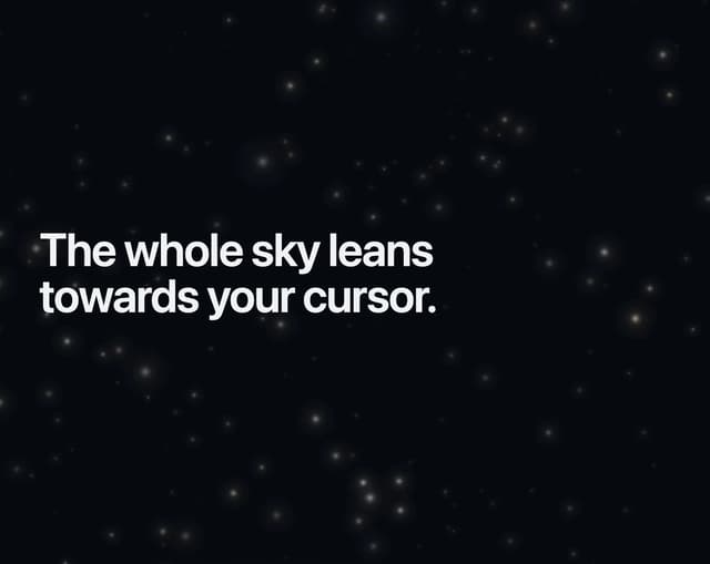
Gravity Stars
110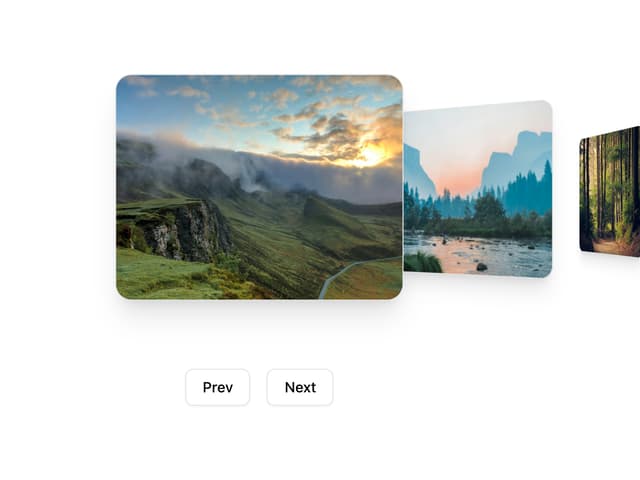
Coverflow Carousel
91