
About
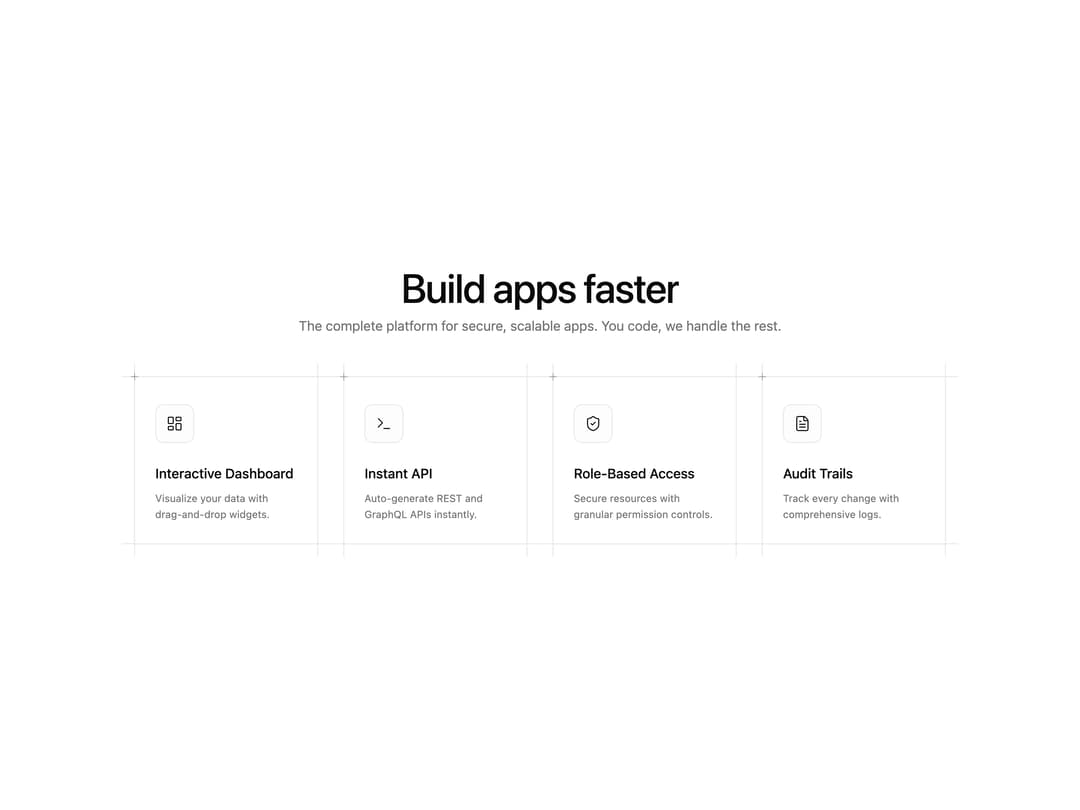
A responsive feature section with cards that have extended crosshair borders, corner plus decorators, and icon, title and description for each feature.
Built with React and Tailwind. Copy the prompt and paste it into Claude Code, Cursor or Lovable: your agent adds Features 4 to your project and fits it to your theme.
Code
How Features 4 is used: the demo's code. The component's own source comes with a free account.
Usage.tsx
import { FeatureSection } from "@/components/ui/features-4";

export default function DemoFeatureSection() {
  return (
    <div className="w-full bg-background text-foreground">
      <FeatureSection />
    </div>
  );
}
Dependencies
More by Efferd
View all

Testimonials Columns
7.1K
Zoom Parallax
5.4K
Dotted Surface
3.5K
Footer Section
2.7K
Grid Feature Cards
1.9K
Logo Cloud 2
1.7K
Header 3
1.6K
Logo Cloud 3
1.5K
More in Features
View all

Feature Sections
114
Feature with advantages
295

Features 8
3.2K
Features Card
260
Feature with image
154
Features 4
393

Feature 72
136
Feature Section with card gradient
174


