
About
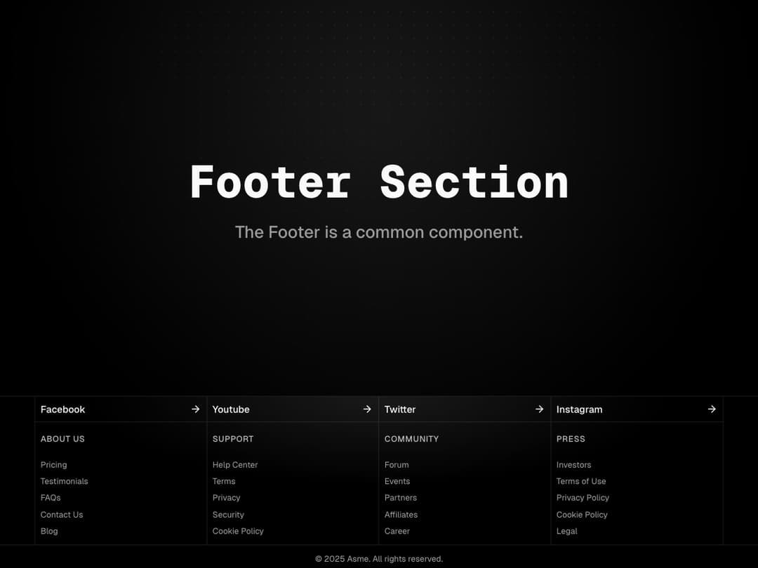
A clean and structured footer with social links, quick navigation groups, and legal info. Designed with responsive grids and subtle styling to keep everything clear and accessible.
Built with React and Tailwind. Copy the prompt and paste it into Claude Code, Cursor or Lovable: your agent adds Footer to your project and fits it to your theme.
Code
How Footer is used: the demo's code. The component's own source comes with a free account.
Usage.tsx
import { Footer } from "@/components/ui/footer";
import { cn } from '@/lib/utils';

export default function DefaultDemo() {
	return (
		<div className="w-full">
			<div className="w-full relative flex min-h-screen h-full items-center">
				{/* Subtle dotted grid */}
				<div
					aria-hidden="true"
					className="pointer-events-none absolute inset-0"
					style={{
						backgroundImage:
							'radial-gradient(rgba(255,255,255,0.08) 0.8px, transparent 0.8px)',
						backgroundSize: '14px 14px',
						maskImage:
							'radial-gradient( circle at 50% 10%, rgba(0,0,0,1), rgba(0,0,0,0.2) 40%, rgba(0,0,0,0) 70% )',
					}}
				/>

				{/* Radial spotlight */}
				<div
					aria-hidden="true"
					className={cn(
						'pointer-events-none absolute -top-1/2 left-1/2 h-[120vmin] w-[120vmin] -translate-x-1/2 rounded-full',
						'bg-[radial-gradient(ellipse_at_center,--theme(--color-foreground/.1),transparent_50%)]',
						'blur-[30px]',
					)}
				/>
				<div className="container mx-auto flex flex-col items-center justify-center px-4">
					<h1 className="text-center text-4xl font-extrabold font-mono">Footer Section</h1>
					<p className="text-foreground/60 mt-4 text-center text-lg font-medium">
						The Footer is a common component.
					</p>
				</div>
			</div>

			<Footer />
		</div>
	);
}