
About
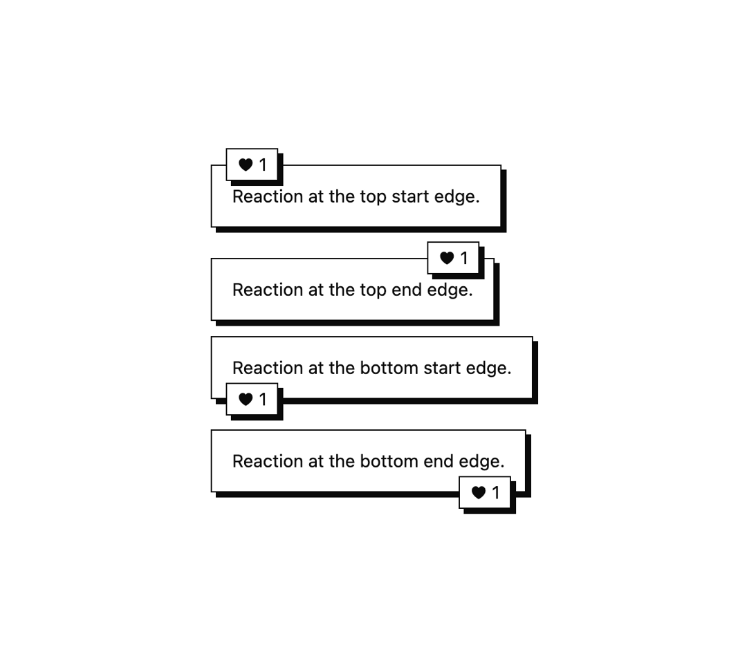
A chat message bubble with grouped layout, style variants, alignment, and inline reaction badges for building conversation threads.
Built with React and Tailwind. Copy the prompt and paste it into Claude Code, Cursor or Lovable: your agent adds Conversation Bubble to your project and fits it to your theme.
Code
How Conversation Bubble is used: the demo's code. The component's own source comes with a free account.
Usage.tsx
import {
  Bubble,
  BubbleContent,
  BubbleGroup,
  BubbleReactions,
} from "@/components/ui/bubble";

const sides = ["top", "bottom"] as const;
const aligns = ["start", "end"] as const;

export default function BubbleReactionPositionsDemo() {
  return (
    <div className="flex min-h-[480px] w-full items-center justify-center bg-background p-8 text-foreground">
      <BubbleGroup className="w-[min(32rem,calc(100vw-2rem))]">
        {sides.flatMap((side) =>
          aligns.map((align) => (
            <Bubble variant="secondary" key={`${side}-${align}`}>
              <BubbleContent>
                Reaction at the {side} {align} edge.
              </BubbleContent>
              <BubbleReactions side={side} align={align}>
                <span aria-label="One heart reaction">♥ 1</span>
              </BubbleReactions>
            </Bubble>
          )),
        )}
      </BubbleGroup>
    </div>
  );
}
Dependencies
More by enoughtools
View all
Tool Row
Sidebar
Group Label
Chart
Callout