
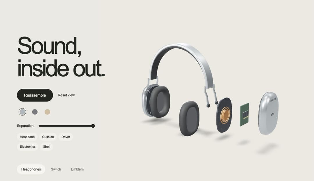
Make product exploration EZPZ. A detailed interactive 3D hero with headphones, a mechanical switch, and a layered emblem. Explode and reassemble parts, rotate the model, change finishes, and inspect individual pieces. Responsive native typography, soft contact shadows, keyboard controls, reduced motion, and poster fallbacks. React and Three.js; no CSS framework required. Free MIT-licensed code and original model assets. Editable Blender source and customization guide: https://github.com/ezam0000/ezpz-exploded-showcase. The included models use pinned public asset URLs; replace them with your own URLs to self-host.
Built with React and Tailwind. Copy the prompt and paste it into Claude Code, Cursor or Lovable: your agent adds EZPZ Exploded Showcase to your project and fits it to your theme.
Code
How EZPZ Exploded Showcase is used: the demo's code. The component's own source comes with a free account.
Usage.tsx
'use client';
import { useState } from 'react';
import { ExplodedShowcase, showcaseProducts } from '@/components/ui/ezpz-exploded-showcase';
export default function Demo(){
 const [active,setActive]=useState(0);
 return <main style={{position:'relative',width:'100%'}}>
  <style>{".ezpz-example-navigation{position:absolute;z-index:5;bottom:28px;left:5.4vw;display:flex;gap:5px;align-items:center}.ezpz-example-navigation button{font:14px Arial,Helvetica,sans-serif;background:transparent;color:#252822aa;border:0;border-radius:30px;padding:12px 18px;cursor:pointer}.ezpz-example-navigation button[aria-pressed=true]{background:#ffffff88;color:#232520}.ezpz-example-navigation button:focus-visible{outline:2px solid #da582e;outline-offset:3px}@media(max-width:900px){.ezpz-example-navigation{bottom:26px;left:23px}.ezpz-example-navigation button{padding:11px 15px}}\n"}</style>
  <ExplodedShowcase key={showcaseProducts[active].id} product={showcaseProducts[active]} />
  <nav className="ezpz-example-navigation" aria-label="Examples">{showcaseProducts.map((p,i)=><button key={p.id} aria-pressed={active===i} onClick={()=>setActive(i)}>{p.name}</button>)}</nav>
 </main>;
}
Dependencies
More by ezpz
View all
collab
6
EZPZ Dither Portrait
2
EZPZ Chrome Type
1
EZPZ Type Tunnel
1
EZPZ Type Steps
1
EZPZ Type Cube
1
EZPZ Type Fold
More in Heroes
View all

SaaS Template
2.5K

Responsive Hero Banner
2.1K

Hero
1.3K
Editorial Collage Hero
467
Centered Hero with Image Fan
994

Hero Section
167

Hero 03
336

Aero Hero-3
586