
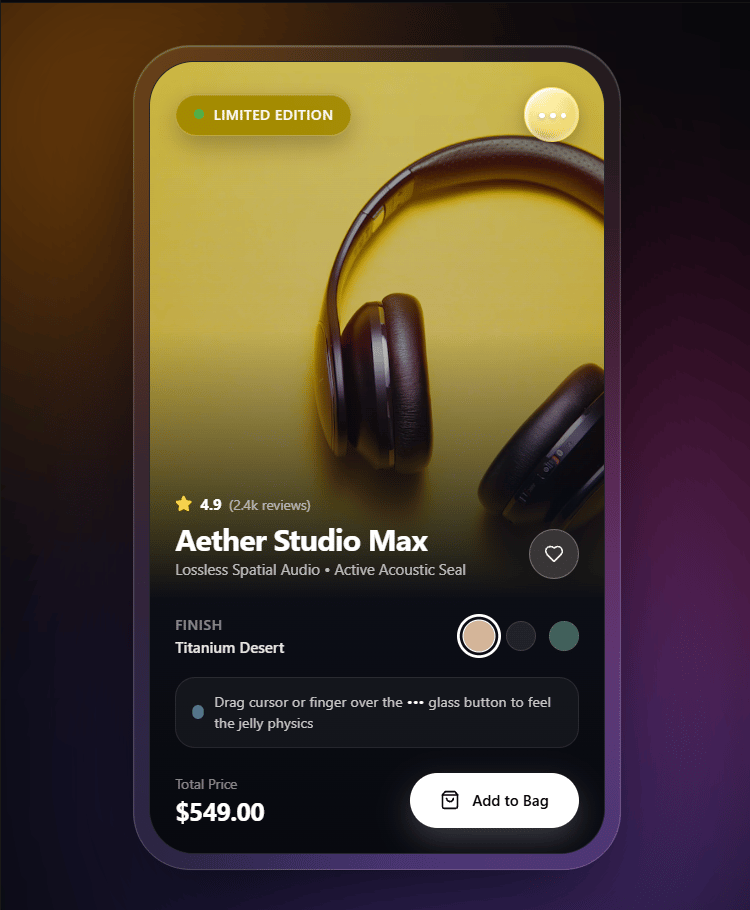
About
An interactive, iOS-inspired liquid glass dropdown menu featuring fluid squash-and-stretch jelly physics, real SVG optical refraction, and dynamic specular highlights. Perfect for premium mobile-first apps and high-end e-commerce interfaces.
Built with React and Tailwind. Copy the prompt and paste it into Claude Code, Cursor or Lovable: your agent adds Liquid Glass Menu to your project and fits it to your theme.
Code
How Liquid Glass Menu is used: the demo's code. The component's own source comes with a free account.
Usage.tsx
// This is a file with a demo for your component
// That's what users will see in the preview

import { LiquidGlassMenu } from "@/components/ui/liquid-glass-menu";
import { cn } from "@/lib/utils";
import React, { useState } from "react";
import { Heart, Share2, Sparkles, Copy, Layers, Check, ShoppingBag, Star, Bookmark } from "lucide-react";
import { motion, AnimatePresence } from "framer-motion";

const MENU_ITEMS = [
  { id: "wishlist", label: "Save to Collection", sublabel: "Sync across iCloud devices", icon: Bookmark },
  { id: "ar", label: "View in AR Space", sublabel: "Apple Vision & iOS QuickLook", icon: Sparkles, badge: "3D" },
  { id: "compare", label: "Compare Specifications", sublabel: "Studio Pro vs. Max Edition", icon: Layers },
  { id: "copy", label: "Copy Product Link", icon: Copy },
  { id: "share", label: "Share via AirDrop", icon: Share2 },
];

const productColors = [
  {
    name: "Titanium Desert",
    bg: "from-amber-500/30 via-rose-500/25 to-indigo-900/60",
    orb1: "bg-orange-400/50",
    orb2: "bg-rose-500/40",
    orb3: "bg-indigo-500/50",
    swatch: "bg-[#d4b499]",
    price: "$549.00",
    tag: "LIMITED EDITION",
  },
  {
    name: "Midnight Obsidian",
    bg: "from-cyan-500/25 via-blue-600/30 to-slate-950/80",
    orb1: "bg-cyan-400/50",
    orb2: "bg-blue-500/45",
    orb3: "bg-purple-600/50",
    swatch: "bg-[#2c3038]",
    price: "$549.00",
    tag: "SPATIAL AUDIO",
  },
  {
    name: "Aurora Emerald",
    bg: "from-emerald-400/30 via-teal-500/25 to-slate-900/70",
    orb1: "bg-emerald-400/50",
    orb2: "bg-teal-400/45",
    orb3: "bg-cyan-600/50",
    swatch: "bg-[#659687]",
    price: "$579.00",
    tag: "PRO SERIES",
  },
];

export default function DemoOne() {
  const [liked, setLiked] = useState(false);
  const [savedItems, setSavedItems] = useState<string[]>([]);
  const [toastMessage, setToastMessage] = useState<string | null>(null);
  const [selectedColor, setSelectedColor] = useState(0);

  const currentTheme = productColors[selectedColor];

  const handleMenuAction = (id: string) => {
    if (id === "wishlist") {
      setSavedItems((prev) =>
        prev.includes(id) ? prev.filter((i) => i !== id) : [...prev, id]
      );
    }

    const messages: Record<string, string> = {
      wishlist: savedItems.includes("wishlist") ? "Removed from Collection" : "Saved to Collection",
      ar: "Launching AR QuickLook...",
      compare: "Comparison sheet added",
      copy: "Link copied to clipboard",
      share: "Scanning nearby AirDrop...",
    };

    setToastMessage(messages[id] || "Action selected");

    setTimeout(() => {
      setToastMessage(null);
    }, 2800);
  };

  return (
    // We add 'dark' class here so the e-commerce demo strictly forces the stunning dark mode for the showcase
    <div className="dark relative min-h-screen w-full flex items-center justify-center p-4 sm:p-8 bg-background text-foreground overflow-hidden select-none font-sans">
      <div className="pointer-events-none fixed inset-0 overflow-hidden">
        <div className={cn("absolute -top-24 -left-24 w-96 h-96 rounded-full blur-[120px] transition-colors duration-700", currentTheme.orb1)} />
        <div className={cn("absolute top-1/3 -right-20 w-[28rem] h-[28rem] rounded-full blur-[130px] transition-colors duration-700", currentTheme.orb2)} />
        <div className={cn("absolute -bottom-32 left-1/4 w-[30rem] h-[30rem] rounded-full blur-[140px] transition-colors duration-700", currentTheme.orb3)} />
      </div>

      <div className="relative w-full max-w-[390px] rounded-[46px] p-3 bg-white/[0.06] border border-white/15 shadow-[0_30px_90px_-15px_rgba(0,0,0,0.85),inset_0_1px_1px_rgba(255,255,255,0.25)] backdrop-blur-2xl">
        <div className="relative w-full rounded-[36px] overflow-hidden bg-[#0c0e16] border border-white/10 shadow-inner">
          <div className="relative h-[430px] w-full overflow-hidden">
            <img
              src="https://cdn.21st.dev/assets/mirror/78/7896ae7ecaf7bdf4533e4bda82cab97e712703a3e1c64a440df431650b7f9827.jpg"
              alt="Flagship Wireless Headphones"
              className="h-full w-full object-cover object-center scale-105 transition-transform duration-700 hover:scale-110"
            />
            <div className={cn("absolute inset-0 bg-gradient-to-b transition-all duration-700 mix-blend-color-dodge opacity-65", currentTheme.bg)} />
            <div className="absolute inset-0 bg-gradient-to-t from-[#0c0e16] via-[#0c0e16]/25 to-black/20" />

            <div className="absolute top-0 inset-x-0 z-30 flex items-center justify-between px-5 pt-5">
              <div className="flex items-center gap-2 px-3.5 py-2 rounded-full bg-white/15 backdrop-blur-xl backdrop-saturate-[180%] border border-white/25 shadow-[inset_0_1px_1px_rgba(255,255,255,0.35),0_8px_20px_rgba(0,0,0,0.25)]">
                <span className="h-2 w-2 rounded-full bg-emerald-400 animate-pulse" />
                <span className="text-[11px] font-semibold tracking-wider uppercase text-white/95">
                  {currentTheme.tag}
                </span>
              </div>

              {/* HERE WE IMPORT AND USE THE REUSABLE COMPONENT */}
              <LiquidGlassMenu
                items={MENU_ITEMS}
                savedItemIds={savedItems}
                onAction={handleMenuAction}
              />
            </div>

            <AnimatePresence>
              {toastMessage && (
                <motion.div
                  initial={{ opacity: 0, y: -20, scale: 0.85, filter: "blur(8px)" }}
                  animate={{ opacity: 1, y: 0, scale: 1, filter: "blur(0px)" }}
                  exit={{ opacity: 0, y: -15, scale: 0.9, filter: "blur(6px)" }}
                  transition={{ type: "spring", stiffness: 420, damping: 22 }}
                  className="absolute top-20 left-1/2 -translate-x-1/2 z-40 flex items-center gap-2.5 px-4 py-2.5 rounded-full bg-black/65 backdrop-blur-2xl border border-white/25 shadow-[0_12px_30px_rgba(0,0,0,0.5),inset_0_1px_1px_rgba(255,255,255,0.3)] whitespace-nowrap"
                >
                  <div className="w-5 h-5 rounded-full bg-emerald-500/20 border border-emerald-400/40 flex items-center justify-center">
                    <Check className="w-3 h-3 text-emerald-400" />
                  </div>
                  <span className="text-xs font-medium text-white/95">{toastMessage}</span>
                </motion.div>
              )}
            </AnimatePresence>

            <div className="absolute bottom-4 left-5 right-5 flex items-end justify-between z-20">
              <div>
                <div className="flex items-center gap-1.5 text-amber-300 mb-1">
                  <Star className="w-3.5 h-3.5 fill-amber-300" />
                  <span className="text-xs font-bold text-white">4.9</span>
                  <span className="text-[11px] text-white/60">(2.4k reviews)</span>
                </div>
                <h2 className="text-2xl font-bold tracking-tight text-white">Aether Studio Max</h2>
                <p className="text-xs text-white/70">Lossless Spatial Audio • Active Acoustic Seal</p>
              </div>

              <motion.button
                whileTap={{ scale: 0.85 }}
                onClick={() => setLiked(!liked)}
                className={cn(
                  "w-10 h-10 rounded-full flex items-center justify-center backdrop-blur-xl border transition-colors",
                  liked ? "bg-rose-500/30 border-rose-400/50 text-rose-400" : "bg-white/15 border-white/25 text-white/90"
                )}
              >
                <Heart className={cn("w-4 h-4", liked && "fill-rose-400")} />
              </motion.button>
            </div>
          </div>

          <div className="p-5 pt-3 flex flex-col gap-4 bg-gradient-to-b from-[#0c0e16] to-[#08090f]">
            <div className="flex items-center justify-between">
              <div className="flex flex-col">
                <span className="text-[11px] text-white/50 uppercase tracking-wider font-medium">Finish</span>
                <span className="text-xs font-semibold text-white/90 mt-0.5">{currentTheme.name}</span>
              </div>
              <div className="flex items-center gap-2.5">
                {productColors.map((c, idx) => (
                  <button
                    key={c.name}
                    onClick={() => setSelectedColor(idx)}
                    className={cn(
                      "w-6 h-6 rounded-full transition-all duration-200 border",
                      c.swatch,
                      selectedColor === idx ? "scale-110 ring-2 ring-white ring-offset-2 ring-offset-[#0c0e16] border-white" : "opacity-60 hover:opacity-100 border-white/20"
                    )}
                    title={c.name}
                  />
                ))}
              </div>
            </div>

            <div className="flex items-center justify-between pt-1">
              <div>
                <span className="text-[11px] text-white/50 block">Total Price</span>
                <span className="text-xl font-bold tracking-tight text-white">{currentTheme.price}</span>
              </div>
              <motion.button
                whileHover={{ scale: 1.03 }}
                whileTap={{ scale: 0.95 }}
                onClick={() => {
                  setToastMessage("Added Aether Studio Max to Bag");
                  setTimeout(() => setToastMessage(null), 2500);
                }}
                className="flex items-center gap-2.5 px-6 py-3.5 rounded-full bg-white text-black font-semibold text-xs shadow-[0_10px_25px_rgba(255,255,255,0.2)] hover:bg-white/95 transition-all cursor-pointer"
              >
                <ShoppingBag className="w-4 h-4" />
                <span>Add to Bag</span>
              </motion.button>
            </div>
          </div>
        </div>
      </div>
    </div>
  );
}