About
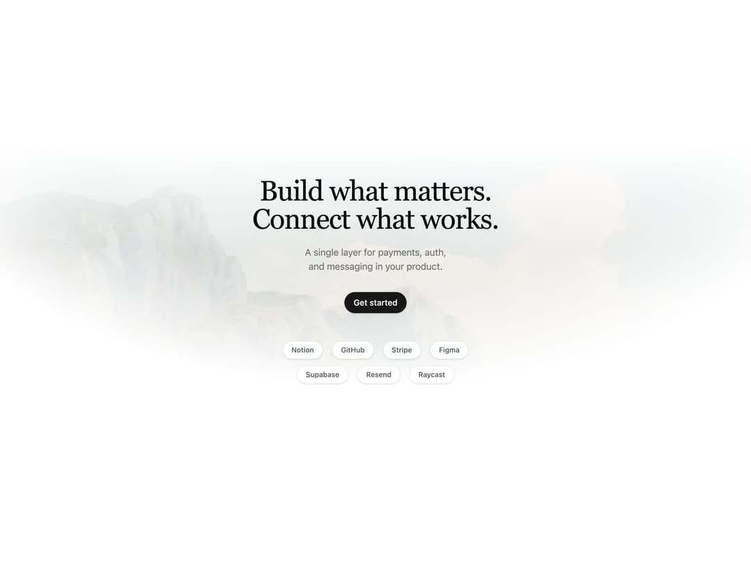
A centered serif hero section with a soft gradient wash background, pill call-to-action button, and a floating integration logo cloud.
Built with React and Tailwind. Copy the prompt and paste it into Claude Code, Cursor or Lovable: your agent adds Centered Serif Hero to your project and fits it to your theme.
Code
How Centered Serif Hero is used: the demo's code. The component's own source comes with a free account.
Usage.tsx
import { Hero01 } from '@/components/ui/hero-01'

export default function Hero01Example() {
  return (
    <Hero01
      title="Build what matters."
      titleLine2="Connect what works."
      description="A single layer for payments, auth, and messaging in your product."
      washImage="https://cdn.21st.dev/assets/mirror/18/18129f9729d7e9fd5393c61d23efb785da4320478b3a878a3e6dd084d86a229d.jpg"
      animation="subtle"
      primaryCTA={{
        ctaEnabled: true,
        text: 'Get started',
        link: '',
        variant: 'default',
        size: 'default',
      }}
      integrationRows={[
        ['Notion', 'GitHub', 'Stripe', 'Figma'],
        ['Supabase', 'Resend', 'Raycast'],
      ]}
    />
  )
}
Dependencies
More by felipemenezes098
View all
Centered Hero with Image Fan
923
Editorial Collage Hero
426
Split Hero With Image Cards
400
Editorial Image Hero
387
Scroll 01
339
Real Estate Search Hero
190
Editorial Hero
172
Hero with Dashboard Mockup
123
More in Heroes
View all

SaaS Template
2.4K

Hero
1.2K

Responsive Hero Banner
2K

Hero Section 6
879

Minimalist Hero Fashion
284

Home Section
65
Hero Golden Spiral
100
Hero with text and two button
112

