flx publishes a shadcn registry at ui.flexnative.com, with 400 components installable through the shadcn CLI.
Copy a prompt for your agent, copy the install command, or open the docs that ship it.
type="multiple" keeps several sections open at once.
Leading icon beside each trigger label.
A titled question-and-answer list.
Each item is a bordered card with spacing between them.
Plus icon on each trigger that turns into a minus when open, instead of a chevron.
Lists, links, and a button inside the panel body.
One trigger disabled while the others stay interactive.
An accordion rendered inside another panel body.
Borderless minimal rows with an active color on open.
Each trigger sits on a muted, rounded background.
Grouped switch rows revealed inside each panel.
Two-line trigger pairing a title with helper text.
Image avatar with an initials fallback.
Missing image falls back to initials.
Generic user icon when there is no image or name.
Small, default, and large sizes side-by-side.
Tinted initials fallbacks using semantic tokens.
Presence dot in the corner showing online, away, or offline.
Verified check icon inside the AvatarBadge.
Avatar beside a name and email, forming a user row.
Overlapping AvatarGroup stack of members.
Overlapping group with a +N count for the remaining members.
Hover each avatar in the group to reveal its name.
Skeleton placeholder while the avatar loads.
Icon badge pinned to the top-right corner.
A single default badge.
All six variants side-by-side: default, secondary, destructive, outline, ghost, link.
Leading verified icon before the label.
A colored presence dot beside an outline label.
Tinted success, warning, error, and info states.
Pill-shaped numeric counts with tabular figures.
render prop renders the badge as an anchor with a trailing icon.
Dismissible tag chips with a trailing remove button.
Assignee chip with a leading avatar inside the badge.
Small, default, and large sizes via className.
Up and down arrows with tinted gain / loss percentages.
Icon, message, and a subtle bordered surface.
Info, success, warning, and error tones stacked.
A close button hides the banner with a restore link.
Full-width gradient promo with a New tag and arrow.
Collapsible release notes that reveal highlights.
Live import banner with a spinner and a progress bar.
Three-column bento: primary tile (two-thirds) with title, description, CTA and media, plus supporting image cards.
Links with a current page and chevron separators.
Ghost icon Button opens a menu of the hidden levels.
Dropdown on small screens, full inline path from sm up.
Breadcrumb links that open in a new tab, with an external-link icon on the outbound crumb.
Last crumb is a Button switcher for sibling pages.
Default button with text label.
All six variants side-by-side: default, secondary, outline, ghost, destructive, link.
Extra small, small, default, and large sizes.
Button with an icon placed before the text label.
Button with an icon placed after the text label.
Square icon-only buttons in every icon size.
Button in the disabled state, visually dimmed and non-interactive.
Button with a spinning loader icon and label, indicating an in-progress async action.
Link-styled button that navigates to an external URL, rendered as an anchor with a trailing external-link icon.
User picker style button with a small avatar image leading the text label.
CTA arrow nudges right on hover.
Notification count badge overlapping an icon button.
Icon and label swap to a check on copy.
Refresh button whose icon rotates a full 360° on each click.
Three bars morph into an X on press.
Horizontal row of buttons with merged borders, used for segmented controls like date range pickers.
Stacked column of buttons with merged borders, used for vertical navigation menus.
Compact toolbar of icon-only buttons with merged borders, used for text formatting actions.
Static text label leading a group of action buttons, useful for labelled sort or filter controls.
Primary action button paired with a chevron that opens a dropdown of secondary actions.
Prev arrow, numbered page buttons, and Next arrow in a merged-border row.
Read-only text value paired with a trailing icon button that copies it to the clipboard, with an animated check on success.
Merged-border button row where one step is visually disabled and non-interactive.
Cancel + Delete spaced action pair.
Sort dropdown paired with a direction-toggle icon button in a merged-border row.
Color swatch button that opens a grid of color swatches, paired with a hex value label in a merged-border row.
Header, action, content, and a bordered footer.
Top media banner above title, body, and a CTA footer.
Image on the left beside a category, title, and link.
Three-dot icon button in the header corner opens a dropdown with rename, share, and delete options.
A footer button launches a modal with subscription detail.
Clickable plan cards with a ring and check on the active one.
Auto-scroll carousel that pauses on item hover and reveals title.
A carousel of media with a title and description.
A carousel of cards with a title and description.
Single checkbox with a label.
Data table with a select-all header, per-row checkboxes, and a count.
Canonical starred-repos toggle with a chevron trigger.
Nested folders built from collapsible rows, with folder icons that swap on open.
Truncated paragraph reveals the rest; trigger label swaps to Show less.
Form reveals extra fields behind an Advanced options toggle.
Canonical command menu with grouped items, icons, and shortcuts.
Spotlight-style ⌘K palette toggled by a button or keyboard shortcut.
Rich search dialog with recent, pages, and people plus a hint footer.
Debounced search with skeleton rows while loading, an empty state, and shouldFilter disabled for server-driven results.
Popover + Command framework picker with a check mark.
Multi-select showing every choice as a removable badge chip in the trigger.
Options split into labeled groups with separators, demonstrated with timezones organized by region.
Avatars with name and email subtext in the trigger and options.
Ghost trigger with a colored status dot, issue-tracker style.
Combobox composed with an accessible field Label.
Controller binds the combobox to RHF; Zod resolver drives FieldError on submit.
form.Field wires the combobox; Zod onSubmit validator surfaces FieldError when touched.
Trigger shows "first, +N" with a separate button to clear all.
Dashed trigger with count badges, checkbox rows, facet counts, and a clear footer.
Side Panel for Comment Thread.
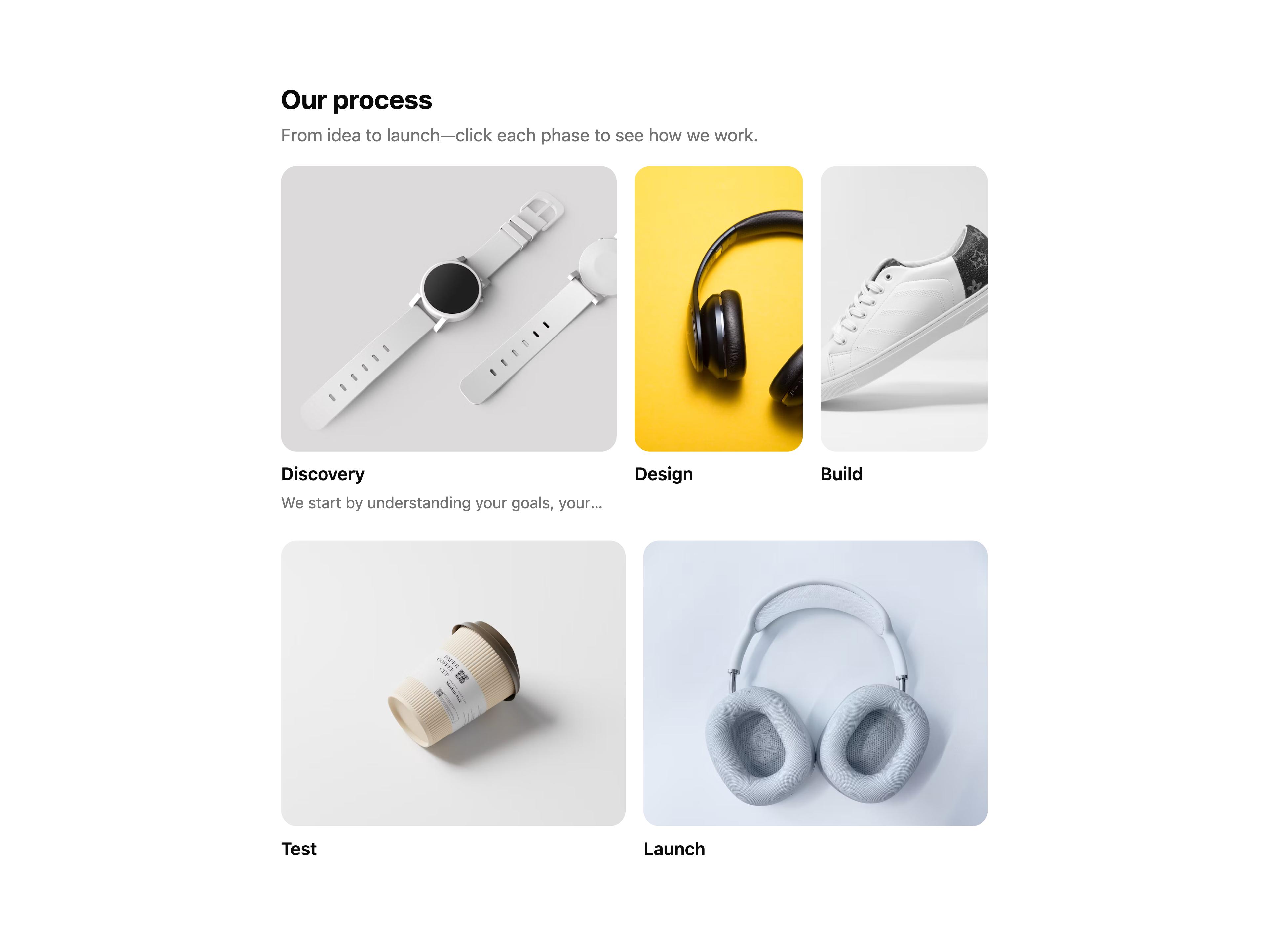
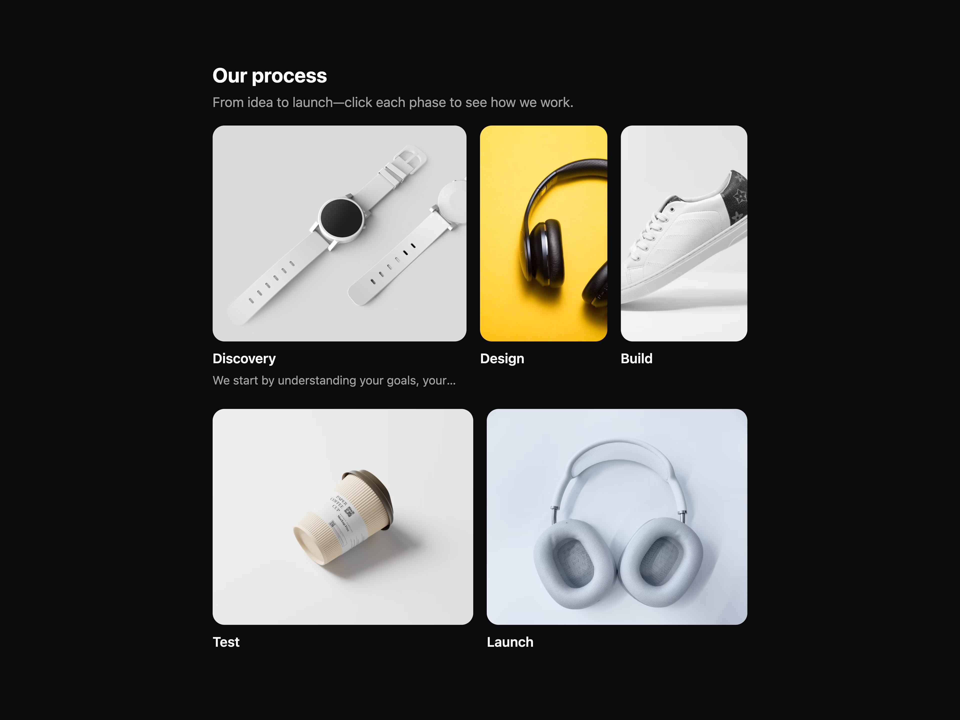
A grid of media cards with a section header and item details below each image.
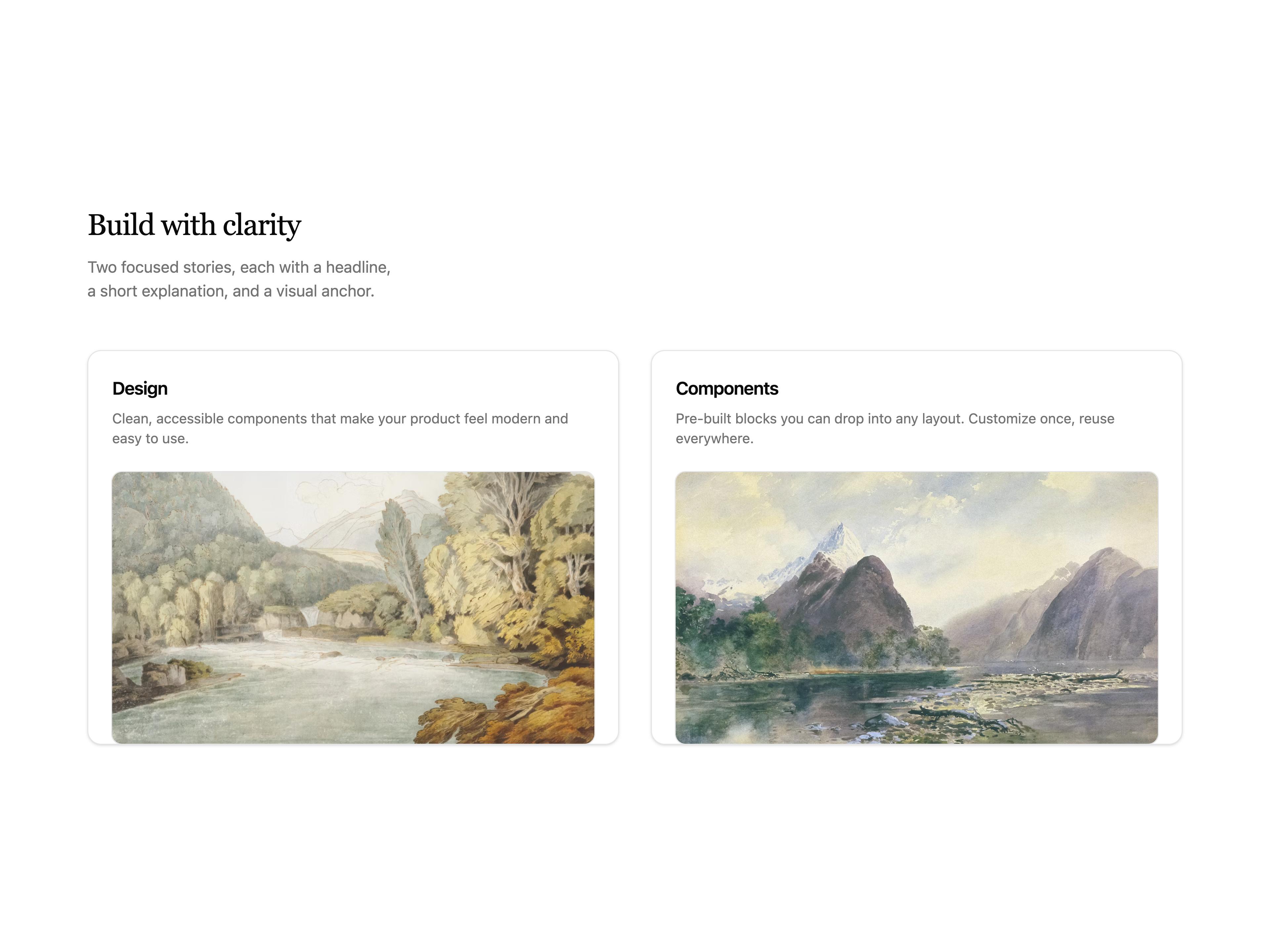
Two-column card grid with a serif section header, copy above each image, and subtle entrance motion.
A focus grid with items that can be focused and dimmed.
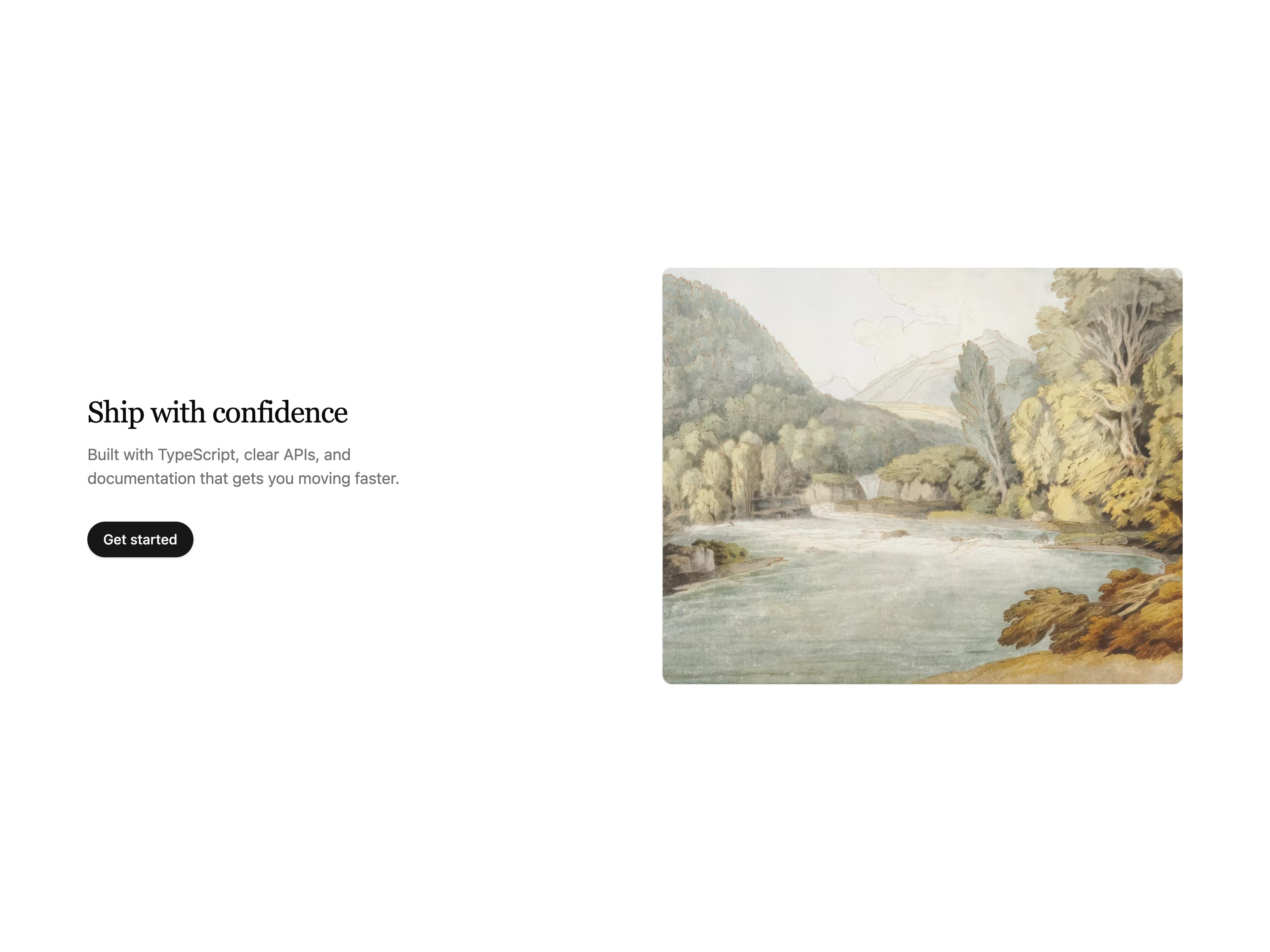
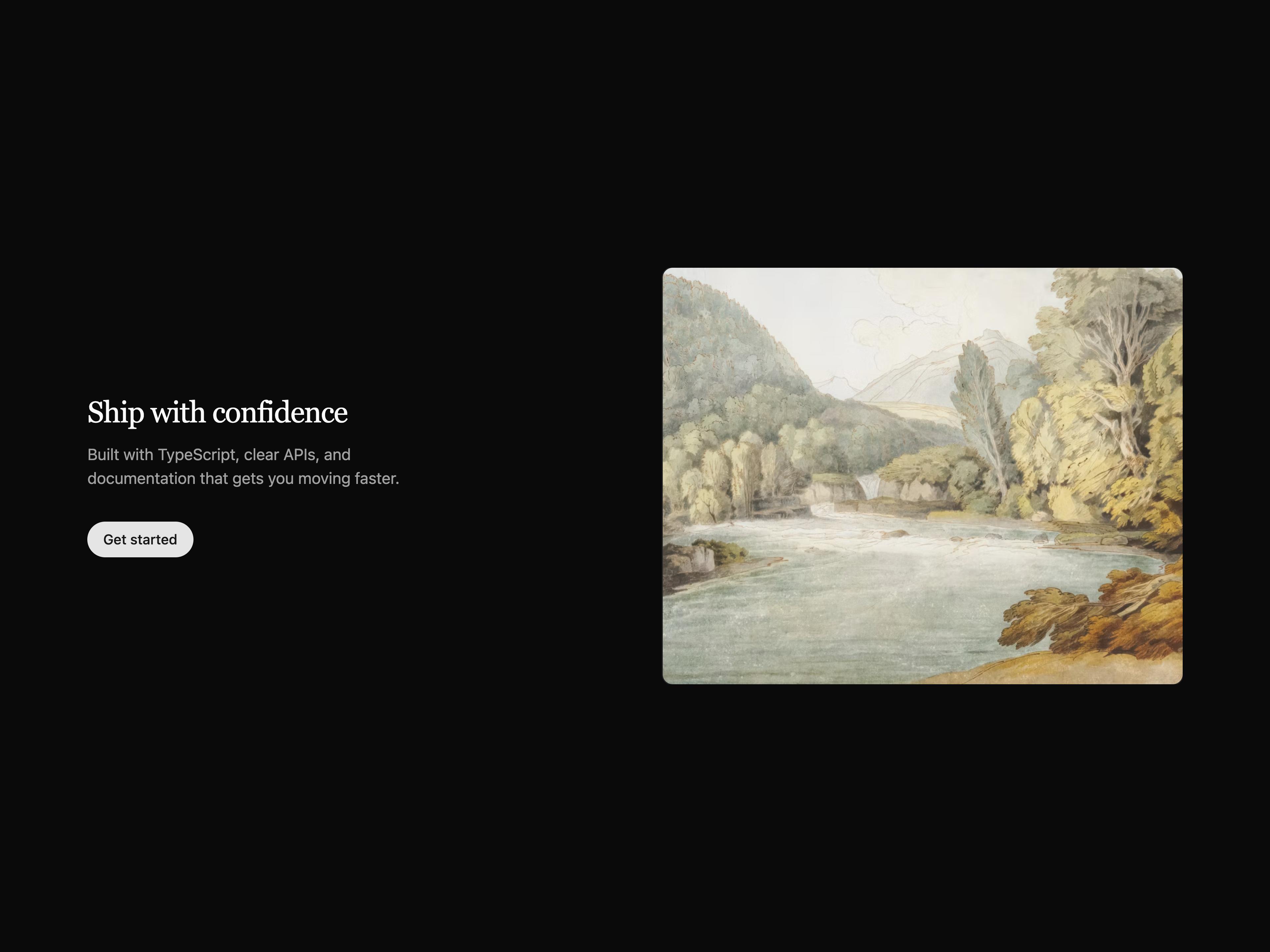
Two-column split with serif headline, supporting copy, optional CTA, and a media panel.
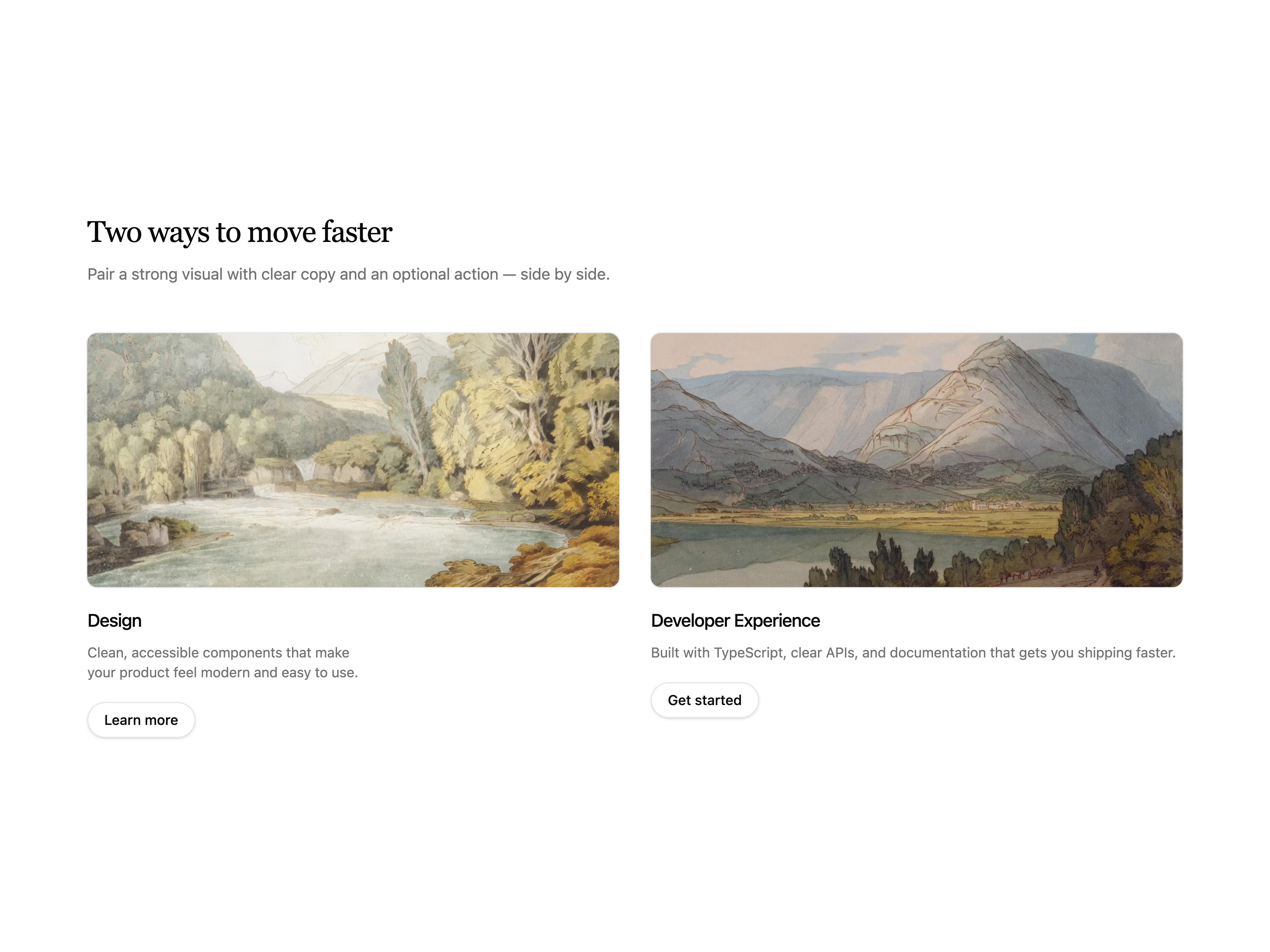
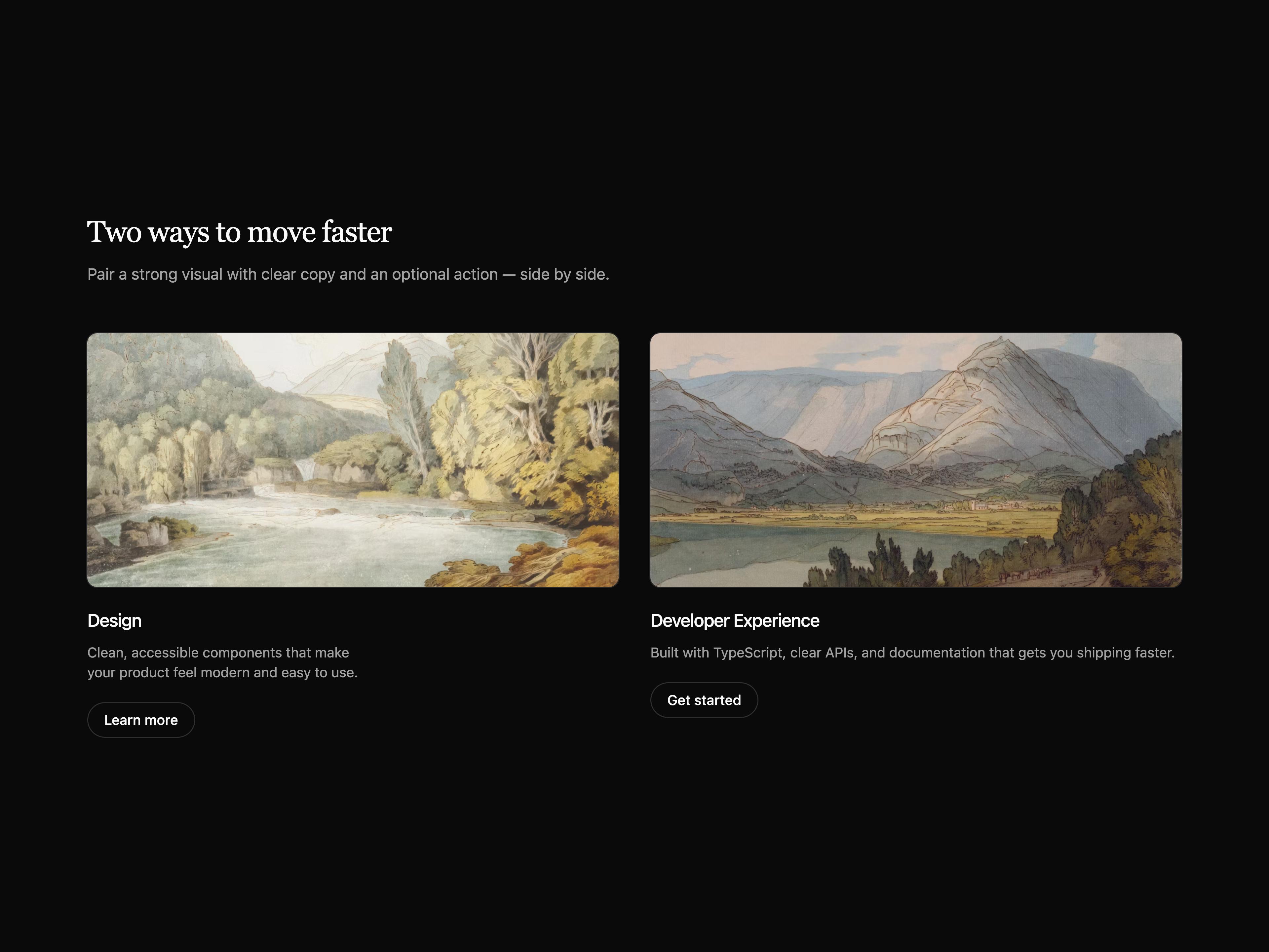
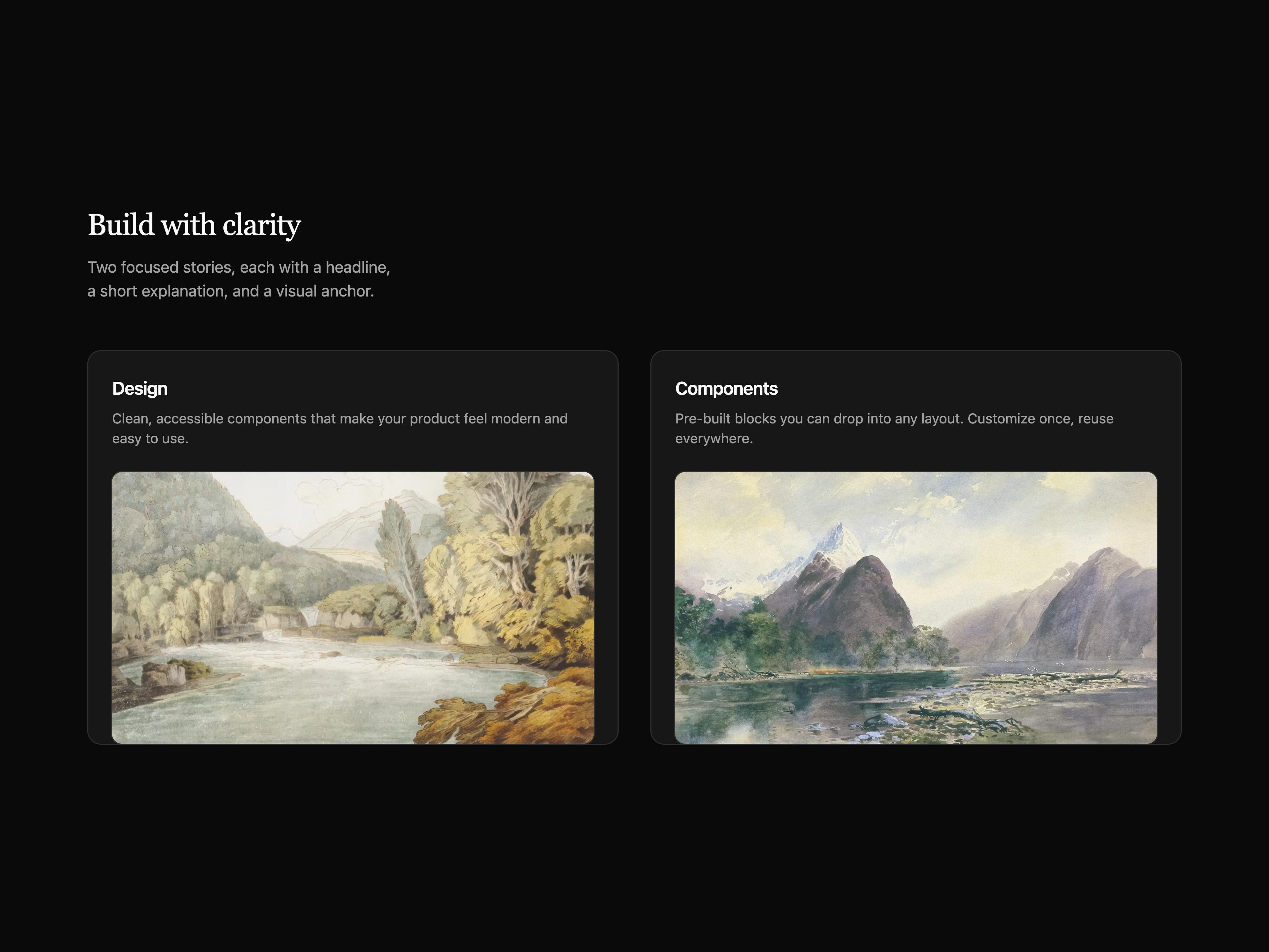
Two-column grid with serif header, media on top, copy, and optional CTA per column.
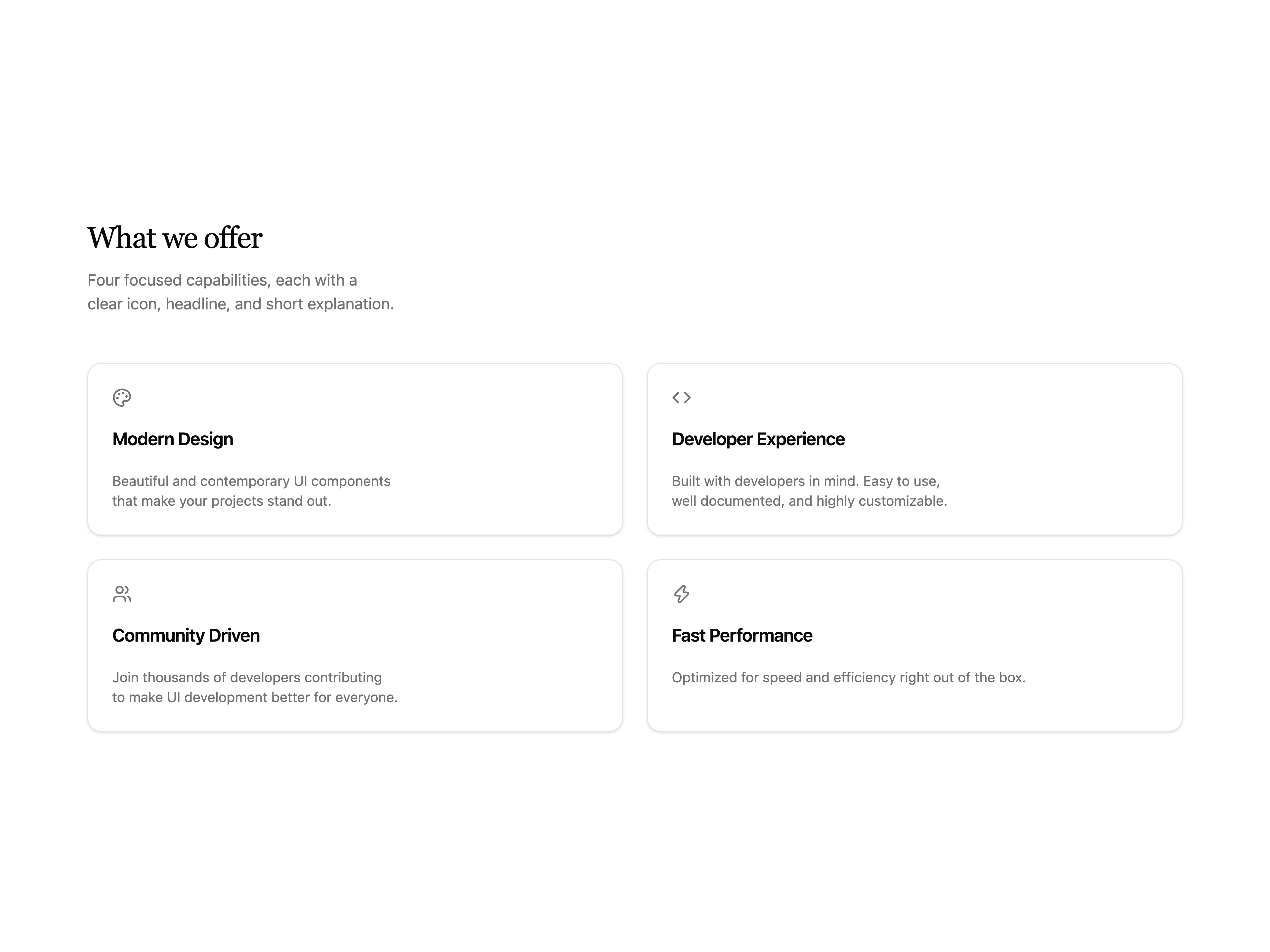
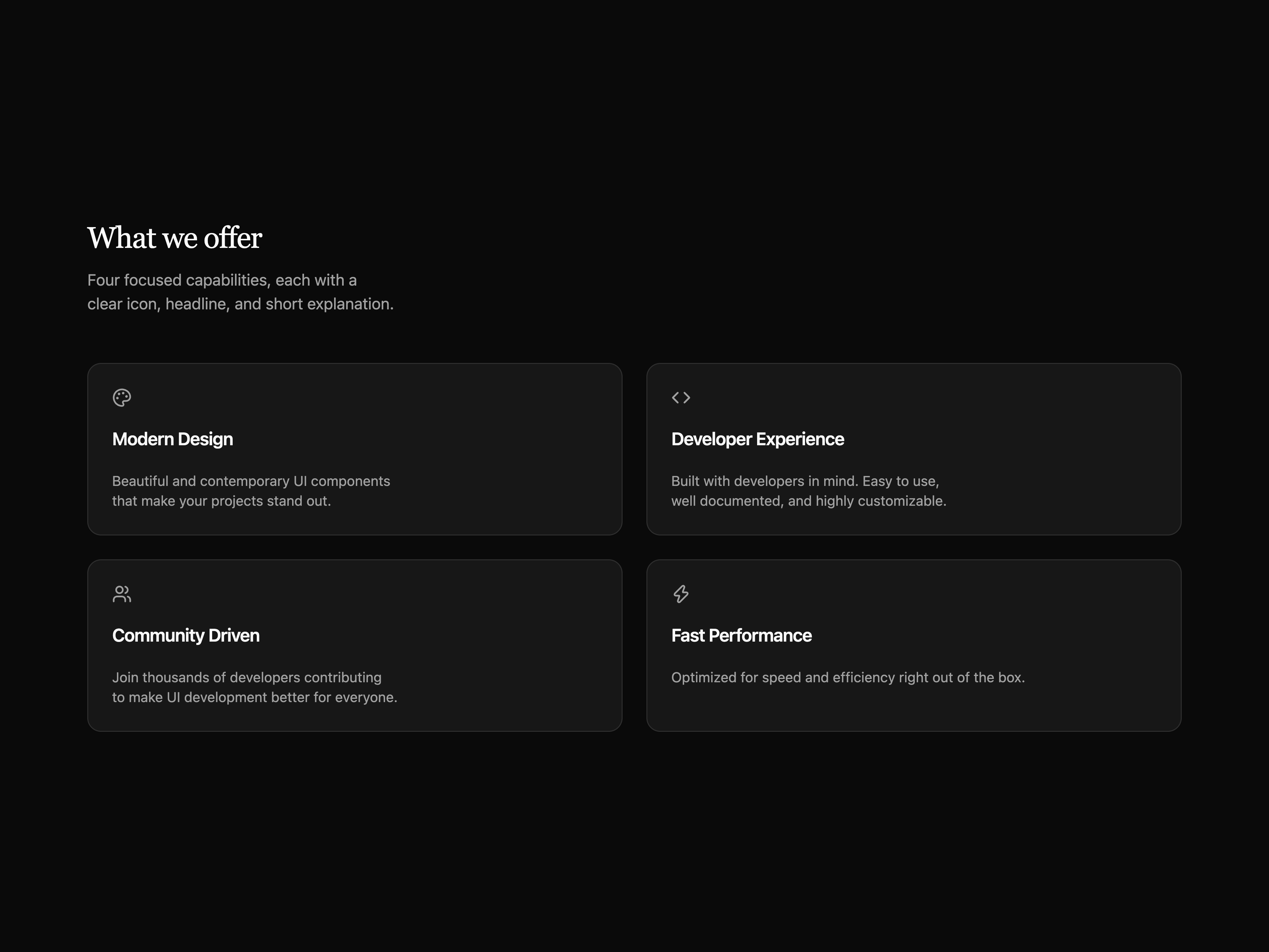
Two-column icon card grid with serif section header and subtle entrance motion.
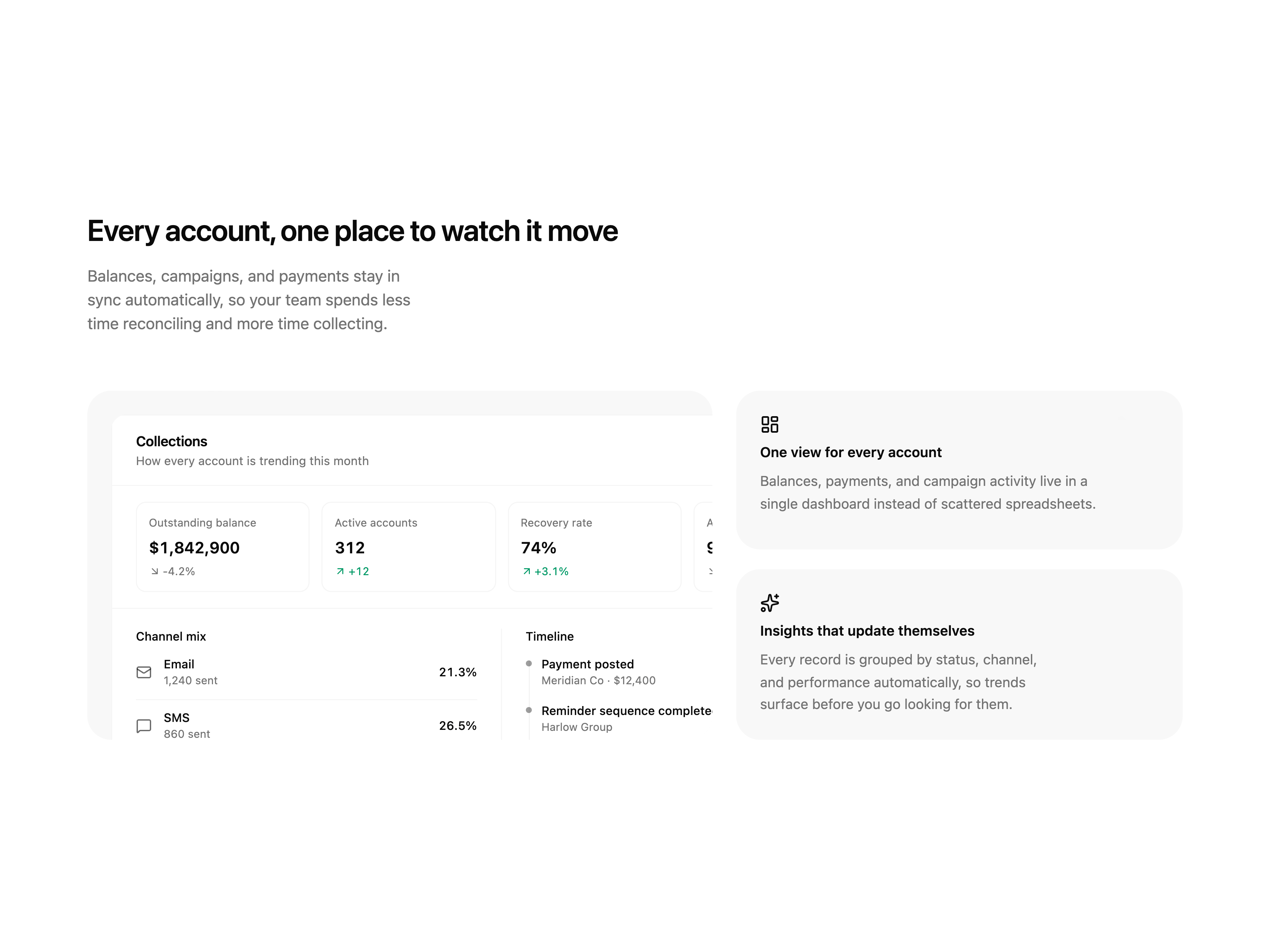
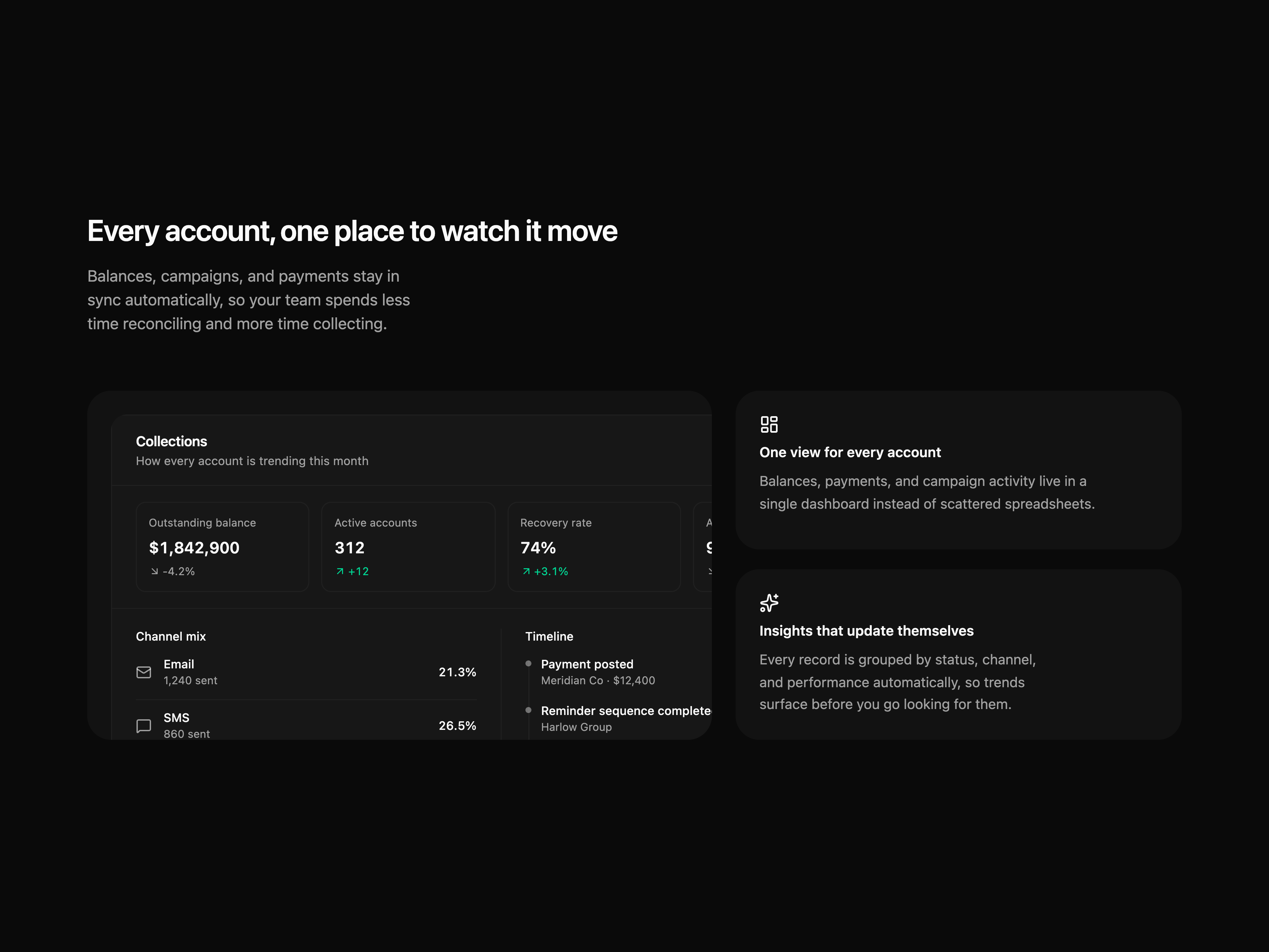
A billing overview split with a dashboard preview card and two feature highlights, built for the app-shell preset.
Shared CTA component with link and button variant
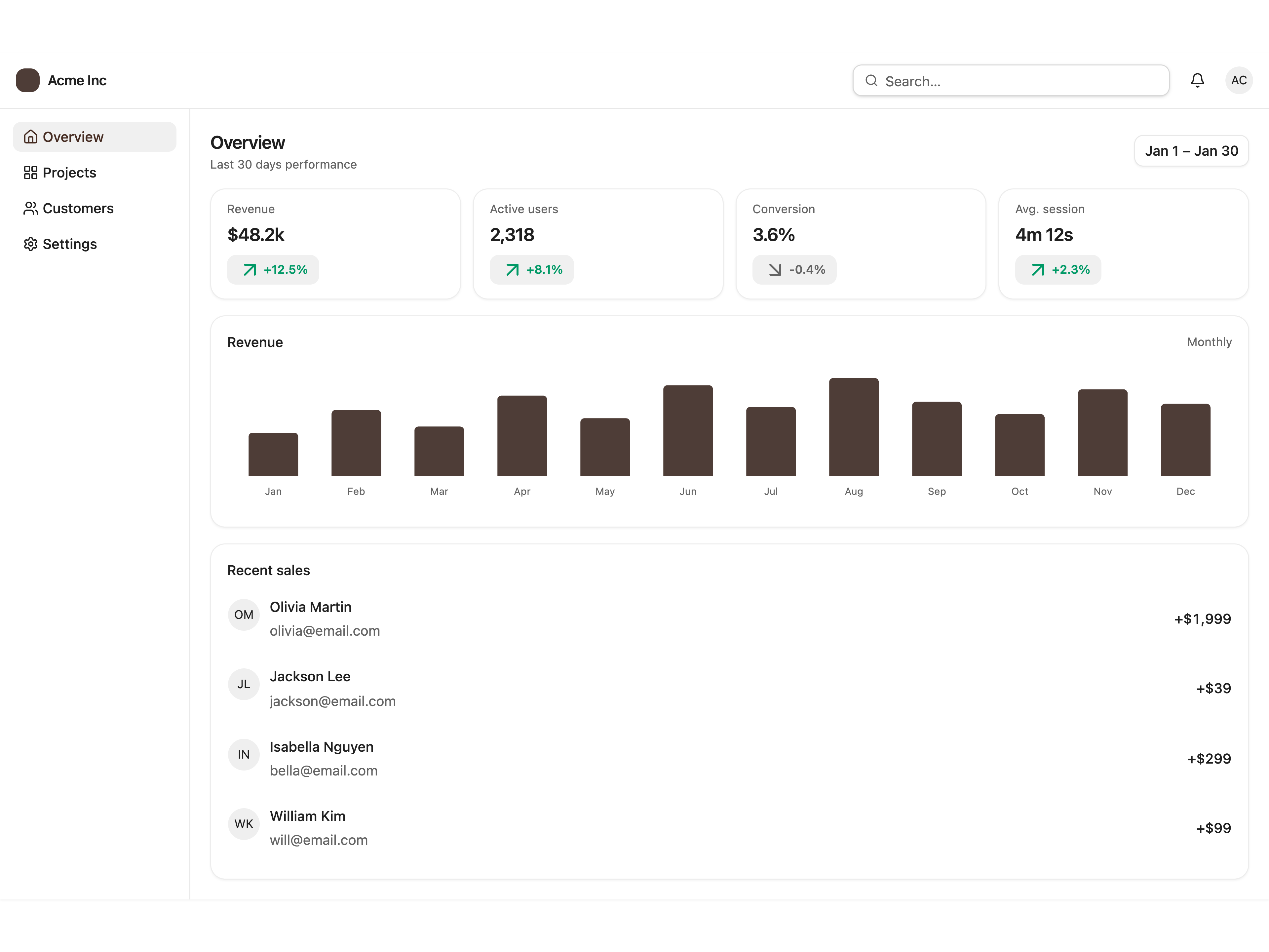
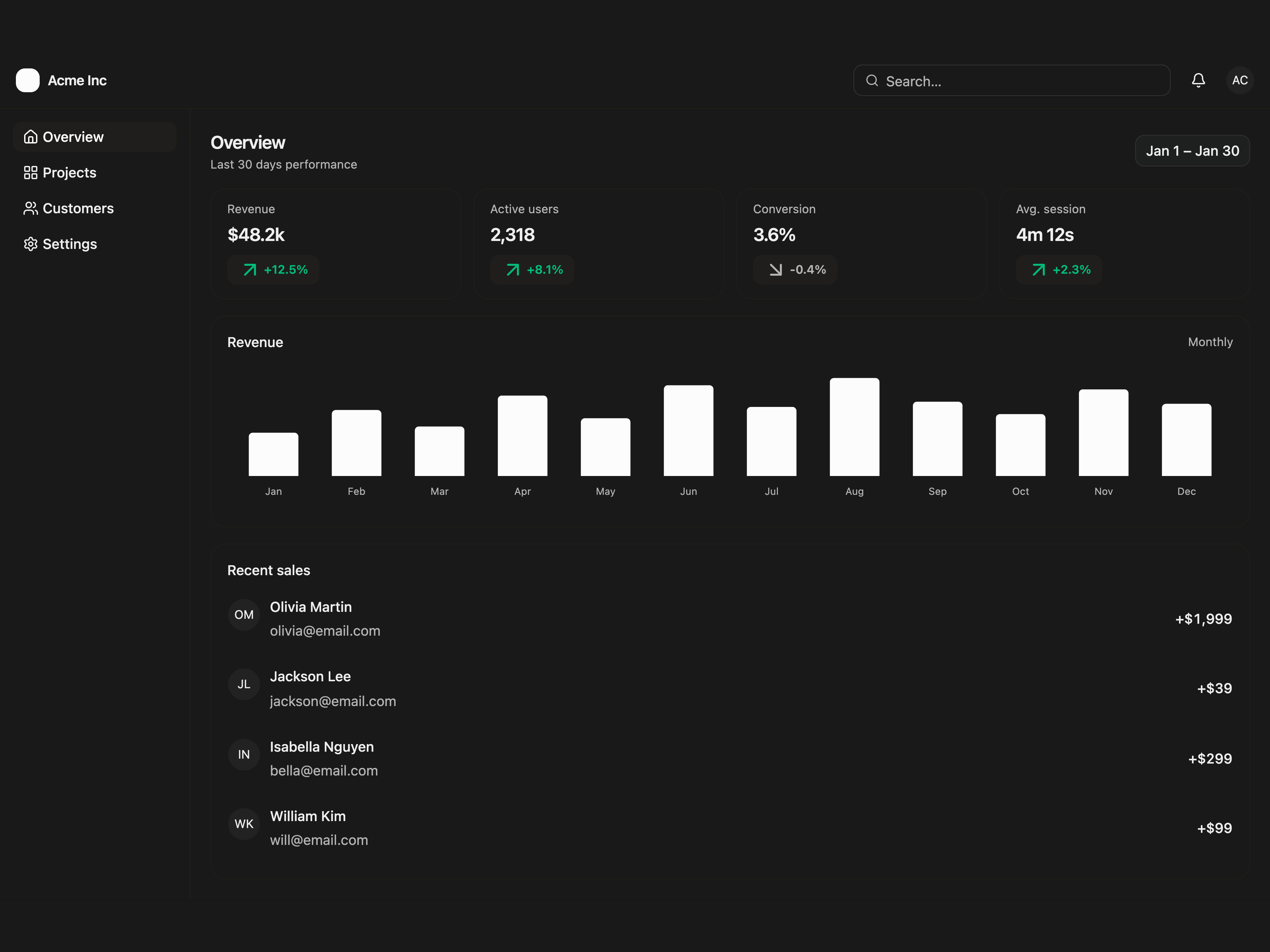
Sidebar, KPI cards, a bar chart, and a recent activity list.
Multi-Step for Delete Account.
Grace Period for Delete Account.
Polished yes/no with icon and clear hierarchy.
FieldGroup form with Save and Cancel footer.
Destructive warning with icon and emphasized copy.
Long scroll body; Accept and Decline pinned footer.
Readonly URL with copy control; minimal footer.
Header fixed; scrollable changelog-style body.
6-digit InputOTP with separator; Verify footer.
Compact hero image, title, and description; dual CTAs.
No corner close button; dismiss only through the footer.
Scrollable avatar rows with selection; Invite footer.
Completion check icon and Continue action.
Type delete to enable destructive button.
Notifications and Security blocks via Separator.
Thumbnail grid with selection ring.
Many fields in scroll; footer-only sticky.
Full-width footer buttons for mobile-friendly CTAs.
Dialog form with RHF, Zod resolver, and FieldError on invalid fields.
Dialog form with TanStack Form and Zod onSubmit validation.
Dialog stacked inside another dialog, e.g. avatar picker from profile.
Dialog triggered by a DropdownMenuItem with onSelect preventDefault.
Label, separator, and a list of action items.
Leading icons paired with trailing keyboard shortcuts.
Multiple labeled groups divided by separators.
A red destructive Delete action separated from the regular items.
Non-interactive items dimmed with the disabled prop.
Toggle multiple view options with checkbox items.
Radio items that keep exactly one option selected at a time.
A menu item that reveals a nested flyout panel with more options.
Avatar trigger with a name and email header block.
Per-row ellipsis menu with edit, copy, and remove.
Menu whose open/closed state is managed externally and reflected in the trigger label.
Checkbox items with a count badge and a clear action.
Bell trigger with an unread badge and an activity list.
A menu item opens a controlled confirmation dialog.
Controller binds a radio group to RHF; Zod requires a selection.
A dynamic icon component with a name and size.
Icon, title, and description for an empty list.
First-run state with primary and secondary CTAs.
Empty inbox state composed inside a Dialog.
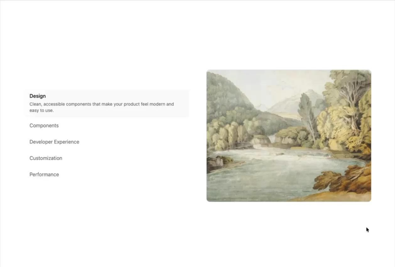
List of items: select one to reveal its description and media.
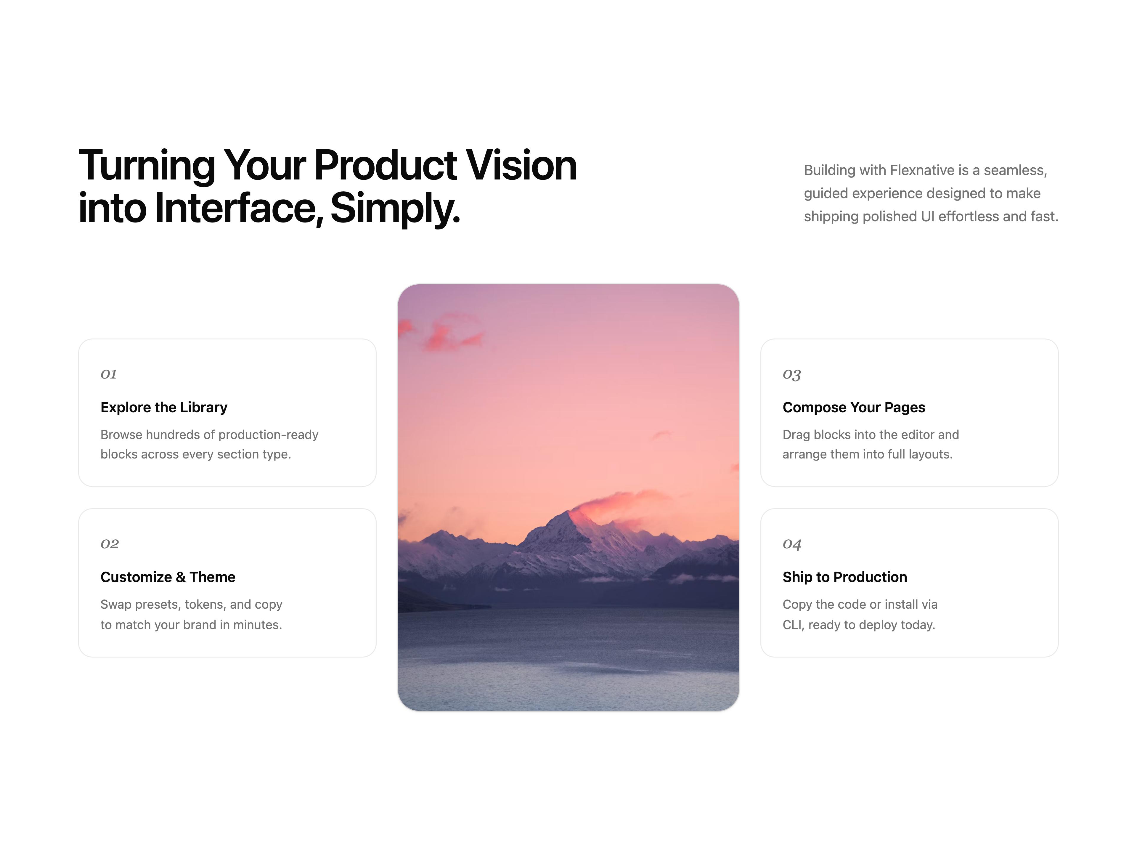
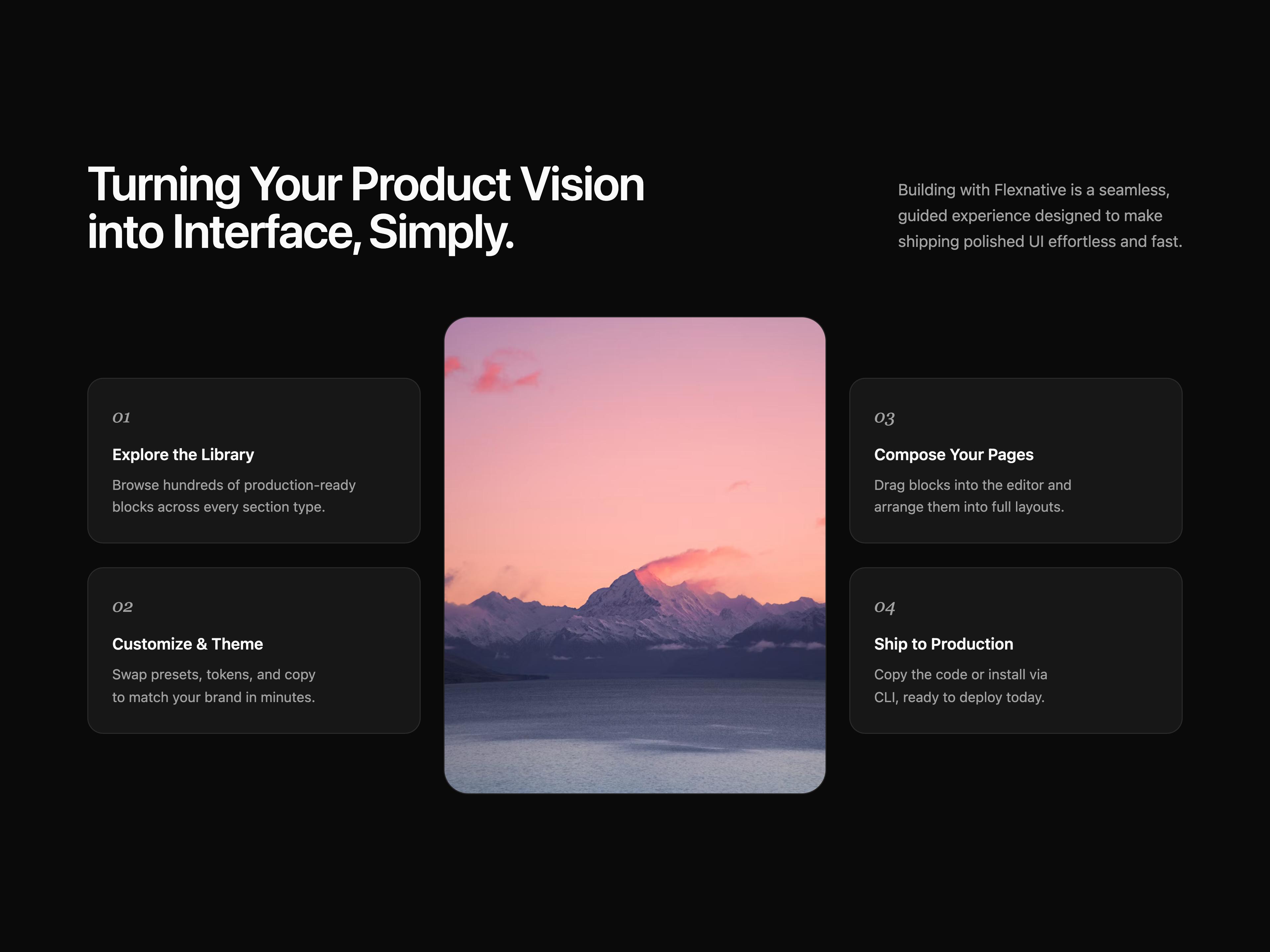
A process section with a split title/description header and a portrait image flanked by two columns of numbered step cards.
A sticky title/description column paired with a scrolling list of features, each with its own title, description, and media.
A split-copy hero with a light product studio mock — issue feed, properties, and a floating agent panel that fades into the page.
Asymmetric editorial hero with serif brand title, supporting copy, and two overlapping media frames.
Plain text input with a placeholder, no addons.
Input with trailing search icon addon.
Text input rendered in a disabled, non-interactive state.
Password input with a trailing eye-off icon to indicate visibility toggle.
URL input with a fixed "https://" prefix and ".com" suffix text addons.
Spinning loader in the trailing addon while searching.
Clear button appears in the trailing addon when the field has text.
Help icon in the trailing addon opens a tooltip on hover.
Info button in the trailing addon opens a popover with helper content.
Trailing addon button opens a menu to choose search scope.
Labeled text input with a supporting description line below the field.
Controller binds Input to RHF; Zod resolver drives FieldError on submit.
form.Field wires Input; Zod onSubmit validator surfaces FieldError when touched.
ButtonGroup pairs a text input with a trailing search action button.
Nested ButtonGroup: currency Select, amount input, and submit icon button.
Username field with a fixed @company.com suffix addon, locking the email domain.
Attach button plus InputGroup message field and send action in a ButtonGroup.
Title plus supporting description.
Default, outline, and muted variants side-by-side.
Default, sm, and xs sizes side-by-side.
Leading icon placed before the title and description.
User avatar photo placed before the name and subtitle.
Small image thumbnail placed before the title and subtitle.
Avatar, name, role, and a trailing action button.
Status badge above the title and a metadata row below the description.
The entire row is clickable, navigating to a URL with a trailing arrow icon.
Multiple rows grouped together with thin dividers between each row.
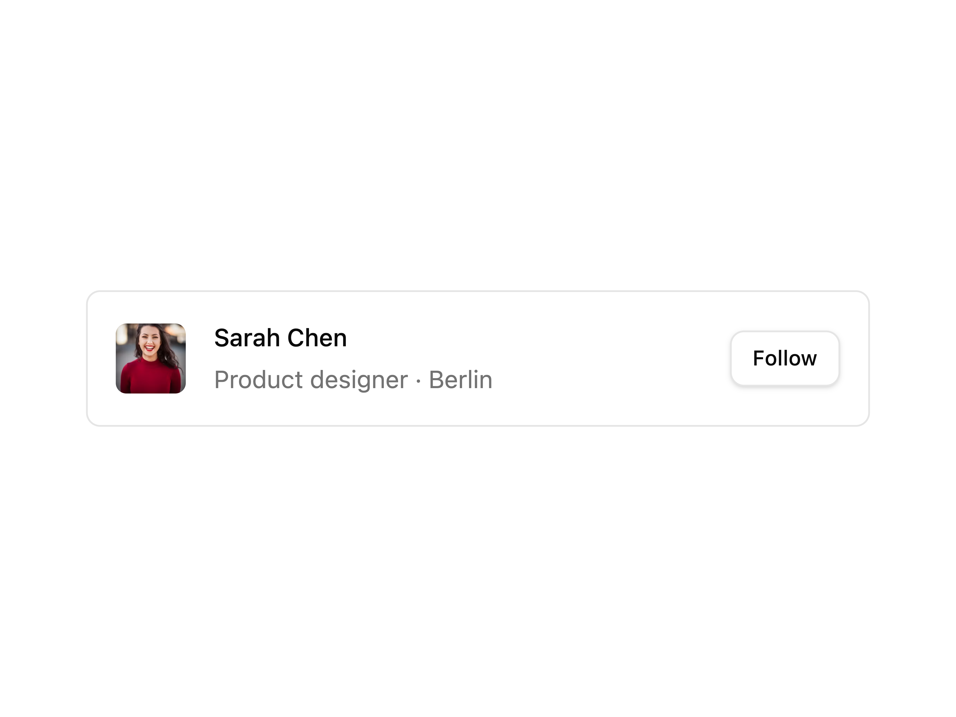
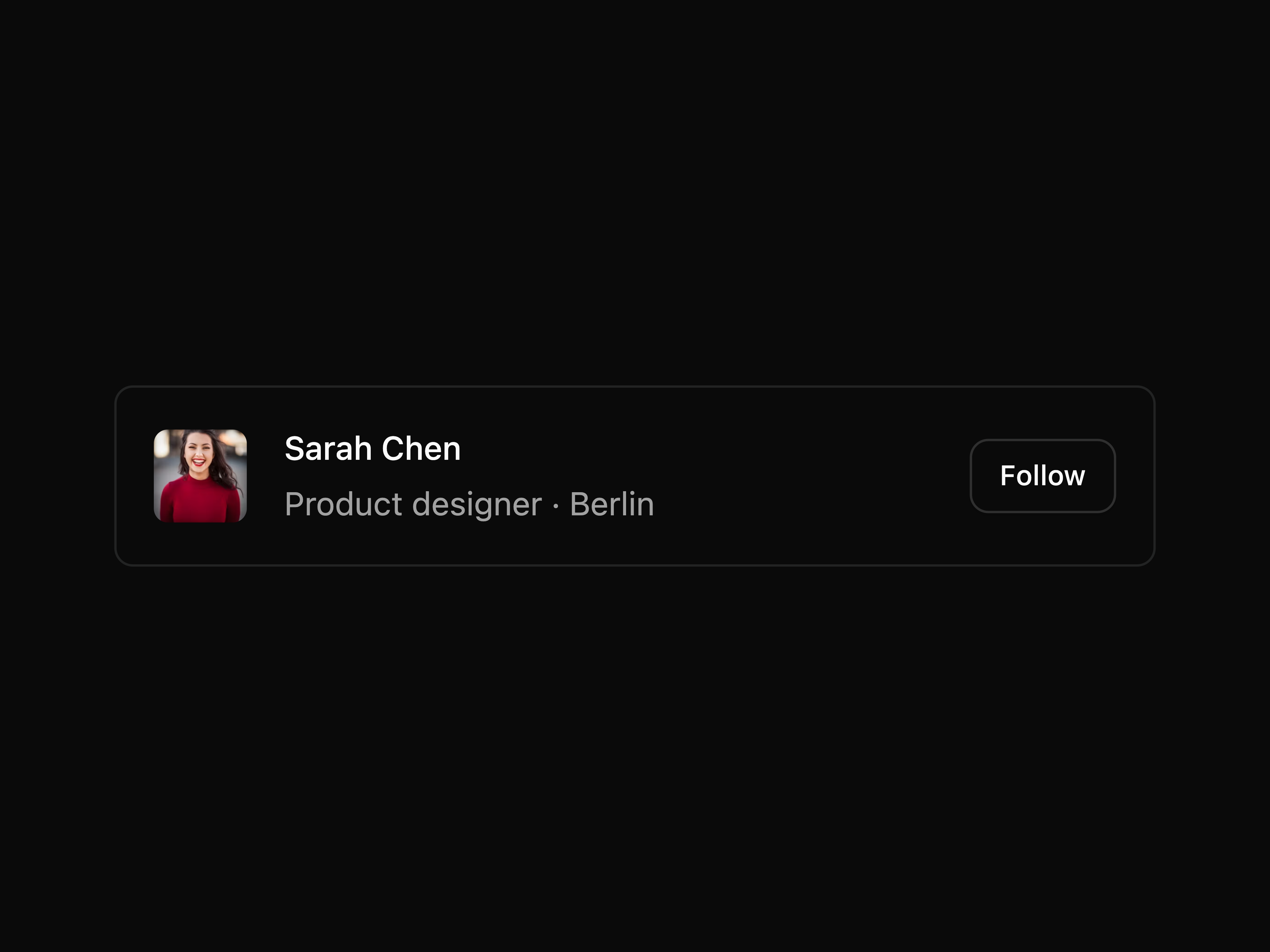
Avatars with name, role, and Follow action per row.
Leading icon, title with an unread dot indicator, and a trailing timestamp.
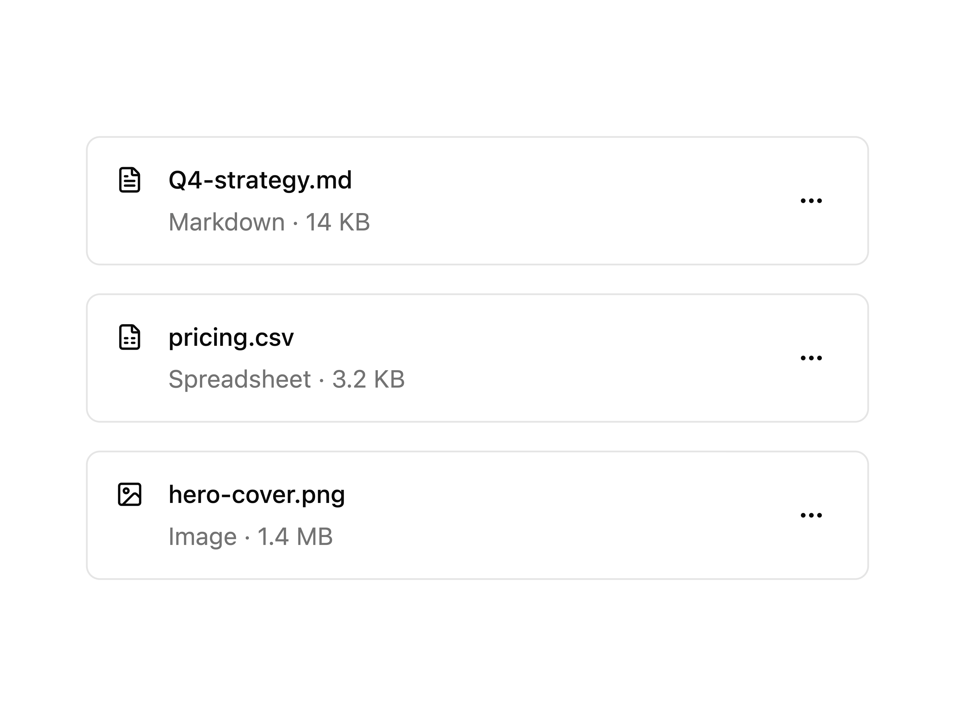
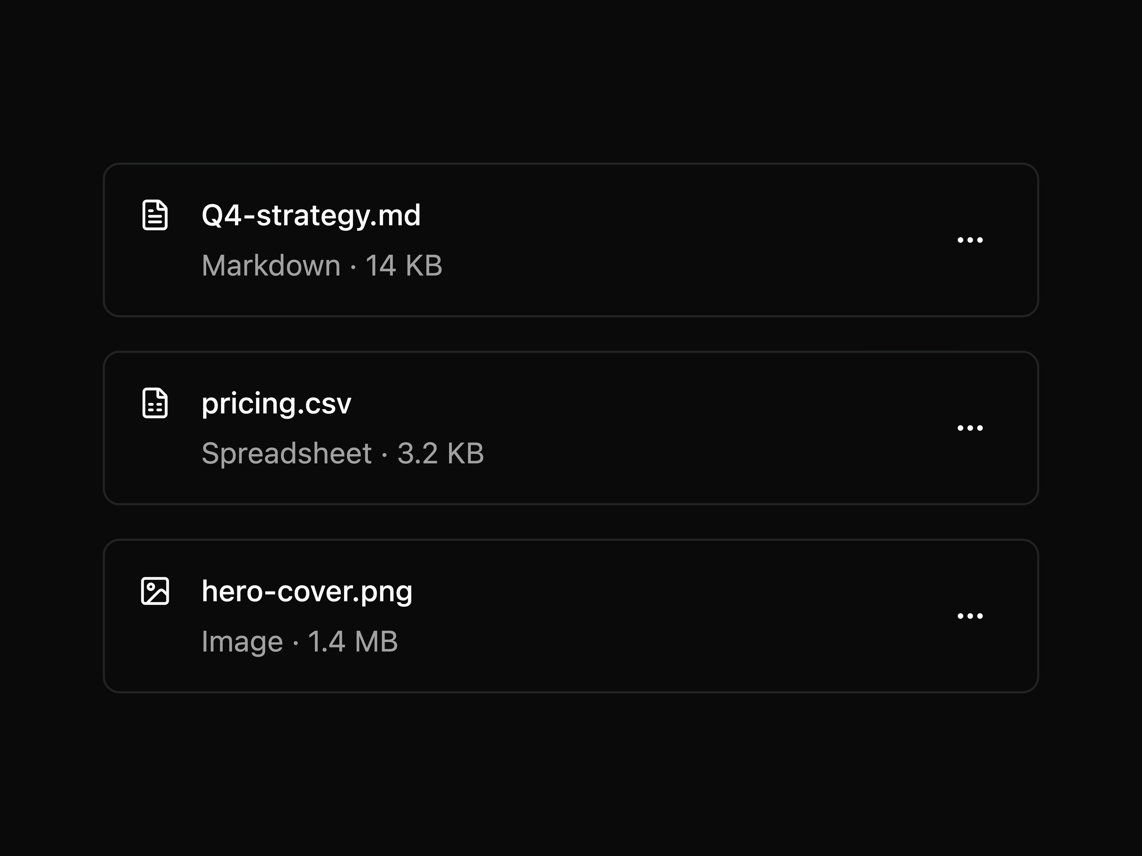
File icon, name, size metadata, and a trailing overflow menu with actions per row.
Title and description with a trailing Switch.
Brand icon, status badge in title, connect Switch.
Stacked KPI rows with label, value, and trend delta.
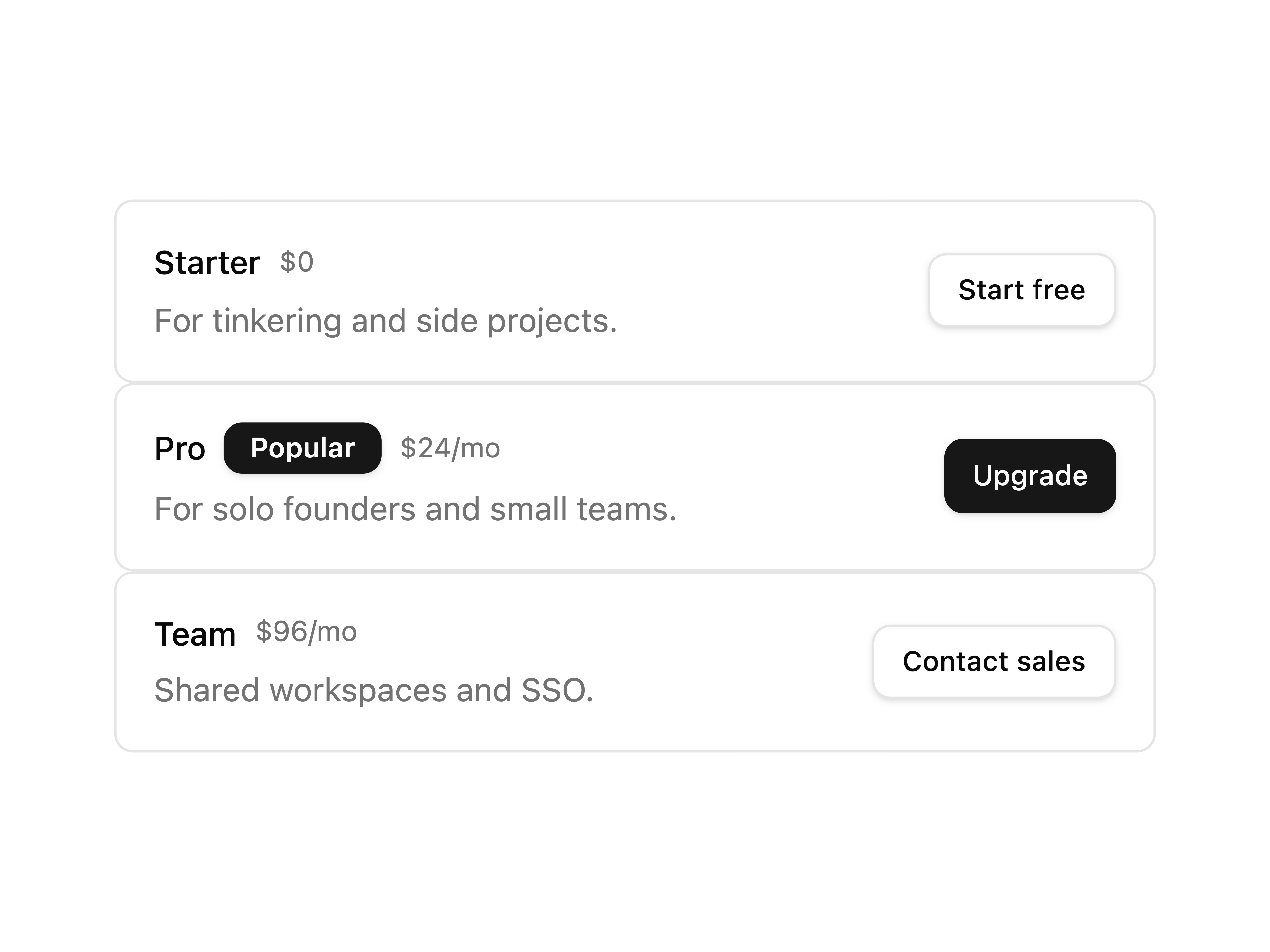
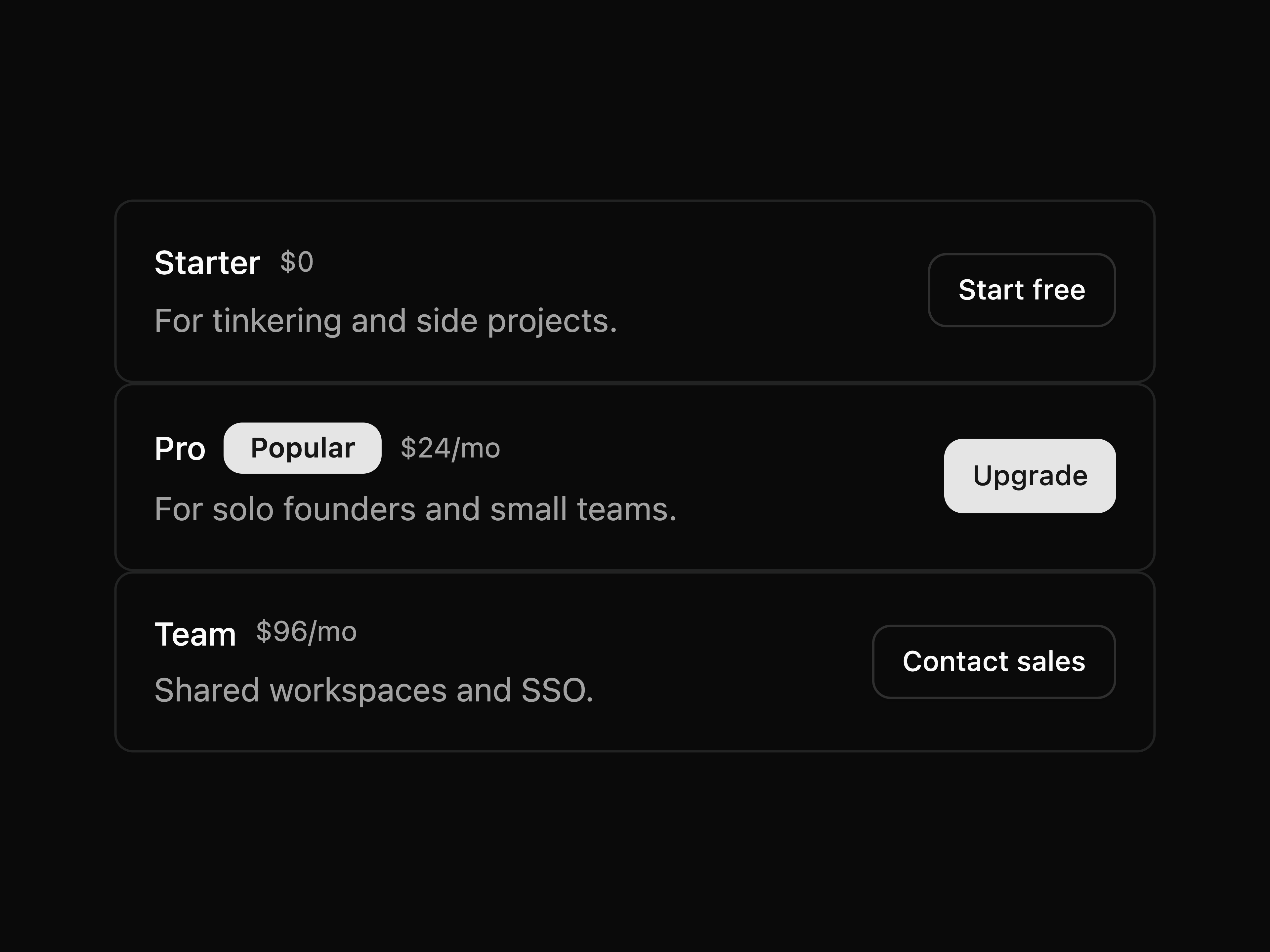
Stacked tier rows with Popular badge, price, and CTA button.
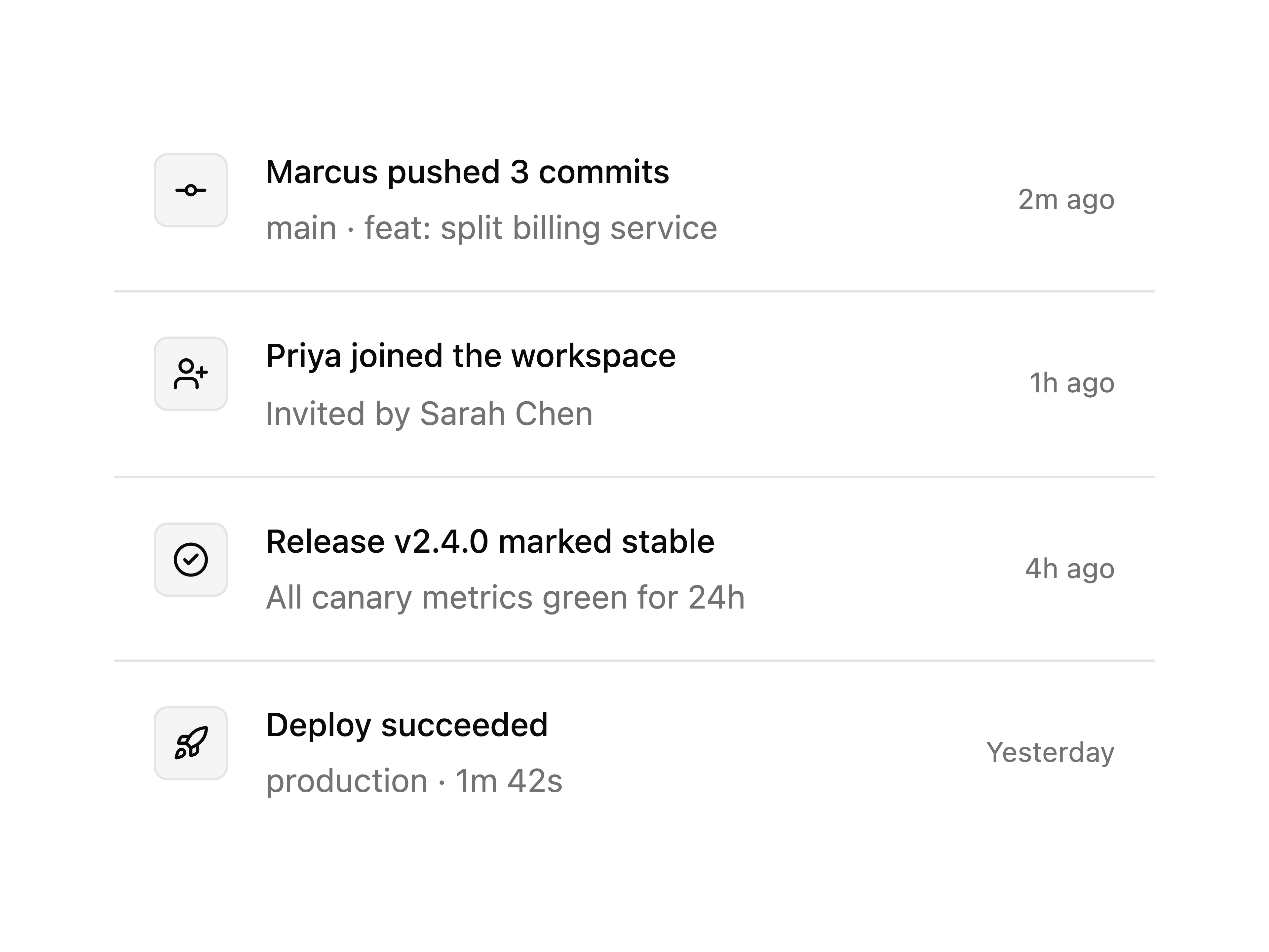
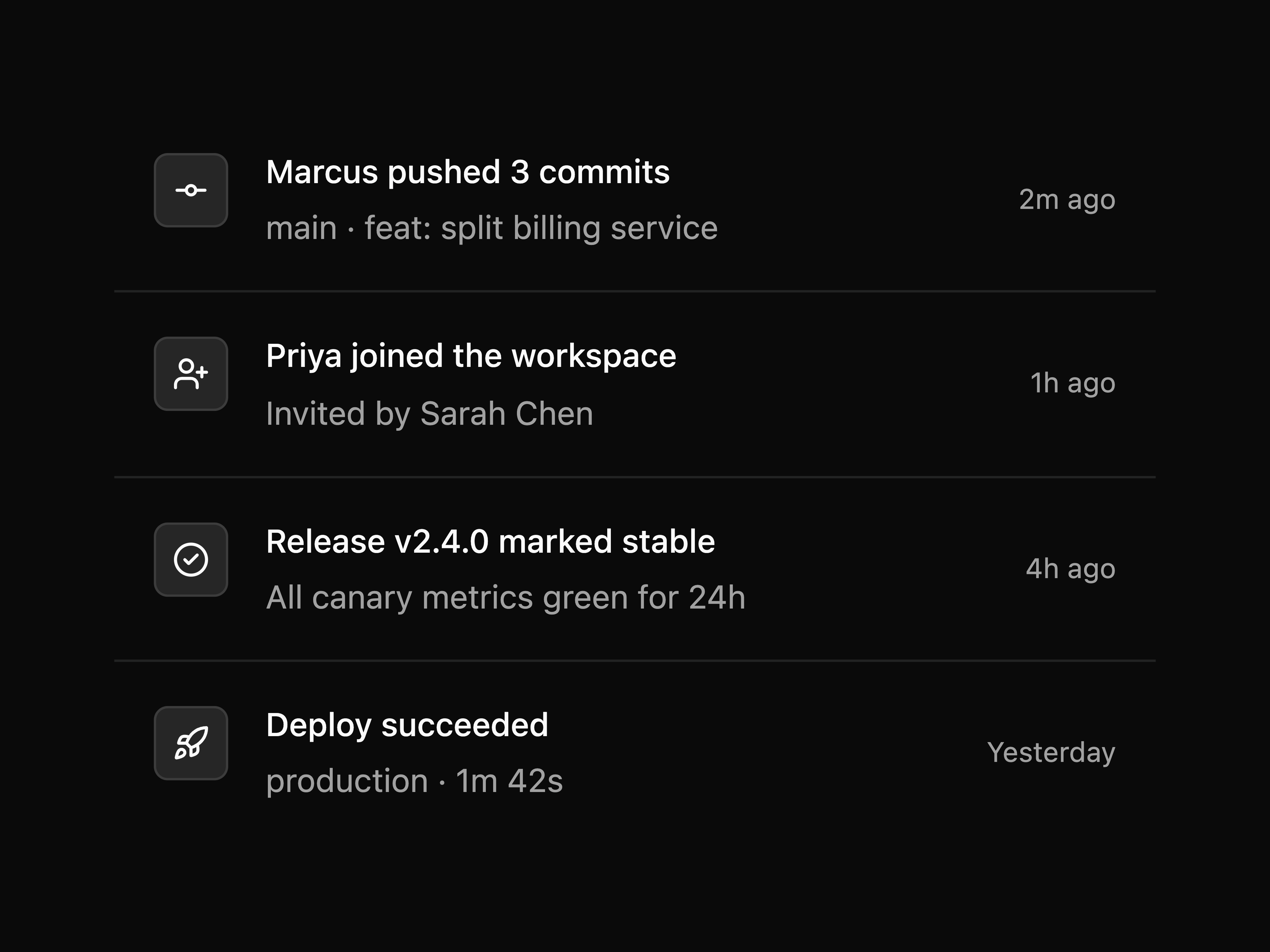
Icon timeline rows with relative time footer.
Compact user avatar and email placed at the top of a dropdown menu.
File rows with image thumbnails displayed inside a floating popover panel.
Overlapping avatar stack above an empty-state message with an invite button.
Avatar Stack for Live Presence.
Activity Status for Live Presence.
Logo carousel with auto-scroll, edge gradient and minimalist style.
Plan Overview for Manage Subscription.
Change Plan for Manage Subscription.
Cancel Flow for Manage Subscription.
Page-size select with first, prev, next, and last.
Two linked cards with titles for adjacent articles.
Carousel-style dots; the active page expands to a pill.
Numeric input to jump directly to any page.
Default popover with a button trigger and simple text.
Popover with a bold title and a short description below it.
Place the popover on top, right, bottom, or left of the trigger.
Align the content to the start, center, or end of the trigger.
Override the default width via className on PopoverContent.
Form with inline labeled inputs for width, max-width, height, and max-height.
Switches with labels and descriptions inside the popover.
Swatch grid with a check icon on the active color.
Readonly URL input with a trailing copy button.
Notification rows with an icon, message text, timestamp, and unread indicator dot.
Banner image, avatar, bio, and follow / message actions.
Thumbnail grid with a selection ring for choosing a cover image.
Grouped toggle button filters for status and priority, with reset and apply actions.
Scrollable list of team members with avatars and roles inside a fixed-height popover.
Activates a preset for a subtree by writing the data-preset attribute. Required by every preset.
Cream paper and burnt-earth ink. Warm off-white surfaces, a deep brown primary, soft warm-tinted shadows and a generous radius, built for editorial serif headlines and watercolor art.
The Flexnative shell as shipped: near-neutral surfaces, a warm charcoal primary, soft gray chrome and the same radius and shadows as the app itself.
Security Questions for Reset Password.
Build an invoice while a dialog validates each line item against its own schema.
Single-select toggle group bound via Controller with Zod validation.
Grouped select with labelled option groups bound via Controller.
Searchable combobox using Command inside a Popover, bound via Controller.
Subscribe with an email and a delivery frequency.
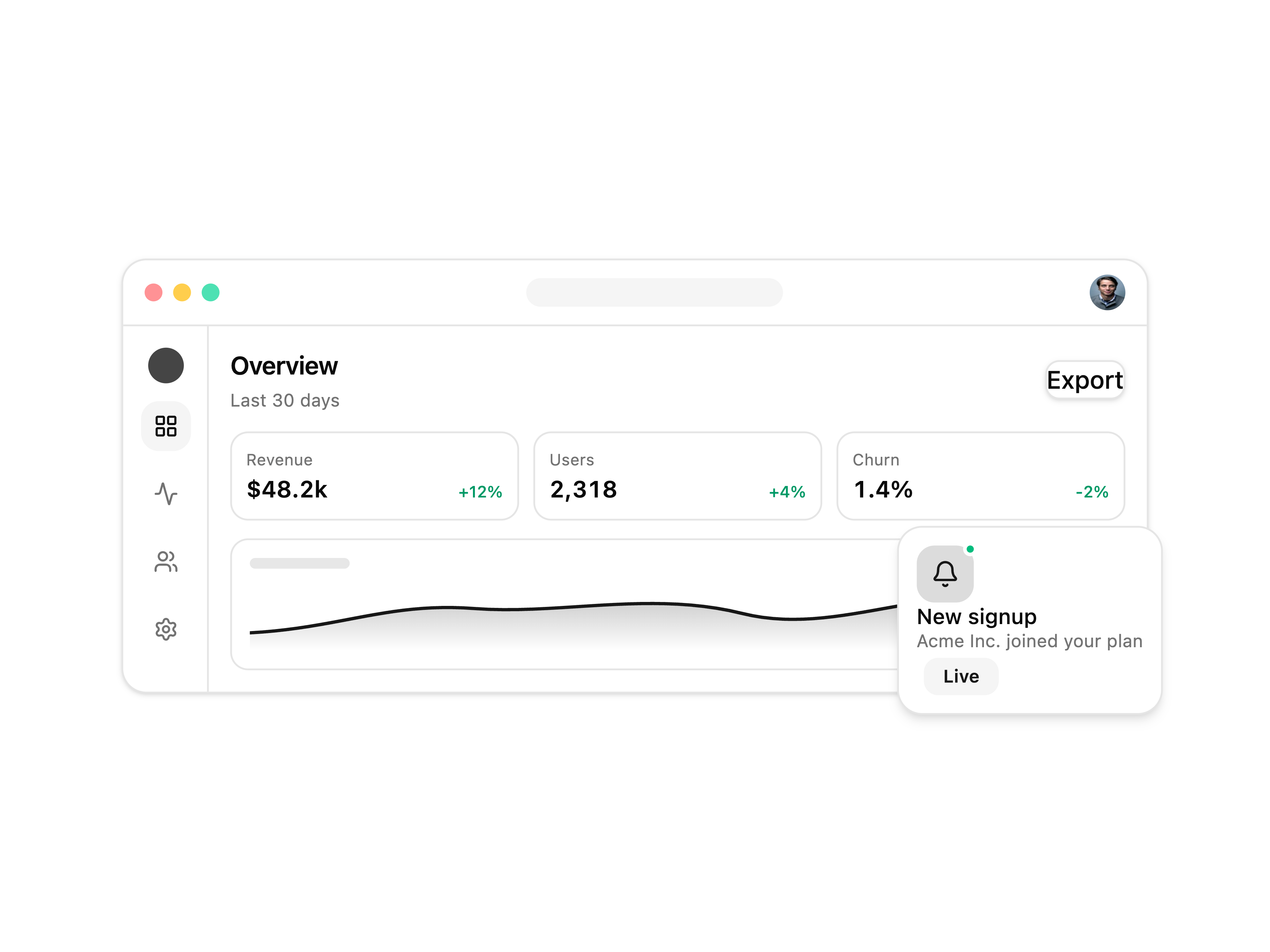
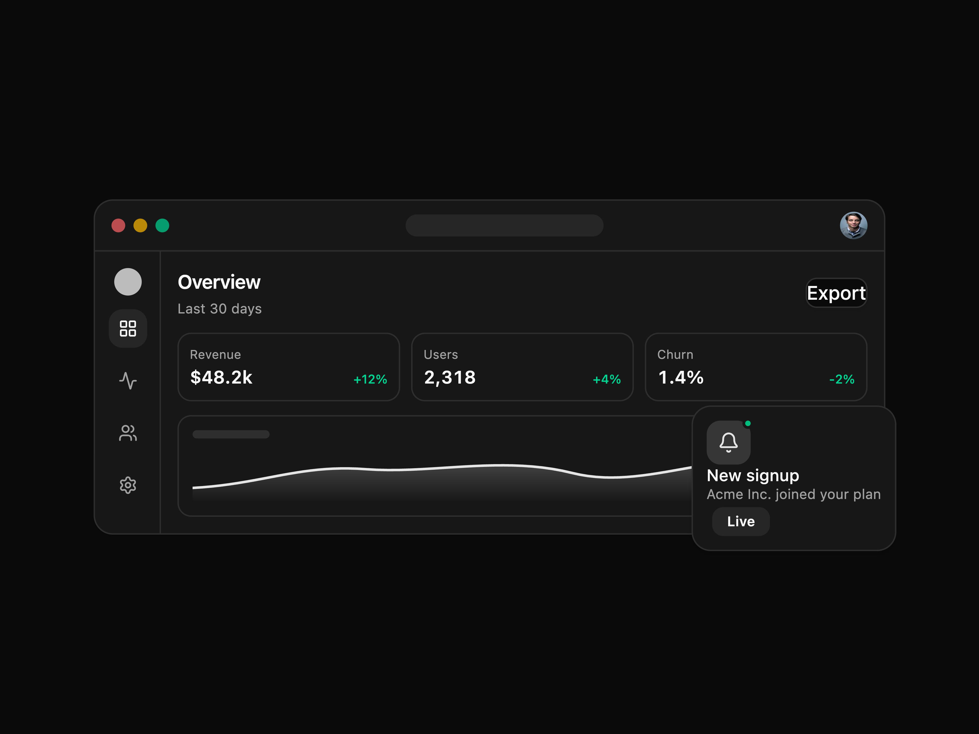
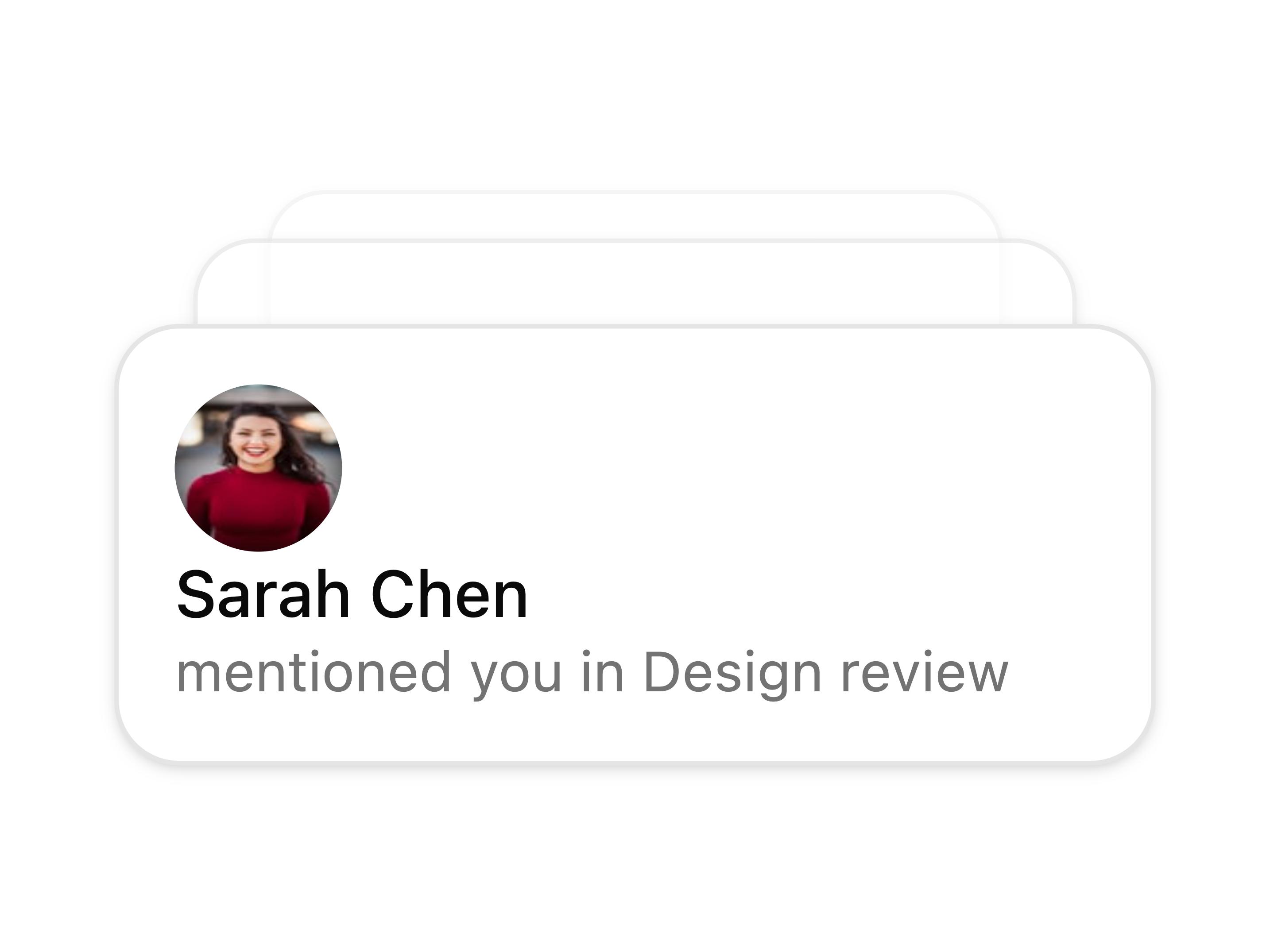
A layered app dashboard with a floating notification.
Options organized into labeled groups.
Options with leading icons.
Dropdown opens in popper position anchored below the trigger with a small offset, giving a tooltip-style layout.
Fixed leading icon in the trigger alongside the selected value; dropdown options are text only.
Tiered Cards for Select a Plan.
Audience Segments for Select a Plan.
Usage Slider for Select a Plan.
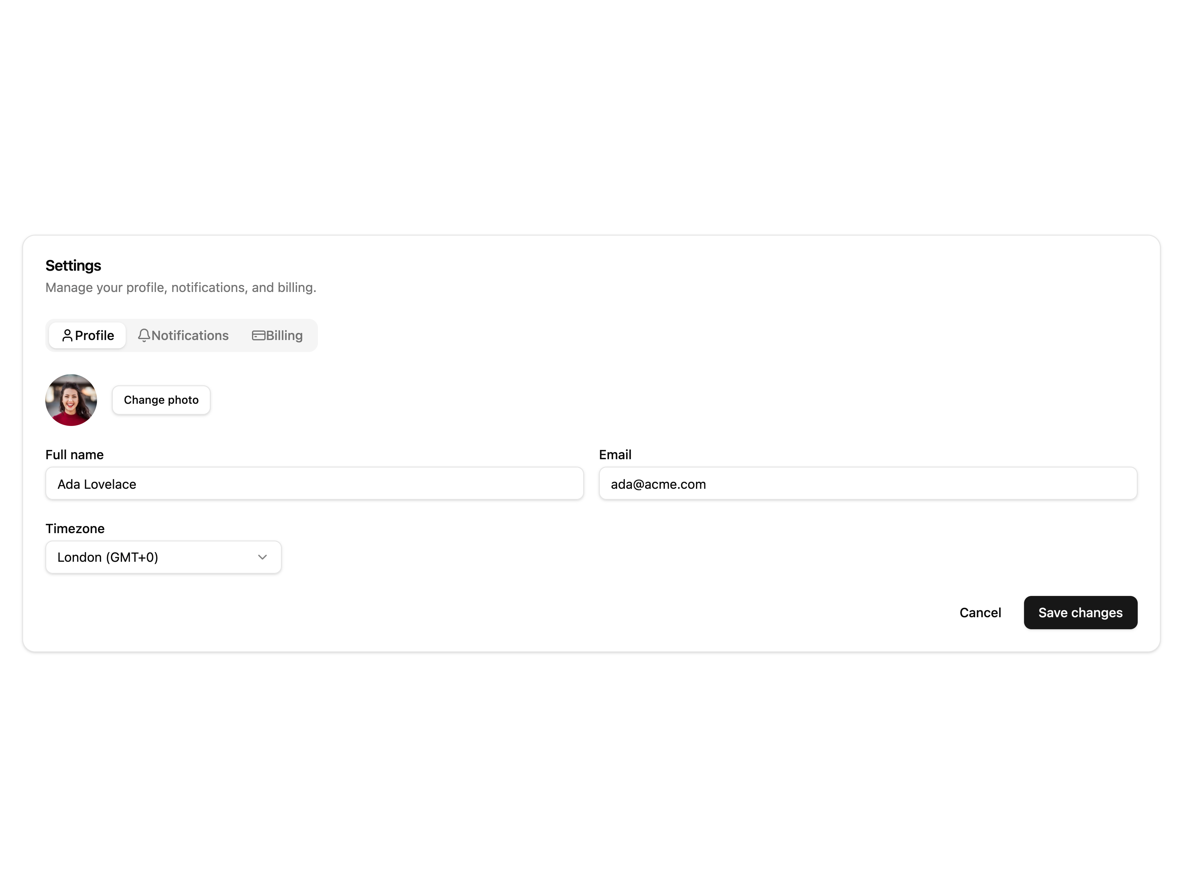
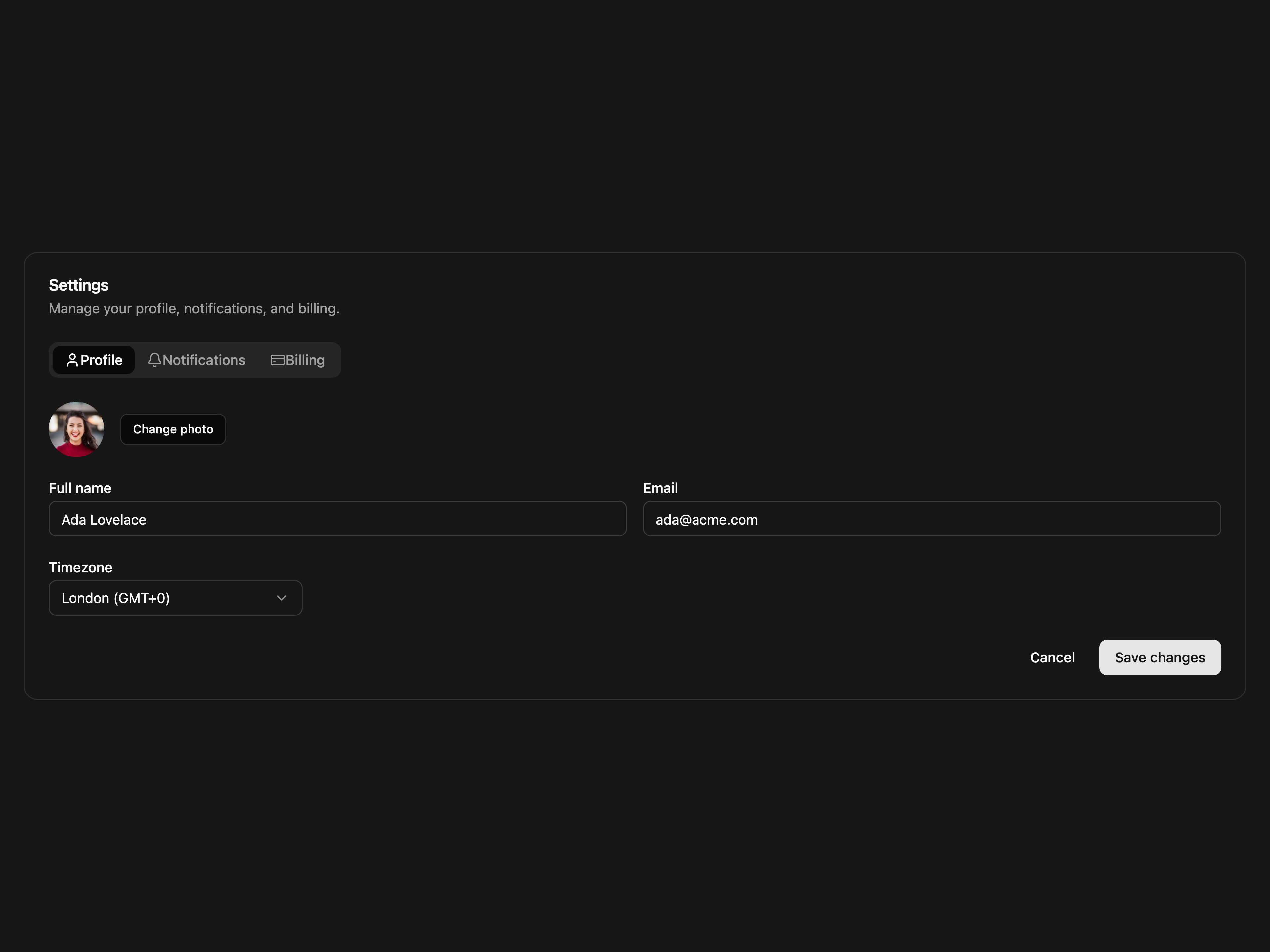
Tabbed Sections for Settings.
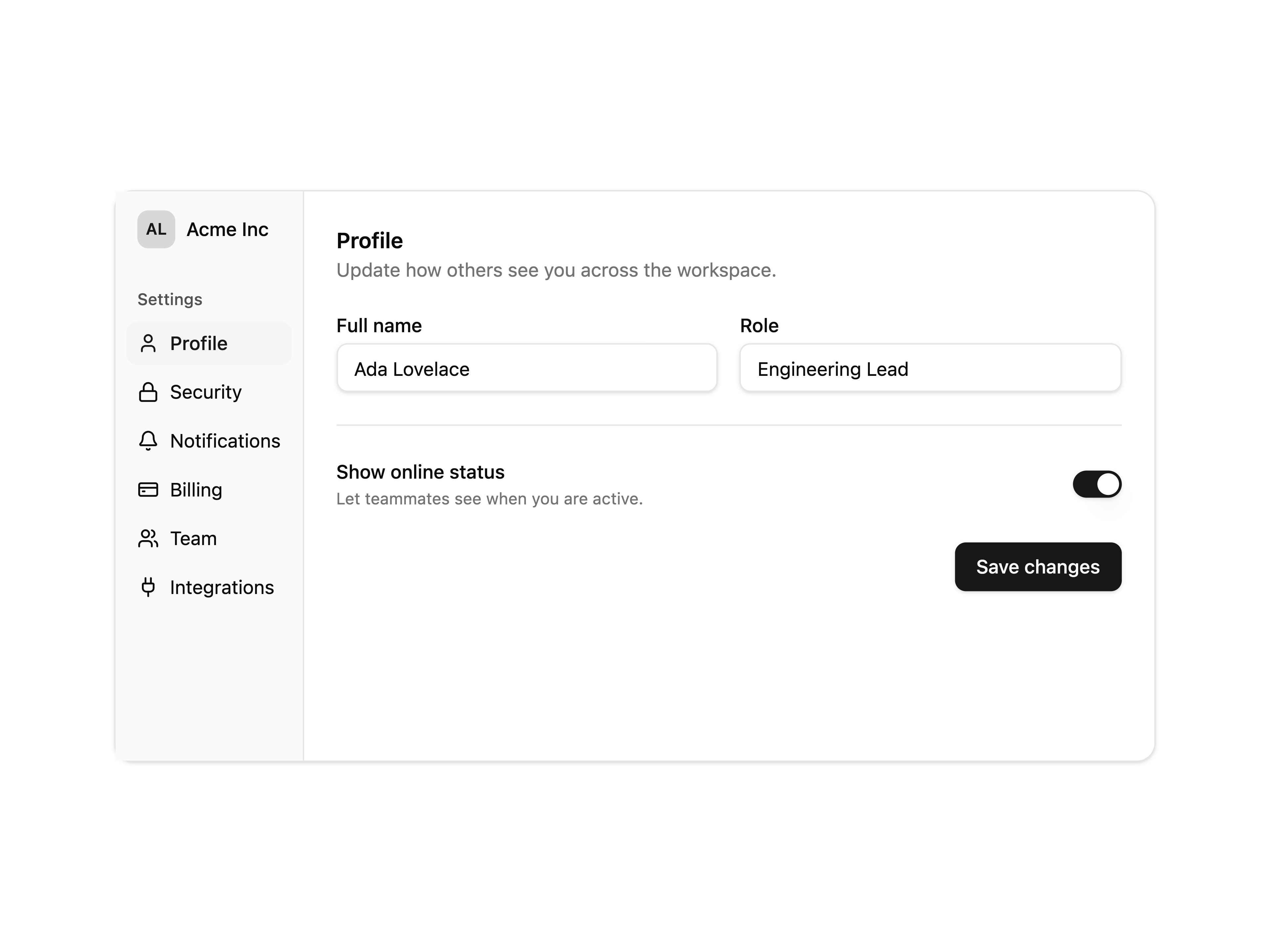
Sidebar Layout for Settings.
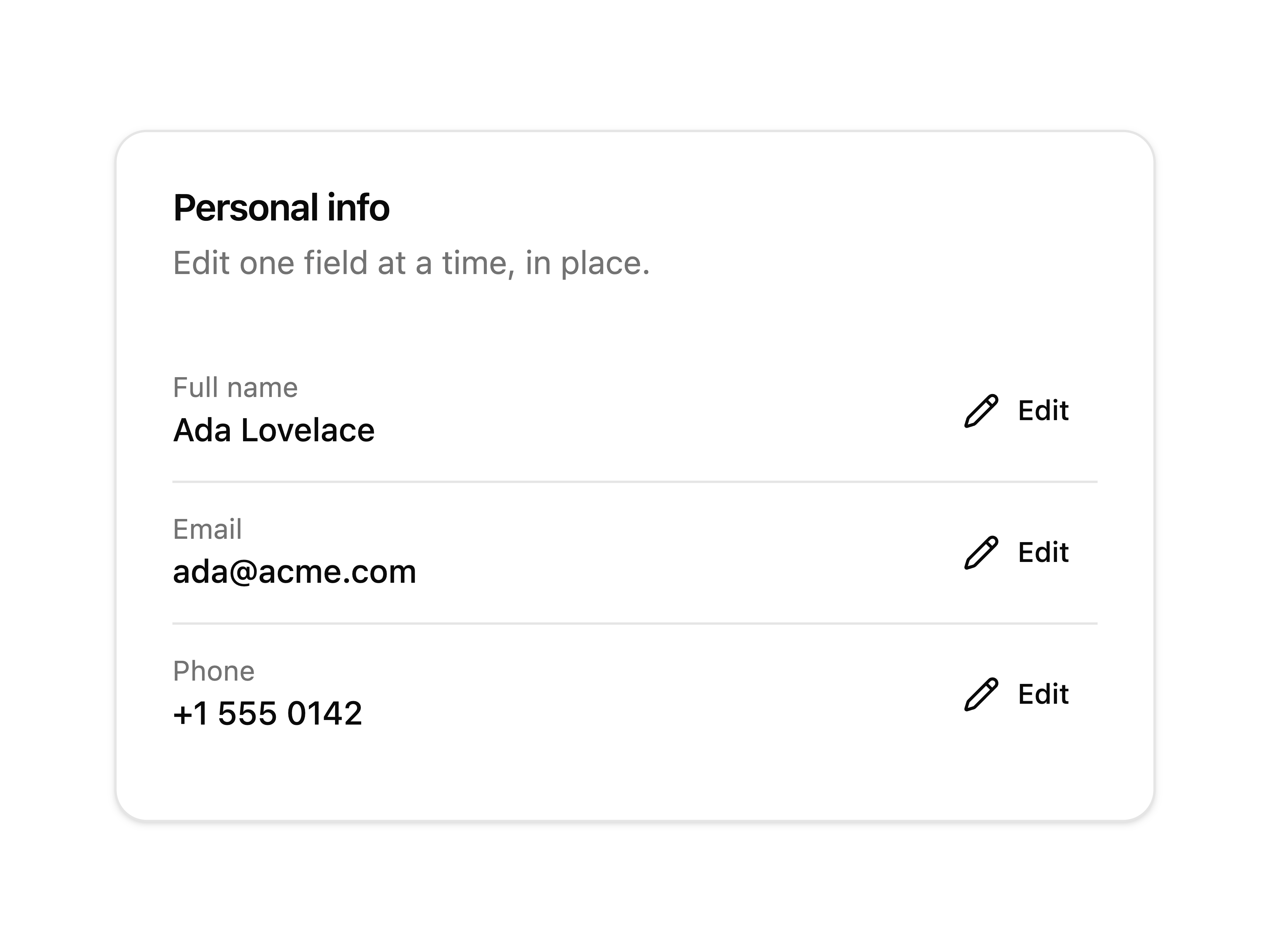
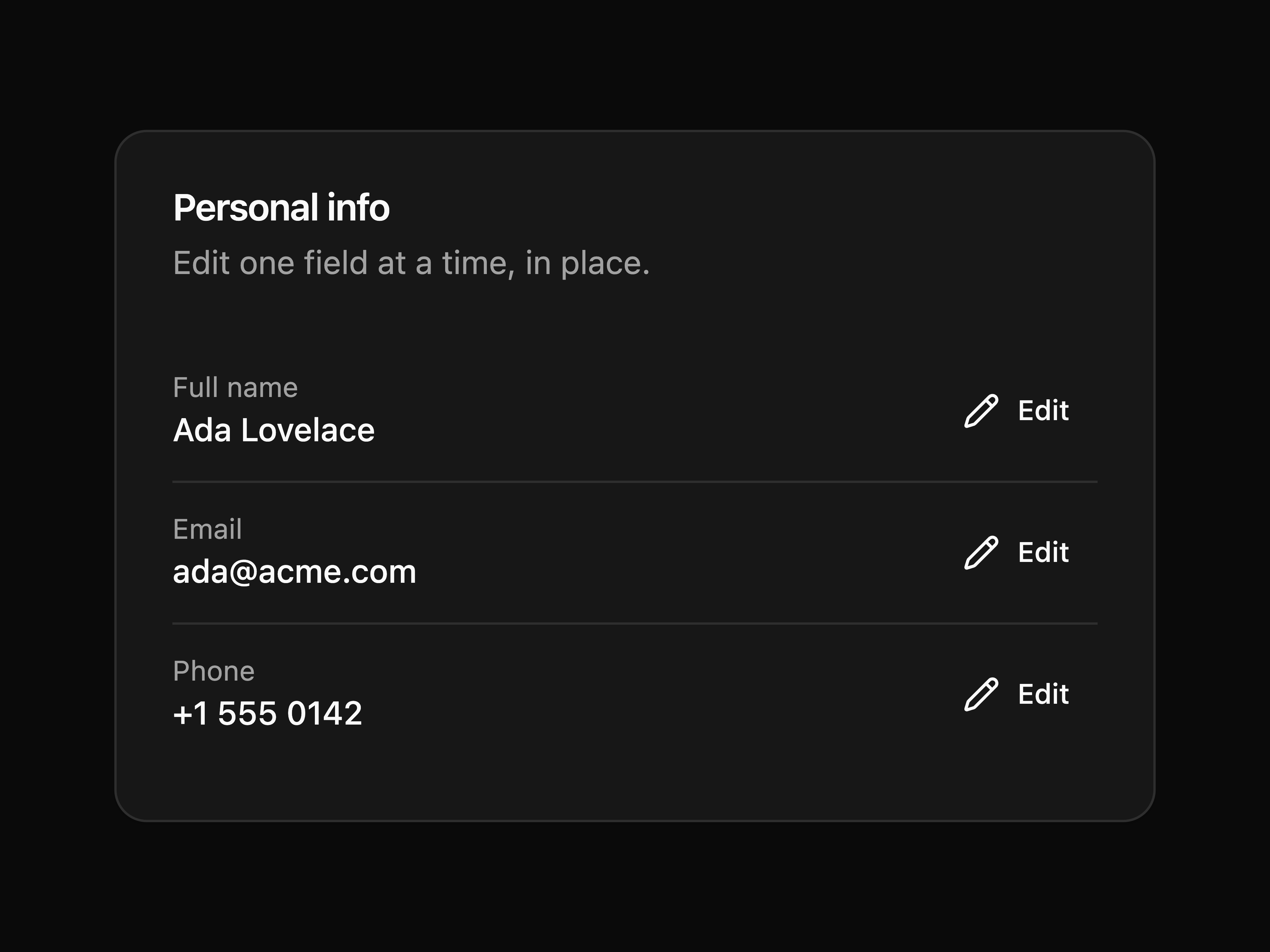
Inline Edit for Settings.
Preferences Dialog for Settings.
Social First for Sign In.
Email & Password for Sign In.
Magic Link for Sign In.
Phone & OTP for Sign In.
A circle beside two lines, mimicking a loading user row.
Media banner above a title, body lines, and a footer.
Repeated rows, each with a circular avatar and two text lines.
A header row above several placeholder data rows.
A field label above a trigger with a chevron block.
Wireframe: sidebar, stat cards, chart, and a list.
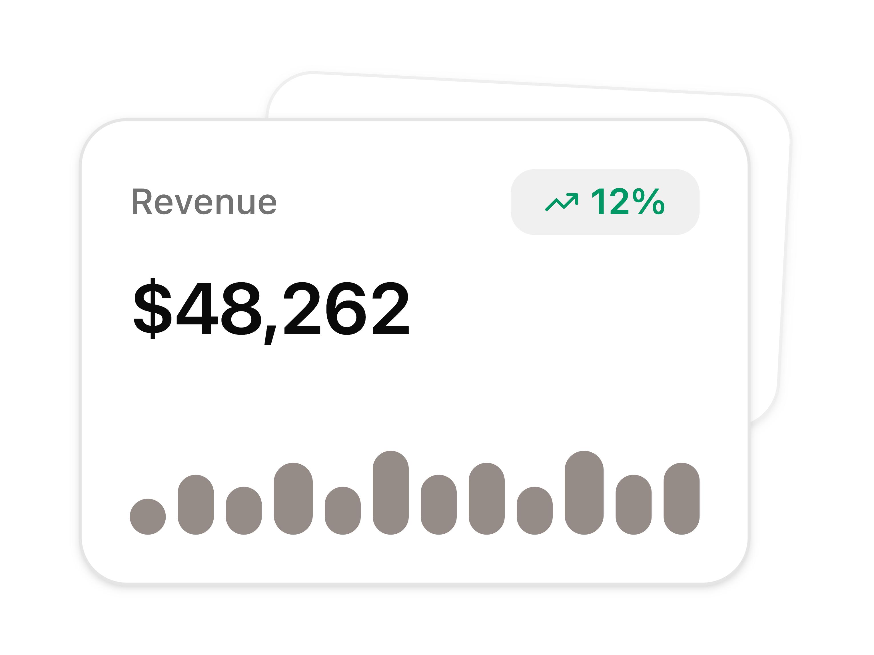
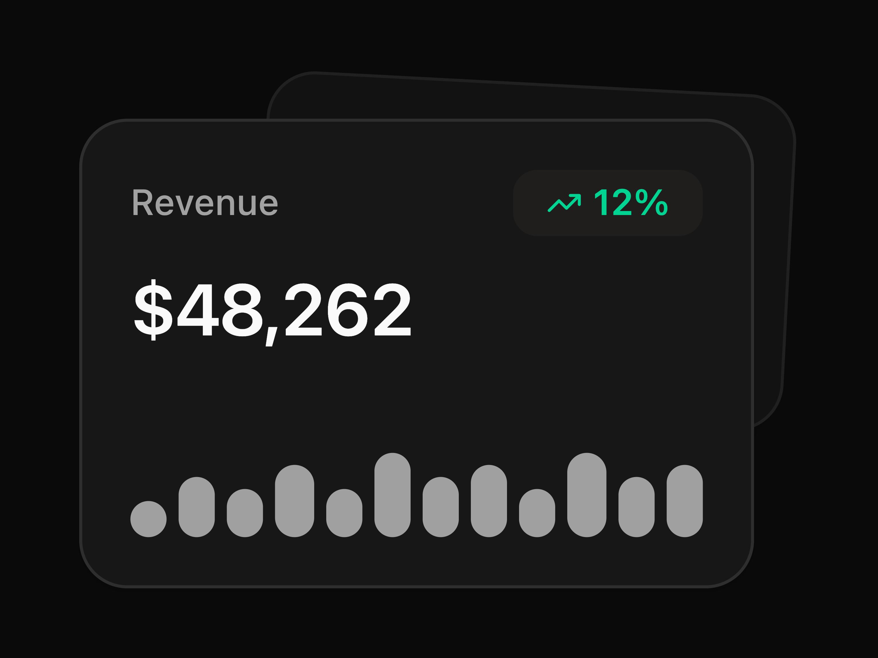
A stat card with trend and sparkline, layered over a second.
A fanned stack of notification cards.
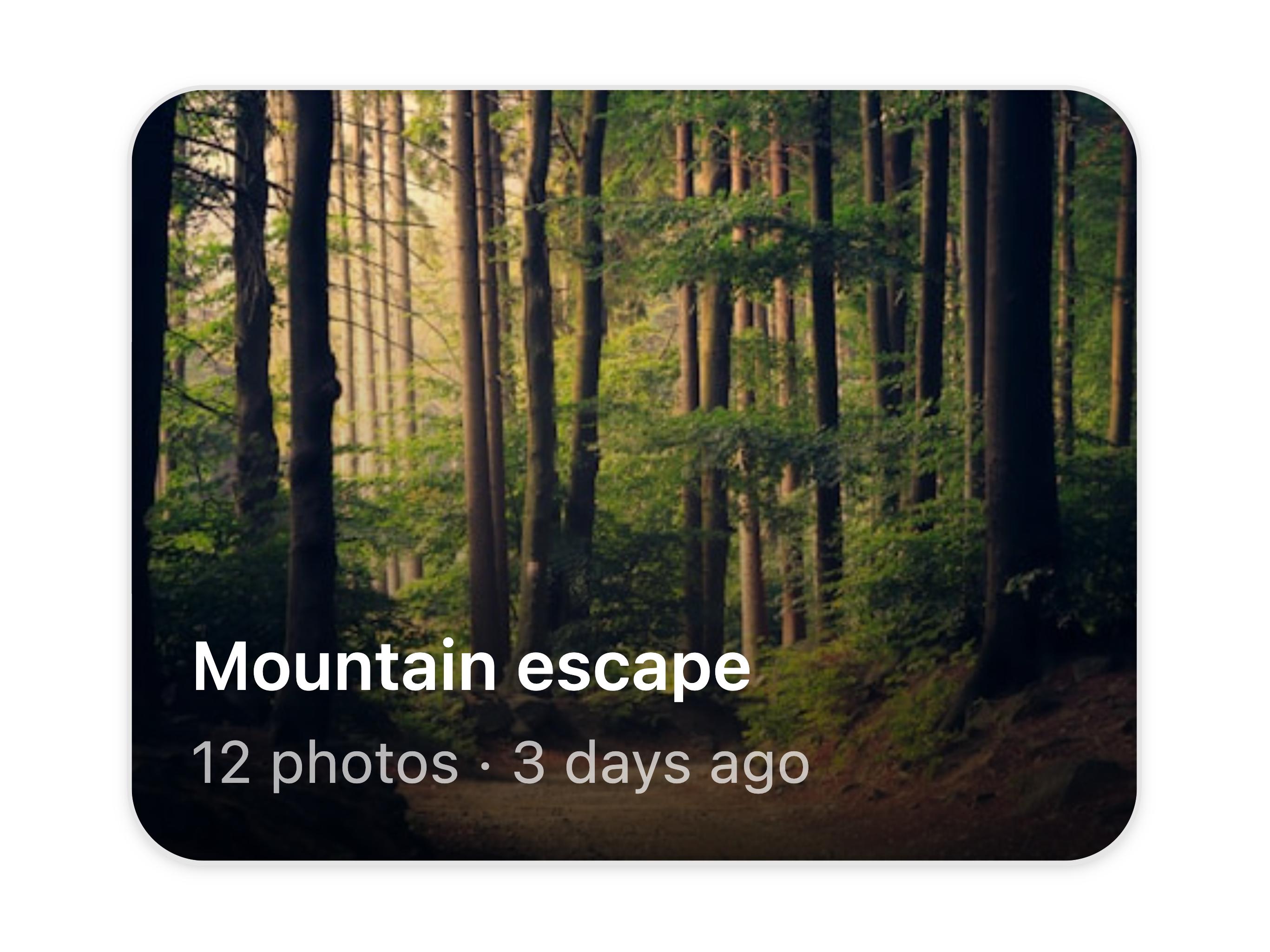
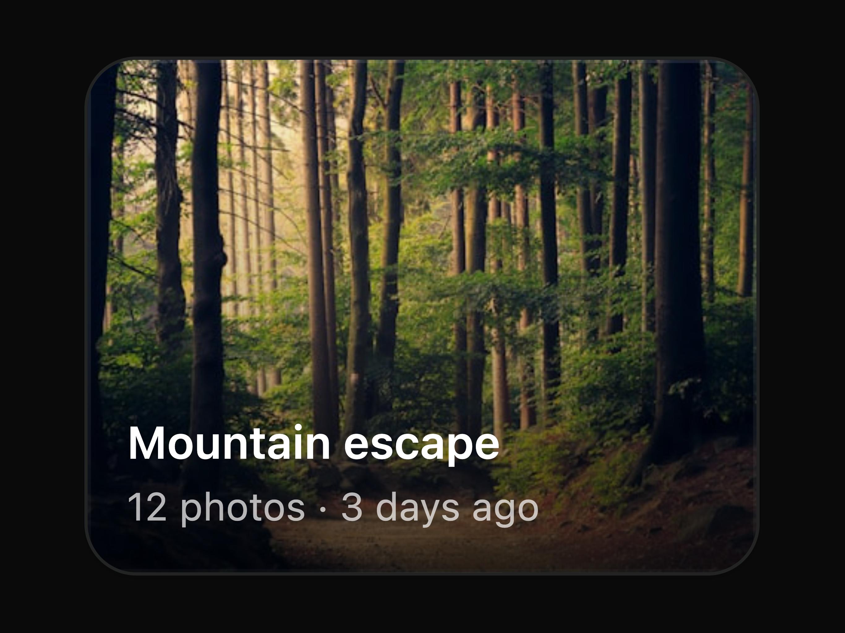
An image card with a soft gradient fade and caption.
A card with a gradient area chart.
A single standalone switch.
Switch paired with an accessible field label.
Label and helper description beside the switch.
The sm and default sizes side-by-side.
Disabled off and disabled on states.
Sun and moon icons flank a light / dark toggle.
Custom larger toggle with sun / moon icons that swap inside the thumb.
A grouped list of notification settings, each row with a label, helper text, and a switch.
A visual credit card mockup above a labeled switch for enabling automatic monthly payments.
Clickable add-on rows showing a title, description, price, and a switch, each fully tappable via a wrapping label.
Controller binds the switch to RHF; Zod requires opt-in on submit.
Borderless rows for a clean, list-like layout.
Column grid lines via per-cell right borders.
Compact padding and type for high-density data.
Key-value details with row headers down the left.
Header pinned while the capped body scrolls.
TanStack Table, drag the header edge to resize column widths.
TanStack Table, row checkboxes with a bulk actions toolbar showing count, clear, and delete.
Ship UI. Keep the Taste.
Scale taste across projects. Blocks, patterns, intents, and prompts for builders and AI agents.
Flexnative is open source. Built on shadcn/ui and Tailwind CSS. You get the source, you own it, extend it, ship it.
Not a component catalog. A way to document taste and scale the layers you reuse across projects:
Tradeoffs written down. Instructions builders and AI agents can follow. Code you keep.
This repo powers ui.flexnative.com.
Browse patterns, blocks, illustrations, intents, and docs at ui.flexnative.com.
pnpm dev
pnpm build
pnpm registry:build
Please read the contributing guide.
Licensed under the AGPL-3.0 license.
The packages and primitives its components pull in, counted across the registry.
Every appearance and removal our crawl has seen in the registry index.
flx is a component library on 21st.dev by felipemenezes098 with 94 public React components. Every component ships with a live interactive preview and full TSX source — copy the code, install it through the shadcn CLI, or pull it into Cursor or Claude Code over MCP.