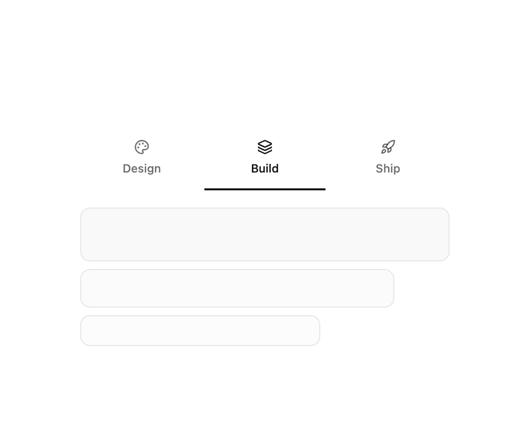
About
A tabbed interface where each trigger stacks an icon above its label, with a distinct visual content panel below each tab.
Built with React and Tailwind. Copy the prompt and paste it into Claude Code, Cursor or Lovable: your agent adds Icon with Title Tabs to your project and fits it to your theme.
Code
How Icon with Title Tabs is used: the demo's code. The component's own source comes with a free account.
Usage.tsx
import { Tabs10 } from "@/components/ui/tabs-10";

export default function Default() {
  return (
    <div className="flex min-h-svh w-full items-center justify-center p-8">
      <Tabs10 />
    </div>
  );
}
Dependencies
More by felipemenezes098
View all
Centered Hero with Image Fan
1.1K
Editorial Collage Hero
487
Split Hero With Image Cards
439
Editorial Image Hero
409
Scroll 01
393
Real Estate Search Hero
214
Editorial Hero
194
Hero with Dashboard Mockup
141
More in Navigation
View all

Sidebar
365

Pagination
38
Navbar
8

Sortable Sidebar Navigation
76

Pagination
105

Oversized 404 Numeral
72
Stacked Circular Footer
446
Tabs like bookmark
76


