About
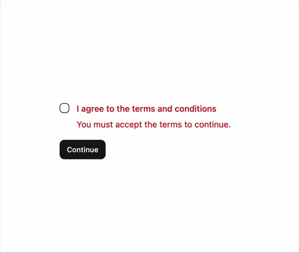
A terms-and-conditions checkbox with an inline error message that appears when the form is submitted without accepting.
Built with React and Tailwind. Copy the prompt and paste it into Claude Code, Cursor or Lovable: your agent adds Invalid / Required Checkbox to your project and fits it to your theme.
Code
How Invalid / Required Checkbox is used: the demo's code. The component's own source comes with a free account.
Usage.tsx
"use client";

import { Button } from "@/components/ui/button";
import { Checkbox } from "@/components/ui/checkbox";
import {
  Field,
  FieldContent,
  FieldError,
  FieldLabel,
} from "@/components/ui/checkbox-11-utils/field";
import { toast } from "sonner";
import { Toaster } from "sonner";
import { useState } from "react";

function Checkbox11Demo() {
  const [accepted, setAccepted] = useState(false);
  const [invalid, setInvalid] = useState(true);

  function onSubmit(event: React.FormEvent) {
    event.preventDefault();
    if (!accepted) {
      setInvalid(true);
      return;
    }
    setInvalid(false);
    toast.success("Terms accepted");
  }

  return (
    <form onSubmit={onSubmit} className="flex w-full max-w-sm flex-col gap-4">
      <Field orientation="horizontal" data-invalid={invalid}>
        <Checkbox
          id="checkbox-11-terms"
          aria-invalid={invalid}
          checked={accepted}
          onCheckedChange={(value) => {
            const next = value === true;
            setAccepted(next);
            if (next) setInvalid(false);
          }}
        />
        <FieldContent>
          <FieldLabel htmlFor="checkbox-11-terms">
            I agree to the terms and conditions
          </FieldLabel>
          {invalid && (
            <FieldError>You must accept the terms to continue.</FieldError>
          )}
        </FieldContent>
      </Field>
      <Button type="submit" size="sm" className="self-start">
        Continue
      </Button>
    </form>
  );
}

export default function DefaultDemo() {
  return (
    <div className="flex min-h-64 w-full items-center justify-center p-6">
      <Checkbox11Demo />
      <Toaster />
    </div>
  );
}
Dependencies
More by felipemenezes098
View all
Centered Hero with Image Fan
1K
Editorial Collage Hero
472
Split Hero With Image Cards
430
Editorial Image Hero
398
Scroll 01
378
Real Estate Search Hero
205
Editorial Hero
189
Hero with Dashboard Mockup
134
More in Forms
View all

Contact Card
1.1K

Form
137

Premium Auth
540

Card Studio
45

Login 2
10
Login Card
30

Book A Demo 1
80
SignInPage
701

